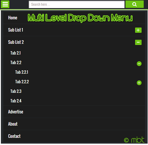
The biggest hurdle while creating a Fluid layout is to convert your Static header menu into a responsive one. You need to replace your wide desktop menu with an auto-adjusting mobile menu that must match your webpage color theme and should also contain enough room for both your Navigation links and Search Form. It thus can play a two-in-one role. Today we will create a jQuery menu with Toggle effect to slide up and slide down the Link list. The Menu container will also contain a search functionality and will support nesting of as many child lists as you wish to create. Our previously shared Responsive menu lacked few features which we have covered in this menu. It is therefore an advanced Multi-level Drop Down menu with several important features which are:
- It is Fully Responsive - will auto adjust to any mobile screen size
- It will appear Only in Mobile devices - thanks to isMobileRequest Conditional Tag
- It has a Responsive Search Form - Users can now easily navigate through your site
- It supports Infinite Nesting - Its nested structure allows you to add infinite sub-menus!
- It is Cross-Platform Browser Compatible - Design Supported by all major browsers
We have added the same menu in mbt and all our client sites. You can see a live demo of this great menu in action:
DEMO (Appears when you reduce window size) Tutorial Series
3. Hiding Widgets & Scripts in Mobile Templates [1], [2] 4. Design a Mobile Responsive Drop Down Menu for Blogger
Add This Responsive Menu in Blogspot
Since we write tutorials exclusively for blogger users, therefore non-Blogger users may ignore steps which are specific to Blogspot. Follow these easy steps:
1. Go To Blogger > Template > Backup your template
2. Click Edit HTML
3. Search for <head> and just below it paste the following code:
<script src='http://ajax.googleapis.com/ajax/libs/jquery/1/jquery.min.js' type='text/javascript'/>
<link href='http://fortawesome.github.io/Font-Awesome/assets/font-awesome/css/font-awesome.css' rel='stylesheet'/>
<link href='http://fonts.googleapis.com/css?family=Oswald' rel='stylesheet' type='text/css'/>
Note: The above code includes source links to jQuery library, FontAwesome icons and Oswald Font. If you already using anyone of it then you may avoid adding their respective source links.
4. Next search </head> and just above it paste the following CSS and JavaScript code
<style>
/*-----------Responsive Drop Down Menu by STCnetwork.org --------------*/
.sf-menu a.home:before,#searchnya button:before{position:absolute;font-family:FontAwesome;font-weight:400;font-style:normal;text-decoration:inherit;-webkit-font-smoothing:antialiased}.highlight{background-color:#f09903;color:#1a1308}#searchnya{float:right;width:80%;position:relative;right:0}.siy{bottom:0;left:0;background:none;font-size:19px;color:#fff}#searchnya input{padding:5px 10px;width:75%;margin:5px 0 0;background-color:#FFF;height:21px;box-shadow:1px 2px 4px #A2A2A2 inset;position:relative}#searchnya input,#searchnya button{border:0;-moz-border-radius:1px;-webkit-border-radius:1px;border-radius:1px;display:inline-block;outline:0;font-size:14px;font-family:oswald;color:#BDB5B5;font-weight:400}#searchnya button{background-color:#6FC415;padding:0;width:15%;height:31px;margin-right:5px;cursor:pointer;position:relative;top:0}#searchnya button:hover{background:#76D314}
#navitions{background-color:#242729;border-bottom:0px solid #6FC415;box-shadow:0 1px 9px #666;display:none}#mobilenav{display:none}#nav1{height:40px;position:relative;background:#242729;box-shadow:1px 2px 9px #6FC415}.sf-menu,.sf-menu *{list-style:none;margin:0;padding:0}.sf-menu li{white-space:normal;-moz-transition:background-color .2s;-webkit-transition:background-color .2s;transition:background-color .2s;position:relative}.sf-menu ul{position:absolute;display:none;top:100%;left:0;z-index:99;min-width:12em;padding-top:4px;width:100%}.sf-menu > li{float:left;text-align:left;margin:0 1px}.sf-menu li:hover > ul,.sf-menu li.sfHover > ul{display:block}.sf-menu a{display:block;position:relative;height:40px;line-height:40px;text-decoration:none;zoom:1;color:#FFF;font-size:100%;padding:0 15px; font-family:oswald; -webkit-transition:all .4s ease-in-out; -moz-transition:all .4s ease-in-out; -o-transition:all .4s ease-in-out; -ms-transition:all .4s ease-in-out;transition:all .4s ease-in-out;}.sf-menu > li > a{font-size:105%;font-family:oswald}.sf-menu ul ul{top:0;left:100%}.sf-menu{float:left}.sf-menu a.home{background-color:#A30000;margin-left:4px;text-indent:-9999px;padding:0}.sf-menu li:hover{background:#222}.sf-menu ul li{background-color:#242729}.sf-menu ul li:hover{background-color:#333}.sf-menu ul a{font-weight:400;height:30px;line-height:30px;font-family:oswald,arial}.sf-menu ul ul li{background:#3C3C3C}.sf-menu li:hover > a,.sf-menu li.sfHover,.sf-menu > li > a.current{-moz-transition:none;-webkit-transition:none;transition:none}.sf-arrows .sf-with-ul{padding-right:1em}.sf-arrows .sf-with-ul:after{content:'';position:absolute;top:50%;right:.75em;margin-top:-3px;height:0;width:0;border:5px solid transparent;border-top-color:#FFF}.sf-arrows > li > .sf-with-ul:focus:after,.sf-arrows > li:hover > .sf-with-ul:after,.sf-arrows > .sfHover > .sf-with-ul:after{border-top-color:#FFF}.sf-arrows ul .sf-with-ul:after{margin-top:-5px;margin-right:-3px;border-color:transparent transparent transparent #FFF}.sf-arrows ul li > .sf-with-ul:focus:after,.sf-arrows ul li:hover > .sf-with-ul:after,.sf-arrows ul .sfHover > .sf-with-ul:after{border-left-color:#FFF}.sf-menu li > i{position:absolute;top:15px;right:15px;width:27px;height:22px;cursor:pointer;display:none;background-color:#6FC415;-moz-border-radius:2px;-webkit-border-radius:2px;border-radius:2px;outline:0;font:12px Verdana,Geneva,sans-serif}.sf-menu li > i:after{content:'+';color:#FFF;font-size:19px;position:absolute;left:5px;top:-2px}.sf-menu li ul li i:after{left:3px;font-size: 16px;top: -1px;} .sf-menu li ul li i.active:after {left: 4px;font-size: 26px;top: -8px;}
.sf-menu li > ul li i{border-radius:100px;-webkit-border-radius:100px;-moz-border-radius:100px; width:20px; height:20px;}
.sf-menu li > i.active:after{content:'-';font-size:36px;top:-14px}.sf-menu a.home{position:relative}.sf-menu a.home:before{position:absolute;font-family:FontAwesome;font-weight:400;font-style:normal;text-decoration:inherit;-webkit-font-smoothing:antialiased;height:30px;top:0;font-size:27px;left:9px}.sf-menu a.home:before,#view a:before{text-indent:0}html {-webkit-text-size-adjust: 100%;}
@media only screen and (max-width:320px){#searchnya input{width:67%}}
@media only screen and (max-width:768px) {
#navitions{display:block}#nav1{width:100%}#mobilenav{display:block;text-indent:-9999px;width:35px;top:4px;left:10px;position:absolute;height:32px;outline:0;background-color:#6FC415;-moz-border-radius:2px;-webkit-border-radius:2px;border-radius:2px;color:#FFF;text-decoration:none}#mobilenav.active{color:#fff}#mobilenav:before{content:"\f0c9";top:3px;text-indent:0;left:7px;font-size:26px}#menunav{float:none;display:none;position:absolute;top:45px;left:10px;right:10px;z-index:99999999;background-color:#242729;padding:5px 10px}#menunav li{float:none;margin:0}#menunav > li{margin:1px 0}.sf-menu a.home,.sf-menu a{text-indent:0;margin-left:0;-moz-border-radius:2px;-webkit-border-radius:2px;border-radius:2px;background-color:#1D1D1D!important;padding:5px 20px;border:0}.sf-menu a:hover{background-color:#2c2c2c!important}.sf-menu ul{position:static;padding-top:0}.sf-menu ul a{padding-left:30px}.sf-menu ul ul li a{padding-left:50px; }.sf-menu ul ul ul li a{padding-left:60px; }.sf-menu a.home,.sf-menu li:hover > a.home,.sf-menu > li > a.current{color:#FFF;background-color:#cd2122}.sf-menu ul a:hover{padding-left:40px}.sf-menu ul ul a:hover{padding-left:60px}.sf-menu a.home:before,.sf-menu li:hover > ul,.sf-menu li.sfHover > ul{display:none}.sf-menu ul li,.sf-menu ul ul li,.sf-menu li:hover > a,.sf-menu li.sfHover{background-color:transparent}.sf-menu a.home:before,#mbt-search-layout button:before,#mobilenav:before{position:absolute;font-family:FontAwesome;font-weight:400;font-style:normal;text-decoration:inherit}
}
</style>
<script type='text/javascript'>
//<![CDATA[
// Superfish v1.7.2 - jQuery menu widget - Joel Brich
(function(b){var a=(function(){var p={bcClass:"sf-breadcrumb",menuClass:"sf-js-enabled",anchorClass:"sf-with-ul",menuArrowClass:"sf-arrows"},f=/iPhone|iPad|iPod/i.test(navigator.userAgent),k=(function(){var c=document.documentElement.style;return("behavior" in c&&"fill" in c&&/iemobile/i.test(navigator.userAgent))})(),d=(function(){if(f){b(window).load(function(){b("body").children().on("click",b.noop)})}})(),m=function(s,t){var c=p.menuClass;if(t.cssArrows){c+=" "+p.menuArrowClass}s.toggleClass(c)},r=function(c,s){return c.find("li."+s.pathClass).slice(0,s.pathLevels).addClass(s.hoverClass+" "+p.bcClass).filter(function(){return(b(this).children("ul").hide().show().length)}).removeClass(s.pathClass)},n=function(c){c.children("a").toggleClass(p.anchorClass)},g=function(c){var s=c.css("ms-touch-action");s=(s==="pan-y")?"auto":"pan-y";c.css("ms-touch-action",s)},j=function(t,u){var c="li:has(ul)";if(b.fn.hoverIntent&&!u.disableHI){t.hoverIntent(l,h,c)}else{t.on("mouseenter.superfish",c,l).on("mouseleave.superfish",c,h)}var s="MSPointerDown.superfish";if(!f){s+=" touchend.superfish"}if(k){s+=" mousedown.superfish"}t.on("focusin.superfish","li",l).on("focusout.superfish","li",h).on(s,"a",i)},i=function(t){var s=b(this),c=s.siblings("ul");if(c.length>0&&c.is(":hidden")){s.one("click.superfish",false);if(t.type==="MSPointerDown"){s.trigger("focus")}else{b.proxy(l,s.parent("li"))()}}},l=function(){var c=b(this),s=o(c);clearTimeout(s.sfTimer);c.siblings().superfish("hide").end().superfish("show")},h=function(){var c=b(this),s=o(c);if(f){b.proxy(q,c,s)()}else{clearTimeout(s.sfTimer);s.sfTimer=setTimeout(b.proxy(q,c,s),s.delay)}},q=function(c){c.retainPath=(b.inArray(this[0],c.$path)>-1);this.superfish("hide");if(!this.parents("."+c.hoverClass).length){c.onIdle.call(e(this));if(c.$path.length){b.proxy(l,c.$path)()}}},e=function(c){return c.closest("."+p.menuClass)},o=function(c){return e(c).data("sf-options")};return{hide:function(s){if(this.length){var v=this,w=o(v);if(!w){return this}var t=(w.retainPath===true)?w.$path:"",c=v.find("li."+w.hoverClass).add(this).not(t).removeClass(w.hoverClass).children("ul"),u=w.speedOut;if(s){c.show();u=0}w.retainPath=false;w.onBeforeHide.call(c);c.stop(true,true).animate(w.animationOut,u,function(){var x=b(this);w.onHide.call(x)})}return this},show:function(){var t=o(this);if(!t){return this}var s=this.addClass(t.hoverClass),c=s.children("ul");t.onBeforeShow.call(c);c.stop(true,true).animate(t.animation,t.speed,function(){t.onShow.call(c)});return this},destroy:function(){return this.each(function(){var s=b(this),t=s.data("sf-options"),c=s.find("li:has(ul)");if(!t){return false}clearTimeout(t.sfTimer);m(s,t);n(c);g(s);s.off(".superfish").off(".hoverIntent");c.children("ul").attr("style",function(u,v){return v.replace(/display[^;]+;?/g,"")});t.$path.removeClass(t.hoverClass+" "+p.bcClass).addClass(t.pathClass);s.find("."+t.hoverClass).removeClass(t.hoverClass);t.onDestroy.call(s);s.removeData("sf-options")})},init:function(c){return this.each(function(){var t=b(this);if(t.data("sf-options")){return false}var u=b.extend({},b.fn.superfish.defaults,c),s=t.find("li:has(ul)");u.$path=r(t,u);t.data("sf-options",u);m(t,u);n(s);g(t);j(t,u);s.not("."+p.bcClass).superfish("hide",true);u.onInit.call(this)})}}})();b.fn.superfish=function(d,c){if(a[d]){return a[d].apply(this,Array.prototype.slice.call(arguments,1))}else{if(typeof d==="object"||!d){return a.init.apply(this,arguments)}else{return b.error("Method "+d+" does not exist on jQuery.fn.superfish")}}};b.fn.superfish.defaults={hoverClass:"sfHover",pathClass:"overrideThisToUse",pathLevels:1,delay:800,animation:{opacity:"show"},animationOut:{opacity:"hide"},speed:"normal",speedOut:"fast",cssArrows:true, disableHI:false,onInit:b.noop,onBeforeShow:b.noop, onShow:b.noop,onBeforeHide:b.noop,onHide:b.noop,onIdle:b.noop, onDestroy:b.noop};b.fn.extend({hideSuperfishUl:a.hide,showSuperfishUl:a.show})})(jQuery);
function menunav(b){b("#mobilenav").click(function(){b("#menunav").slideToggle();b(this).toggleClass("active");return false});b(".sf-menu ul").each(function(){var d=b(this).parent("li");d.append("<i></i>")});function a(){var d=b(window).width();if(d>979){b("#menunav").css("display","block");b("#menunav").superfish({animation:{height:"show"},animationOut:{height:"hide"}});b(".sf-menu i").css("display","none")}else{if(d<=979&&b("#mobilenav").attr("class")==="active"){b("#menunav").css("display","block");b("#menunav").superfish("destroy");b(".sf-menu i").css("display","block")}else{if(d<=979&&b("#mobilenav").attr("class")!=="active"){b("#menunav").css("display","none");b("#menunav").superfish("destroy");b(".sf-menu i").css("display","block")}}}}a();b(window).resize(a);b(".sf-menu i").click(function(){var d=b(this).parent("li");var e=d.children("ul");e.slideToggle();b(this).toggleClass("active");return false});var c=window.location.href;b("#menunav a").each(function(){if(this.href===c){var d=b(this).parents("li").children("a").addClass("current")}})};
//]]>
</script>
5. Find <body> and just below it paste the following HTML code
<b:if cond='data:blog.isMobileRequest == "true"'>
<div id='navitions'>
<div class='isi'>
<nav class='navix' id='nav1'>
<div id='searchnya'>
<form action='/search'>
<input name='q' onblur='if ('' === this.value) {this.value = 'Search here…';}' onfocus='if ('Search here…' === this.value) {this.value = '';}' type='text' value='Search here…'/>
<button title='Search' type='submit'>
<i class='fa fa-search siy'/>
</button>
</form>
</div>
<a href='#' id='mobilenav'>
Select Menu
</a>
<ul class='sf-menu' id='menunav'>
<li>
<a class='home' expr:href='data:blog.homepageUrl'>
Home
</a>
</li>
<li><a href='#'>LINK TEXT </a></li>
<li><a href='#'>LINK TEXT </a></li>
</ul>
<script type='text/javascript'>
//<![CDATA[
menunav (jQuery);
//]]>
</script>
</nav>
</div>
</div>
</b:if>
- Replace the # hash tag symbol with your Page URL
- Replace LINK TEXT with your Page Title
- You can create sub-menus by following standard HTML by following these steps
- You can keep on adding new tabs just above </ul>
6. Finally save your template and you are all done!
Creating Multi Level Drop Down List
You are all done with the major code work. Now you just need to create the list in HTML using standard method. Any tab or link in your menu will have this structure:
<li><a href="#">LINK TEXT</a> </li>
To add a drop down list to this tab all you need to do is to paste the following code just before the closing </li> tag. See below:
<li><a href="#">LINK TEXT</a>
<ul>
<li><a href="#">FIRST LIST 1</a></li>
<li><a href="#">FIRST LIST 2</a></li>
<li><a href="#">FIRST LIST 3</a></li>
</ul>
</li>
To add a second drop down list within this vertical list, simply use the same concept. I will add the second vertical list after the tab: "FIRST LIST 2"
<li><a href="#">LINK TEXT</a>
<ul>
<li><a href="#">FIRST LIST 1</a></li>
<li><a href="#">FIRST LIST 2</a>
<ul>
<li><a href="#">SECOND LIST 1</a></li>
<li><a href="#">SECOND LIST 2</a></li>
<li><a href="#">SECOND LIST 3</a></li>
</ul>
</li>
<li><a href="#">FIRST LIST 3</a></li>
</ul>
</li>
Rest follows the same pattern.
Hide your Desktop Menu From Loading in Mobile Devices
To make sure redundant links may not appear once because of your Desktop menu (menu you are currently using) and second because of your Responsive menu, we will have to disable your Desktop menu on mobile devices.
Enclose your Desktop Menu's HTML code inside the following conditional expressions:
<b:if cond='data:blog.isMobileRequest == "false"'>
Your Desktop Menu
</b:if>
The above condition will show the Desktop menu only in Laptops and Desktop screens but will hide it in Smartphones and Tablets/ipads. To understand in detail what the condition above does, please read part#3 of this tutorial series.
Credits
The menu uses the Superfish Plugin V 1.7.2 created by Joel Brich as the backbone for its front-end dynamic effects. Superfish is a jQuery plugin that adds usability enhancements to multi-level drop-down menus. Due to this plugin our menu now fully supports touch devices and keyboard interaction.
The design and customization to the scripts are contributed by STCnetwork. Kindly attach due credits back to this page if you wish to share this menu with your readers.
Need Help?
If you have any questions that you wish to ask then please do not hesitate to post them below. I hope the menu above may change the overall UI experience of your beautiful blogger blog for your mobile visitors.
The tutorial series above have been really popular this month and I would like to thank you all for finding it so useful. I am trying my best to complete it as soon as time allows. Wish you all a safe and happy blogging journey, Peace and blessings buddies! =)







 All blogspot users are recently informed in their dashboards that European Union (EU) laws require all publishers to give EU visitors information about cookies used on their blogs. For that reason Blogger team has automatically added a notice bar on all blogs to help meet these regulations. The notice lets visitors know about Google's use of certain Blogger and


 It makes a lot of sense to always add your website name along with Copyrights Date/time in Footer credits to let your users get accustomed to your brand identity and also know that you reserve full copyrights of the content you share on your blog. A credit link consists of mostly your Trademark/benchmark name (i.e. Blog Title) and the Time interval for which you deserve full ownership of your Blog resources and of its use and distribution. When we design Blogger templates we often add Credit links or attribution links at the bottom of the blog footer to let everyone know who designed and developed the template.
  Now that you have learnt how to hide HTML content in Blogspot blogs using the conditional tag "isMobileRequest", Its time to learn how to prevent blogger Widgets from loading inside Mobile devices for Responsive Blogger Templates. It is really important that your mobile site may load as faster as possible due to slow internet speed of Mobile browsers. In order to achieve this purpose, we need to hide some widgets that makes no sense in small screen devices. These Sidebar widgets could include your Fancy Subscription boxes, search boxes, Labels, Archives, PopularPosts, Blog ROLL, Recent comments and so on. Most of these widgets use jQuery or JavaScript that really slows down the site. Therefor we will not just hide the Widget HTML content but would also disable its javaScript. You can continue showing them in Desktop/Laptop devices but it is really advisable that you hide such widgets for mobile devices in order to speed up your Page load time as much as possible in order to rank higher on Mobile Search results. We have experienced a tremendous positive impact of this technique on our Blogger blog (mbt) and it has really helped increasing our mobile traffic a lot. Lets get started!


