Showing posts with label Blogger Widgets and plugins. Show all posts

Happy New Year - jQuery Popup For Sites!

happy new year jquery popup for sites


Time fly too fast! Two years back we released a combination of 2 different popups to wish your website visitors happy winter holidays and happy new year, we are releasing today a dynamic popup for new year so that you may not remain dependant on a fixed background theme and instead change the date and time by editing the text.


This Popup plugin contains 4 Unique Features!


  1. Falling snowflakes,


  2. It has a digital countdown timer,


  3. It has 3 different animations,


  4. Supports HTML5 sessionStorage functionality to set cookie in order to control the popup display. You can choose to show the popup once or several times.


It is perfectly compatible with all major browsers. A perfect way to greet your website visitors.  You can add it easily to your blogspot or wordpress blogs or on HTML webpage you may have. It is extremely easy to customize. View the demos below and then proceed to the installation guide.


Note: I have willingly set the counter to 2017 so that the demo may live longer :)


How to install this popup?


All steps are exactly similar to the ones we already shared on our christmas popups tutorial except for the styling which I will discuss here. Kindly therefore follow all steps shared in the Winter Holidays tutorial linked below. Follow all steps there and skip step#5.


Add the following CSS code instead of the code shared in step#5 of previous tutorial:


/* -------------------------------------------------- 
New Year Popup by MBT


-------------------------------------------------- */


#mbt-counter {


padding: 10px;

font-family: oswald,verdana;


background-color: transparent !important;


position: relative;


top: 28%;


font-size: 25px;


left: 28%;


text-shadow: 1px 2px 4px rgb(51, 51, 51);


color: rgb(255, 254, 198) !important;


border: 2px solid orange;}


        .reveal-modal h2 { 
   position: relative;


top: 25%;


font-family: oswald,arial;


font-size: 1.7em;


text-shadow: 2px 4px 10px #000;


color: orange;


text-align: center;}


    .reveal-modal-bg {

        position: fixed;


        height: 100%;


        width: 100%;


        background: rgba(0,0,0,.8);


        z-index: 100;


        display: none;


        top: 0;


        left: 0;


        }


    .reveal-modal {


        visibility: hidden;


        left: 50%;


        top:170px;


        margin-left: -300px;


        width: 550px;


        height: 305px;


        background: rgba(51, 51, 51, 0) url(https://blogger.googleusercontent.com/img/b/R29vZ2xl/AVvXsEhtU3aX2esST0txTR2jBguN0HwxYQytb3CRxs9kvcs02AcO7gCOyv-Hcj_I_0IcWSoml0HYLkpbmKhOcWPsKNMmCJDL-ub6-OGe6Rb74XqKs-PxvhYx9cBkBTj608hTCFB8QDsTD6KYxJ0/s1600/happy-new-year-png.png) no-repeat -17px 0px;


        position: absolute;


        z-index: 101;


        padding: 30px 40px 34px;


        -moz-border-radius: 8px;


        -webkit-border-radius: 8px;


        border-radius: 8px;


        color: #FFF;


        }


    .reveal-modal.small         { width: 200px; margin-left: -140px;}


    .reveal-modal.medium         { width: 400px; margin-left: -240px;}


    .reveal-modal.large         { width: 600px; margin-left: -340px;}


    .reveal-modal.xlarge         { width: 800px; margin-left: -440px;}


    .reveal-modal .close-reveal-modal {


        font-size: 32px;


line-height: 0.5;


position: absolute;


right: 25px;


font-weight: bold;


cursor: pointer;


bottom: 25px;


color: orange;


        }


        .reveal-modal .close-reveal-modal:hover {


            color:#2d2d2f;


        }


That's all!


Hide Winter Snow Fall


If you don't want to show the falling snow then kindly remove this code:


$(document).snowfall({deviceorientation : true, round : true, minSize: 1, maxSize:8,  flakeCount : 250});


This code is given in step#4 of previous tutorial.


The HTML


For step#6 use the following HTML code


<div id="myModal" class="reveal-modal" >

        <h2>Count Down Begins...</h2>


        <script type='text/javascript' src="http://tools.mybloggertricks.com/mbt-counter.js"></script>


        <a class="close-reveal-modal">&#215;</a>


        </div>


Need Help?


Kindly let me know if you needed any help. I whole heartedly expect that you will like this pleasant gift for new year. Happy new year 2016 buddies but before I go here goes my new year resolution:


"Spending more time with my newly born baby "Ifza" and ofcourse blogosphere."


Love you all buddies! What are your new year resolution? =)

Disable rendering of JavaScript and Widgets Using isMobileRequest [2]

Disable Javascript in Mobile Blogger TemplatesNow that you have learnt how to hide HTML content in Blogspot blogs using the conditional tag "isMobileRequest", Its time to learn how to prevent blogger Widgets from loading inside Mobile devices for Responsive Blogger Templates. It is really important that your mobile site may load as faster as possible due to slow internet speed of Mobile browsers. In order to achieve this purpose, we need to hide some widgets that makes no sense in small screen devices. These Sidebar widgets could include your Fancy Subscription boxes, search boxes, Labels, Archives, PopularPosts, Blog ROLL, Recent comments and so on. Most of these widgets use jQuery or JavaScript that really slows down the site. Therefor we will not just hide the Widget HTML content but would also disable its javaScript. You can continue showing them in Desktop/Laptop devices but it is really advisable that you hide such widgets for mobile devices in order to speed up your Page load time as much as possible in order to rank higher on Mobile Search results. We have experienced a tremendous positive impact of this technique on our Blogger blog (mbt) and it has really helped increasing our mobile traffic a lot. Lets get started!
UPDATE: isMobileRequest is applicable only to smartphone devices and it does not apply to tablets, iPads etc. Just a correction to this post.

Tutorial Series
3. Hiding Widgets & Scripts in Mobile Templates [1], [2]
7. Make Blog Sections Responsive: Header Widgets, Posts + Sidebar, Footer

How to Find and Hide Widgets?

Before hiding widgets first learn how to find Widget ID. We published a post yesterday solely to help you out.

After you have explored how to locate widgets inside Template, you are ready to learn how to disable them in mobile devices so that they may not load in background and may not slow down your blog speed in smartphones and tablets, thus giving a speedy mobile experience to your readers.

Disable Widgets in Responsive Templates

In order to understand how it is done, we will assume that our widgetid is HTML3, which is the 'Back at Home' widget on our blog and we will discuss it throughout this tutorial.

Hiding this widget in Mobile devices

1 Go To Blogger > Template > Backup your template

2 Click Edit HTML

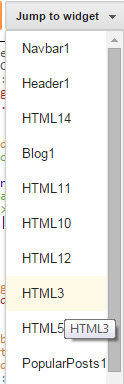
3 From the drop down menu locate your widget through the widget ID. In our case it is HTML3

locate widget by ID

4 You will be taken to the widget code. Expand/Collapse the code by clicking the black-pointed arrow towards its left. Click it once more when you see the second sub-arrow

expand the code

5 The code will now look something like this,

<b:widget id='HTML3' locked='false' title='Back at Home' type='HTML'>
                  <b:includable id='main'>
                    <!-- only display title if it's non-empty -->
                    <b:if cond='data:title != &quot;&quot;'>
                      <h2 class='title'> <data:title/>
                      </h2>
                    </b:if>
                    <div class='widget-content'>
                      <data:content/>
                    </div>
                    <b:include name='quickedit'/>
                   </b:includable>
                </b:widget>

We will apply the conditional isMobileRequest expression right inside the <b:includable> tag as shown below

<b:widget id='HTML3' locked='false' title='Back at Home' type='HTML'>
                  <b:includable id='main'>
<b:if cond='data:blog.isMobileRequest == "false"'>
                    <!-- only display title if it's non-empty -->
                    <b:if cond='data:title != &quot;&quot;'>
                      <h2 class='title'><data:title/>
                      </h2>
                    </b:if>
                    <div class='widget-content'>
                      <data:content/>
                    </div>
                    <b:include name='quickedit'/>
                    </b:if>
                  </b:includable>
                </b:widget>

  • We have set the isMobileRequest Boolean value to false, so that the widget may load only in Desktop devices and it must be kept hidden in Mobile devices. If you visit our blog using a Mobile browser (not a desktop simulator), you will observe that the 'Back at home' widget is not loaded at all.
  • If you want the widget to display only in Mobile devices but not desktop then set the Boolean value to true
  • This Slideshow widget contains up to 12 images which could have really slowed down our blog in mobile devices but thanks to this conditional tag, things are much neater now.

6 Save your template and you are all done!

Disable Widget Scripts From Loading in Background

Almost every widget that you install on your blog has a JavaScript or jQuery attached to it to bring about the dynamic front-end fancy effects. Just by hiding the widget HTML content wont help you speed up your blog unless you also hide/disable the scripts that make them work. If you hide a widget but forget to disable the script, then the JavaScript will still be loaded and rendered in background thus slowing down your site.

JavaScript of your widgets in blogger is either located above </head> tag or below <head> tag.

You must know where you widget script is located because you installed it yourself! Normally officially blogger widgets scripts load only when the HTML loads so you don't need to worry about most of blogger official widgets like PopularPosts, archives, Poll, Comments, Label List etc.

The Slideshow widget HTML3 that we hide earlier has a script that needs to be disabled also. Lets do that now!

1 Inside your template locate the script by searching it near <head> opening and </head> closing tags.

2 Once you find it then enclose the entire script code using isMobileRequest conditional expression as shown below

Disabing Javascript


Use the following syntax:

<b:if cond='data:blog.isMobileRequest == "false"'>

JavaScript to Hide

</b:if>

  • The condition is set to false which means the script will not be loaded in Mobile devices but it will load in Desktop and Laptops.
  • If you want the opposite then set the condition to true

3 Save your template and you are all done! That simple!

Need Help?

Let me know if you could not understand any part of the tutorial by leaving your comments below. I hope this rarely used yet recommended technique may help you better optimize your blogger blogs for mobile.

Wish you peace and love buddies! =)

2 Ways to Find Section ID and Widget ID in Blogspot

Locate widgets in bloggerWe have been asked several times how to find Gadgetid or widgetid of Blogger widgets so we thought a separate tutorial would be helpful in this case. We will share two ways to find and locate the widgetid and sectionid so both Windows users and Macintosh users may find it helpful. The page elements Section is now referred to as Layout section in Blogger dashboard. The widgets are mostly referred as Gadget in Layout section with blue highlighted links. Through this tutorial you will also understand how to easily locate widgets inside your blogger template using their IDs.


What is widgetid or sectionid?

widgetid :

Each widget that you create inside Layout has its unique Identification number that we refer as "ID". This Widget ID is always alphanumeric and is the only code that helps us control the widget look and appearance.

sectionid:

Each widget is added inside a section. In other words each section is a container that holds widgets. Popular sections of your blog are the Header, Sidebar, Footer and Main. These sections are also uniquely identified using their ID which we call the sectionid. We can use the section Id to modify the look and appearance of all widgets inside it.

Finding Section and Widget ID - Method 1

Each widget that you add to Layout has an edit link. If you hover your mouse cursor over it, your browser will show a tooltip at the bottom of your screen displaying important information related to that link. The information included in each link is:

gadget edit link

edit link info

  1. Blog ID : You can create up to 100 blogs in blogger. Each blog is identified using this ID.
  2. Widget Type: It's the Official name used for blogger widgets such as Header, Main, PopularPosts, Label etc.
  3. Widget ID
  4. Section ID

As shown in the second image above, the value next to widgetid is HTML3 which is the Gadget ID Code and the value next to sectionid is sidebar which is your Section ID code.

Section ID can easily be found now because recently blogger updated the Layout interface by highlighting in bold letters each section with its section ID Code.

blog posts section id

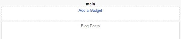
Sectionid is main in the above screenshot

sidebar section id

Sectionid is sidebar in the above screenshot

This method works for both Windows users and MAC users and is same for Safari/Opera/Firefox/Chrome browsers.

Finding Section and Widget ID - Method 2

This method could however work only for windows users because I am not user if Mac Safari browser does show URL for popup windows.

This time click the Edit link next to your widget, a popup window will open. Maximize it to see the Full URL in the address bar of the popup IFRAME.

popup url info


From the URL above you can see that the widgetid is HTML3 and sectionid is sidebar

That simple!

Locate Widgets in Blogger Templates

Now when you have learnt how to find the widgetid, its time to locate widgets inside your blogspot template. Suppose we wish to locate the widget with widgetid HTML3

locating widgets in blogger

1. Go to Blogger > Template > Click Edit HTML

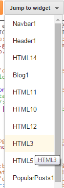
2. Click the drop down menu "Jump to widget"

3. The drop down menu contains a list widget IDs. In our case it is HTML3. Click it!

List of Widget IDs

4. You will be taken to the location where the HTML DOM for your widget exists enclosed inside <b:widget> tags.

Widget Code

You can expand this code and edit the Widget Contents like its Headline, style content hidden inside <data:content/> tag or do amazing things with it like hiding the Widget from rendering inside Mobile devices or hiding widget on a particular page or post.  

Need Help?

Let me know if you need further clarification on any method. I would love to make it more simple for you. Stay tuned and subscribe to our email news letter for more amazing stuff. Peace and blessings buddies! =d

Using OR, AND, NOT Logic Operators in Blogspot Template Layouts

blogspot template operatorsAre we are going to discuss electronics or logic gates here? Of course not! :) Blogger Team has recently made some performance based changes to their XHTML Widget tags for layouts. They have introduced some logic operators to simplify long conditional expression using short and simple syntax thanks to Blogger Logical Operators. I have been testing Blogger templates since 7 years and the best thing I loved about it is the simplicity to retrieve data from the server. Although users are restricted from accessing the server side and database records but they have been given a great deal of access to call objects on Front end using Layout tags.  Lets get straight to the fun ride!
For The Record: This is the first unofficial detailed tutorial of its kind across the web on Blogspot layout tags

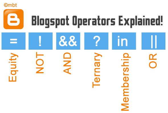
List of Operators Supported by Blogger Templates

At present blogspot templates support all major operators used in basic programming which are:

Operator Syntax Definition
OR or and || OR or UNION is used to combine several conditions, any of which if true would render the HTML content. You can declare it either as or or ||.
Prevents repeating b:if tags
AND and and && And or INTERSECTION is used to combine two or more than two conditions. All conditionals must be true. You can use either and or the ampersand symbols &&.
Prevents repeating
b:if tags
NOT ! and not NOT or EXCLUSION is used when you want to exclude something from the condition. Use either not or !
Best used with Membership operator
Equivalence == and != Equity is used to to check what a data value is. Here '==' means equal to and '!=' means not equal to
Ternary Selector [condition] ? [result when true] : [result when false] Used to select one of two options, based on a condition.
Membership in and contains Used to check whether a value is one of several possible values. You can define the set using either square brackets [ ] or Curly braces { }.
Prevents repeating OR

Example Usage of These Operators

Below I will give brief examples of how smartly these operators simplify an expression and prevents repeating a condition.

OR Example

Suppose you wish to show a HTML code only inside index pages (search pages, homepage) and item pages (Posts) but not on Static pages or archive pages. This is how you will write down the conditional expressions using widget layout tags.

Previously without 'or' the expression was written as such:

<b:if cond='data:blog.pageType == "index"'>

<b:if cond='data:blog.pageType == "item"'>

HTML Code To render

</b:if>

</b:if>

Now with 'or' operator the expression is simplified as such:

<b:if cond='data:blog.pageType == "index" or data:blog.pageType == "item"'>

HTML Code To render

</b:if>

or you can use || instead of or:

<b:if cond='data:blog.pageType == "index" || data:blog.pageType == "item"'>

HTML Code To render

</b:if>

AND and Equivalence Example

Suppose you wish to show a HTML code only on Search pages but not on homepage. Here we are selecting label pages only out of index pages.

Previously without 'and' the expression was written as such:

<b:if cond='data:blog.pageType == "index"'>

<b:if cond='data:blog.url != data:blog.homepageUrl'>

HTML Code To render

</b:if>

</b:if>

Now with 'and' operator the expression is simplified as such:

<b:if cond='data:blog.pageType == "index" and data:blog.url != data:blog.homepageUrl'>

HTML Code To render

</b:if>

or you can use && like this

<b:if cond='data:blog.pageType == "index" && data:blog.url != data:blog.homepageUrl'>

HTML Code To render

</b:if>


You might be thinking what is the different between ! and != then lets try the next example to clear this confusion.

NOT and Membership Example

Unlike != which is only used when comparing/equating two tags, not (!) is used to negate an entire expression. not is mostly commonly used with Membership operator as shown below.

Lets suppose we wish to show a HTML code on all pages except the Posts and Static Pages. We will format our expression as shown below.

Previously without membership operator (contains or in) and NOT operator the expression was written as such:

<b:if cond='data:blog.pageType != "item"'>

<b:if cond='data:blog.pageType != "static_page"'>

HTML Code To render

</b:if>

</bi:f>

Now with NOT and membership operator the expression is simplified as such:

<b:if cond='data:blog.pageType not in {"item","static_page"}'>

HTML Code To render

</b:if>

you can also write it like this by placing not before the expression. Note that you can use either [] or {}, same meaning for membership operators.

<b:if cond='not data:blog.pageType in ["item","static_page"]'>

HTML Code To render

</b:if>

Or like this using contains:

<b:if cond='not ["item","static_page"] contains data:blog.pageType'>

HTML Code To render

</b:if>

Combined Use of OR and AND

You can surely make your expression even more in-depth by using OR and AND operator together in a single expression.

In the example below, the HTML code will render only when the page visited by user is either the archive page or Search/Label Page.


<b:if cond='data:blog.pageType == "archive" or (data:blog.pageType == "index" and data:blog.url != data:blog.homepageUrl)'>

HTML Code to render

</b:if>

You can group multiple conditions inside the round braces and then compare them as against others. As simple as that!

Ternary Selector Example

Ternary selector is most useful when you need to apply one class out of two classes to any HTML DOM.

In the example below we will use a ternary operator in a div tag to apply a class comments-open when comments are allowed and apply the class comments-closed when the page no more accepts comments

<div expr:class=’data:post.allowComments ? "comments-open" : "comments-closed"'>

HTML Code To render
</div>

This is an excellent way to show your readers a special message when you are no more accepting comments for certain posts.

Need Help?

In our coming tutorials we will make extensive use of these new operators to make sure you are served the most optimized blogger widgets and scripts. We have already started applying these new expressions in posts published last week. Do check how we used Ternary operators along with combined AND, OR and Equivalence operators in this post.

Let us know me know if you need any help or assistance in understanding any syntax. Peace and blessings buddies! :>

8 Creative Ways To Show Email Subscription Form in Blogger


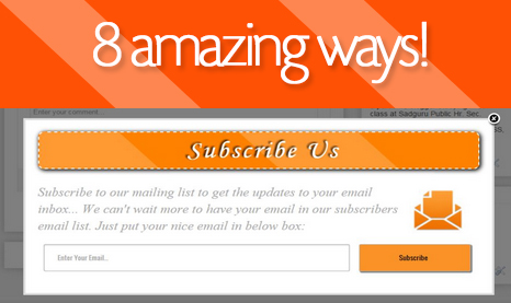
8 Ways to create a Subscribe form


Do you know what a Email subscribe box or Subscription Form is? A box which brings high traffic to your blog. People just put their email address in an ordinary box and then click on the "Subscribe" button and then, they would get all your blog's new material right on their email's Inbox and if you have feedburner's summary feature enabled, they will come to your blog by reading an interesting heading on the reached email.


So today, I am going to tell you 8 ways to show a subscribe box on a blogger blog. These different eight ways will force your blog's visitor to put their email on that ordinary box. Let's see what are the 8 ways!:


8 ways to show a subscribe box:


  1. Subscribe box from a hyperlinked text.

  2. Subscribe box from a hyperlinked and floating image.

  3. Subscribe box on a pop-up box after few second a visitor reach at the page.

  4. Subscribe box when a visitors goes to exit from a page (Lightbox Popup).

  5. Subscribe box on sidebar as a widget.

  6. Subscribe box below every post.

  7. Subscribe box on a floating hidden frame.

  8. Subscribe box when a visitor reach at the end of the page.


Let?s describe these 8 ways and also, how to add them in your blogger blog one by one!


#1. Subscribe box from a hyperlinked text


Its like hyperlinking a text but instead of a url, we'll put a subscribe box's link on it that will show a nice subscribe box when clicked. When your blog's visitors will click the hyperlinked text, a small beautiful and light weight subscribe box will appear with a subscription teaser and of course! with a subscribe box and a subscribe button. You can use this on your blog's header and hyperlink a text like 'Subscribe Us' so that, when a blog's visitor click the 'Subscribe Us' text, a small box will appear and ask the email of the visitor.


DEMO: See live demo here.


When a Visitor Clicks a Text


Let?s know, how to add it on your blogger blog:


  • Go to Blogger Dashboard > Template > Edit HTML


Now, you have to add some CSS (Cascade Styling Script) to make the subscribe box beautiful.


  • Search for ']]></b:skin>' on your template.

  • Paste the following CSS above ']]></b:skin>':


.newsletter-sm {

background:#fff;

width: 100%;height: 253px;

margin: 0;

padding: 20px;

}

.newsletter-sm form {

padding: 10px;

margin-top: -37px;

}

.newsletter-sm h3 {

color: #FFF;

font-family: algerian;

font-size: 24px;

font-weight: normal;

text-align: center;

padding: 10px;

text-shadow: 2px 2px 2px #000;

margin-top: -18px;

box-shadow: 0px 0px 5px 2px #000;

margin-right: -20px;

position: static;

margin-left: -20px;

margin-bottom: 10px;

background: #009EFF;

}

.text {

  font-size: 14px;

  color: #FFF;

  margin-left: -20px;

  padding-bottom: 28px;

  margin-right: -20px;

  background: #009EFF;

  font-family: cursive;

  line-height: 20px;

}

.newsletter-sm .fa {

  float: left;

  padding-left: 16px;

  padding-right: 16px;

  padding-bottom: 16px;

  padding-top: 7px;

  font-size: 140px;

}

.newsletter-sm .newsletter-input-sm {border: 0;

  padding: 5px 10px;

  width: 69%;

  float: left;

  height: 40px;

  font-family: oswald;

  color: #555;border-radius: 3px; -webkit-border-radius: 3px; -moz-border-radius: 3px;}

.newsletter-sm .newsletter-sm-bot{  background: #009EFF url(https://blogger.googleusercontent.com/img/b/R29vZ2xl/AVvXsEgBFV89FGOAyrKuk8RH-URNQ7F7O41AJXaFG-CKuaow5a6FjjBnQtcsBzvJa1Zu05ivCCLiC0EdY_MALKEHIqST5vUrL1Ax_srZJYzWttnyGU_Sd_AePVVsXBG6qUrG_exA71X5Hr-JQqE/s1600/bg.png) no-repeat;

  margin: 27px -30px 0px;

  height: 64px;

  padding-left: 16px;

  padding-top: 16px;

}

.newsletter-sm .newsletter-button-sm {

  float: right;

  height: 50px;width:23%

  display: inline-block;

  text-shadow: 2px 2px 1px #000;

  font-size: 16px;

  font-family: oswald;

  padding: 10px 22px;

  position: relative;

  color: #fff;

  text-align: center;

  margin-right: 16px;

  background: #009EFF;

  border: 1px solid #fff;

  cursor: pointer;

  border-radius: 3px;

-webkit-border-radius: 3px;

-moz-border-radius: 3px;

}

.modalDialog {

position: fixed;

font-family: Arial, Helvetica, sans-serif;

top: 0;

right: 0;

bottom: 0;

left: 0;

background: rgba(0,0,0,0.6);

z-index: 99999;

opacity:0;

-webkit-transition: opacity 200ms ease-in;

-moz-transition: opacity 200ms ease-in;

transition: opacity 200ms ease-in;

pointer-events: none;

}

.modalDialog:target {

opacity:1;

pointer-events: auto;

}

.modalDialog:target > div {

margin: 8% auto;

}

.modalDialog > div {

-webkit-transition: all 100ms ease-in;

-moz-transition: all 100ms ease-in;

transition: all 100ms ease-in;

width: 500px;

position: relative;

margin: 5% auto;

background: #fff;

min-height: 200px;

}

h2.signup {

background:#00aa9f;

border-bottom: 1px solid #008d84;

font-weight: normal;

text-align:center;

padding: 10px;

color:#fff;

font-size: 18px;

}

.close {

color: #888!important;

position: absolute;

top: 1px;

right: -40px;

width: 30px;

height: 30px;

line-height: 30px;

text-align: center;

font-size: 16px;

}

.close:hover { text-decoration:none; }

.close:hover { color:#555; }

Now, this is the time to add the main html that is required for this subscribe box.


  • Search for '</body>' and above it, paste following code:


<div class="modalDialog" id="signup">

<div>

<a class="close" href="#close" title="Close"><i class="fa fa-times"></i></a>

<div class="signup-container">

<div class="newsletter-sm">

<h3>Subscribe to Newsletter</h3>

<div class="text"><i class="fa fa-envelope"></i><br><div class="texts">Subscribe us to get all our juicy article fastly. You know how and where? Directly on your inbox! Just enter your nice and good looking email id below and click on subscribe button! After that, verify it through the verification email and start learning more!</div></div>

<form action="http://feedburner.google.com/fb/a/mailverify" method="post" onsubmit="window.open('http://feedburner.google.com/fb/a/mailverify?uri=tntbystc', 'popupwindow', 'scrollbars=yes,width=550,height=520');return true" target="popupwindow">

<div class="newsletter-sm-bot">

<input class="newsletter-input-sm" name="email" placeholder="Enter Your Email" type="text">

<button class="newsletter-button-sm" type="submit">Subscribe</button>

</div>

<input name="uri" type="hidden" value="tntbystc">

</form>

</div>

</div>

</div>

</div>


  • Now, save your template.


Customization:


  • Replace tntbystc with your feedburner username.

  • You can replace text by editing the highlighted code.


How to hyperlink a text to show the subscribe box?


Now, almost everything is done. Whenever you wish to hyperlink a text, so that, the text will show a subscribe box when clicked, you have to use following piece of code:


<a href='#sign-up'>YOUR TEXT HERE</a>

Do you know? You can use this to hyperlink on an image too! Just use below piece of code:


<a href='#signup'><img src='IMAGE URL GOES HERE' alt='IMAGE DESCRIPTION' title='IMAGE DESCRIPTION'/></a>

Done! You can check it by going on your blog and clicking the text or image for which you have used the above code.


Note: This hyperlink can be added multiple times on texts on same page.


#2. Subscribe box from a hyperlinked and floating image


Instead of hyperlinking a text, why not we hyperlink a floating image? This will attract your visitor's eyes too! This time, an floating image will appear at the left-bottom or right-bottom or left-top or right-top of the page. When a visitor click on that image, a nice subscribe box will appear teasing them to put their email in the box!


DEMO: See Live Demo


Subscribe Box When Image Clicked


Let?s know how to add it on your blogger blog:


  • Same, Go to Blogger Dashboard > Template > Edit HTML

  • To make this subscribe box good looking, you have to add some CSS codes. Search for "]]></b:skin>"

  • Paste the following code above "]]></b:skin>"


#subscribe-button {

    float: left;

    position: fixed;

    bottom: 5%;

    left: 0;

    z-index: 999;

}


#subscribe-widget {

    display: none;

}

    /* Overlay */

#mbt-overlay {

    background-color: #000;

}

    /* Container */

#mbt-container {

    height: 350px!important;

    width: 63%!important;

    min-height: 350px;

    min-width: 500px;

    color: #222;

    background-color: #fff;

    border: 4px solid #ddd;

}


#mbt-container .mbt-data {

    padding: 8px;

}


#mbt-container a.mbtCloseImg {

    background: url(https://blogger.googleusercontent.com/img/b/R29vZ2xl/AVvXsEidSjsGj515PuOUplZ5mF3xunkfwW3Py_j24h0YG8_b6g9FBaycD5BbMoe2LpqCmnMbXo0aPN9VZZU5172cEDWU_2BN3uOPinhTSd5OgndHhdsP0MfmPDC0EDcYp9ooTyUR68q3di0XIRE3/s1600/mbt-close-button.png) no-repeat;

    width: 25px;

    height: 29px;

    display: inline;

    z-index: 3200;

    position: absolute;

    top: -15px;

    right: -16px;

    cursor: pointer;

}

.subscribeheader {

  padding: 5px;

  padding-left: 21px;

  text-shadow: -3px -2px 5px #000;

  box-shadow: 2px 2px 11px 1px #000000;

  background: #FF8100;

  color: rgba(255, 255, 255, 1);

  padding-top: 11px;

  border-radius: 11px;

  text-rendering: optimizeSpeed;

  background-image: -webkit-linear-gradient(45deg, rgba(255, 255, 255, .2) 25%, transparent 25%, transparent 50%, rgba(255, 255, 255, .2) 50%, rgba(255, 255, 255, .2) 75%, transparent 75%, transparent);

  margin-bottom: 30px;

  letter-spacing: 4px;

  text-align: center;

  font-family: monotype corsiva;

  border: 2px dashed #FFF;

  font-size: 50px;

}

#description {

  color: #AAAAAA;

  font-family: times New Roman;

  font-size: 25px;

  font-style: italic;

  float:left;

  line-height: 34px;

}


#description img {

    float: right;

    height: 100px;

    padding: 0 25px 0 10px;

    width: 100px;

}


#mbtfollowForm {

    padding: 15px;

}


#mbtfollowForm p {

    margin: 0 0 10px;

}

input[type="submit"] {

  background: #FA9227;

  box-shadow: 2px 2px 1px 1px #838383!important;

  width: 25%!important;

  padding-left: 0px!important;

  margin-left: 17px;

}

#mbtfollowForm input:not([type=&quot;checkbox&quot;]) {

  width: 67%;

    margin-top: 20px;

    margin-bottom: 20px;

    font-family:oswald;

    height:33px;

    float:left;

    padding: 10px 5px 10px 25px;

    border: 1px solid rgb(178, 178, 178);

    -webkit-appearance: textfield;

    -webkit-box-sizing: content-box;

    -moz-box-sizing: content-box;

    box-sizing: content-box;

    -webkit-border-radius: 3px;

    -moz-border-radius: 3px;

    border-radius: 3px;

    -webkit-box-shadow: 0px 1px 4px 0px rgba(168, 168, 168, 0.6) inset;

    -moz-box-shadow: 0px 1px 4px 0px rgba(168, 168, 168, 0.6) inset;

    box-shadow: 0px 1px 4px 0px rgba(168, 168, 168, 0.6) inset;

    -webkit-transition: all 0.2s linear;

    -moz-transition: all 0.2s linear;

    -o-transition: all 0.2s linear;

    transition: all 0.2s linear;

}


#mbtfollowForm input:not([type=&quot;checkbox&quot;]):active, #mbtfollowForm input:not([type=&quot;checkbox&quot;]):focus {

    border: 1px solid rgba(91, 90, 90, 0.7);

    background: rgba(238, 236, 240, 0.2);

    -webkit-box-shadow: 0px 1px 4px 0px rgba(168, 168, 168, 0.9) inset;

    -moz-box-shadow: 0px 1px 4px 0px rgba(168, 168, 168, 0.9) inset;

    box-shadow: 0px 1px 4px 0px rgba(168, 168, 168, 0.9) inset;

}

    <!--[if lt IE 7]> #mbt-container a.mbtCloseImg {

    background: none;

    right: -14px;

    width: 22px;

    height: 26px;

    filter: progid:DXImageTransform.Microsoft.AlphaImageLoader(src='https://blogger.googleusercontent.com/img/b/R29vZ2xl/AVvXsEidSjsGj515PuOUplZ5mF3xunkfwW3Py_j24h0YG8_b6g9FBaycD5BbMoe2LpqCmnMbXo0aPN9VZZU5172cEDWU_2BN3uOPinhTSd5OgndHhdsP0MfmPDC0EDcYp9ooTyUR68q3di0XIRE3/s1600/hb-close-button.png', sizingMethod='scale');

}


#mbtfollowForm input {

    padding: 10px 5px 10px 32px;

    width: 93%;

}


#mbtfollowForm input[type=checkbox] {

    width: 10px;

    padding: 0;

}

    <![endif]-->


  • Now, to make the floating image appear, search for ?</body>?

  • Paste the following chunk of code above ?</body>?


<div id="subscribe-button">

    <a class="subscribe" href="#"><img src="https://blogger.googleusercontent.com/img/b/R29vZ2xl/AVvXsEgLAuhVJICWxZvRJV5o8T3AYhJgT0LPmjRFyFq8FLz4E6qinS3S8BBLWVdpcPvENCw7-j112H9VdmjsLoXBSjrA8N2TICDCgdCg6COHTHbeBtBE7WwOH8FbSxqrbrkdvWeibE_vD4Lxki-H/s1600/hb-email-icon.png" alt="subscribe" /></a>

</div>

<div id="subscribe-widget">

    <div id="mbtfollowForm">

<div class="subscribeheader">Subscribe Us</div>

<div id="description">

<img alt="email" border="0" src="https://blogger.googleusercontent.com/img/b/R29vZ2xl/AVvXsEhYWsW4nIjZe5JRFDFtaAiRCwGyOBVV8GpP-FDAE_AG_NOZFuZ9hdqKIiLgUNd4thux7xIYrlHJtj69myzDQuO8WtiALh3jaS76IWSlwr8k7Lucs4OQ2Z98krpgitYL8lZb7MQKN6n1JW3h/s1600/hb-email-icon1.PNG">Subscribe to our mailing list to get the updates to your email inbox... We can't wait more to have your email in our subscribers email list. Just put your nice email in below box:</div>

        <form

        action="http://feedburner.google.com/fb/a/mailverify" method="post" onsubmit="window.open('http://feedburner.google.com/fb/a/mailverify?uri=tntbystc', 'popupwindow', 'scrollbars=yes,width=550,height=520');return true"

        target="popupwindow">

            <input name="email" placeholder="Enter Your Email..." required="required"

            type="text" />

            <input name="uri" type="hidden" value="tntbystc" />

            <input name="loc" type="hidden" value="en_US" />

            <div class="button">

                <input type="submit" value="Subscribe" />

            </div>

            </form>

    </div>

</div>

<script src="https://googledrive.com/host/0B8acxOz46qBZckxsanR6Rm1KTms" type="text/javascript"></script>

<script type="text/javascript">

    jQuery(function (a) {

        a("#subscribe-button .subscribe").click(function (b) {

            a("#subscribe-widget").modal();

            return false

        })

    })

</script>


  • Save your template and you?re done!


Customization:


Yeah! Customization on the above code as following:


  • If you want that image to be displayed in left, then change right to left in above code.

  • If you want that image to be displayed in the top of the page, then change bottom with top.

  • If you want to change the text or subscription teaser, then just replace the highlighted code.


Important Customization:


  • Change tntbystc with your feedburner username in above code.


#3. Subscribe box on a pop-up box after few second a visitor reach at the page


Nowadays, this one of the most common way to show a subscription box in a blogger blog. Many third party tools are providing this widget for free. One of the best tool that provide the pop up email subscription tool is GetSiteControl. Let's know how to add it:


  • Go to GetSiteControl sign up page

  • Sign up by filling the fields (email, passwords and website) and click on red 'Sign up for free' button.

  • On next page, click on that green 'Create Widget' button and choose 'Subscribe' from the dropdown.


Click on Create Widget


  • Choose and modify your settings while creating the Subscribe Widget and at last, click on 'OK' button.


Creating 'Subscribe Box'


  • On the next page, click on 'Activate Now' button, So that, it will activate the subscribe widget.

  • Now, are you able to see a red colored bar? (as shown in below picture).


Click on black install button


  • Click on that black ?Install? button.

  • On the next page, four or five line JavaScript would be given. Copy that and place in on your blog's template before '</body>'


Copy the code and place it above </body>


  • Now, just look at the top bar. Their, click on 'Site Settings':


Site Settings


  • After clicking on 'Site Setting', you will see a Mail Chimp option on the screen. On the given box, put your Mail Chimp's API key, click on Connect button.

  • You are done!


#4. Subscribe box when a visitors goes to exit from a page


Yes! If visitor has enjoyed your articles, he/she will surely subscribe to your blog if he get a nice subscribe box in front of him. So, its a good idea to show a subscribe box when your blog's visitor goes to exit from a page. This can be done by following all steps of way #2. The only thing you have to do different is-


  • After modifying your settings, go to 'Behavior' tab from the widget creator.

  • Choose & tick ?when the user is leaving the website?


Click on when the user is leaving the website


  • Click on OK button and you're done!


#5. Subscribe box on sidebar as a widget


Yeah! this is also a most common way to show a subscribe box in blogger. Not only common, but the easiest way to add a nice subscribe box on blogger blogs. MBT has published many subscription boxes that can be installed on your blogger blog. Here's a list of some:


#6. Subscribe box below every post


This is also a good way to get some more subscribers. This way increases your chances to get some new subscribers. Your visitors will surely subscribe to your blog if they found an enjoyable post and a subscription box below post, together. Here are some articles that were published by MBT before some time by which you can add a subscription box below every post on your blogger blog:


#7. Subscribe box on a floating hidden frame


Did you ever seen floating Facebook like box near scroll bar?. Yeah! why not. floating Facebook like box is today one of the most famous & lovable widget of bloggers. Today, we are going to tell you a widget which works same as that Facebook like box but the difference is, this time, it is floating subscribe box.


DEMO: See live demo here.


Floating Subscribe Box


DEMO: Live Demo


Let?s know how to add it:


  • Go to Blogger Dashboard > Layout > Add a Gadget > HTML/JavaScript

  • Now, leave the title box empty and move on content field.

  • Paste below code on content field:


<script type="text/javascript"> /*<![CDATA[*/ jQuery(document).ready(function() {jQuery(".mbt").hover(function() {jQuery(this).stop().animate({right: "0"}, "medium");}, function() {jQuery(this).stop().animate({right: "-250"}, "medium");}, 500);}); /*]]>*/ </script> <style type="text/css"> .mbt{background: url("http://s12.postimg.org/gjpszngzx/Untitled_1_copy.png)" no-repeat scroll left center transparent !important; float: right;height: 270px;padding: 0 5px 0 46px;width: 245px;z-index: 99999;position:fixed;right:-250px;top:20%;} .mbt span{bottom: 4px;font: 8px "lucida grande",tahoma,verdana,arial,sans-serif;position: absolute;right: 6px;text-align: right;z-index: 99999;} .mbt span a{color: gray;text-decoration:none;} .mbt span a:hover{text-decoration:underline;} } </style>

<div class="mbt">

<div class="mbt-floating">

<div class="subscribe-mbt">Subscribe Us&gt;</div><br /><i class="fa fa-envelope"></i><br /><form action="http://feedburner.google.com/fb/a/mailverify" method="post" onsubmit="window.open('http://feedburner.google.com/fb/a/mailverify?uri=tntbystc', 'popupwindow', 'scrollbars=yes,width=550,height=520');return true" target="popupwindow">

<div class="newsletter-sm-bot">

<input class="newsletter-input-sm" name="email" placeholder="Enter Your Email" type="text" />

<button class="newsletter-button-sm" type="submit">Subscribe</button>

</div>

<input name="uri" type="hidden" value="tntbystc" />

</form></div></div>

<style>.mbt-floating {

  background: #F2F2F2;

  height: 285px;

  padding: 7px;

  border: #444444 2px solid;

}

.subscribe-mbt {

  background: #444444!important;

  padding: 8px!important;

  text-shadow: -1px 0px 2px #000000;

  color: #FFFFFF;

  box-shadow: 0px 0px 7px -2px #000;

  border: 2px dashed;

  font-size: 20px;

  font-family: algerian;

}

.mbt-floating .fa {

  font-size: 115px;

  padding-left: 54px;

  padding-bottom: 17px;

  margin-top: -18px;

}form {

  padding: 10px;

  margin-top: -16px;

}

input.newsletter-input-sm {

  padding: 17px;

  padding-top: 15px;

  padding-bottom: 15px;

  box-shadow: 0px 3px 4px 0px #000;

  padding-left: 10px;

  width: 84%;

  margin-bottom: 15px;

  border: 0;

}

button.newsletter-button-sm {

  background: #444444;

  color: #FFF;

  border: 0;

  padding: 15px;

  font-size: 14px;

  text-shadow: 2px 2px 2px #000;

  border-bottom: 2px solid #000;

  border-radius: 6px;

  width: 100%;

  box-shadow: 0px 3px 2px 1px #000;

}

</style>

Customization:- Replace 'tntbystc' with your Feedburner username.


#8. Subscribe box when a visitor reach at the end of the post


This way of showing a subscribe box on blogger blog when a visitor reach at the end of the page can also help you in collecting some good subscribers. You can add this to your blogger blog by simply doing one step after doing all steps from way #3. Look at way #3's image and you will see an option-  'when the user reach at the bottom of the page? (option three); tick that option and click on OK button and done! When your visitor reach at the bottom of the page, a nice subscribe box will show up on your blogger blog.


Guest Author:


Shivansh Verma Skv is a 13 years old young blogger and a ninja member of "Blogger Help Forum". He loves to write about technology and web development. He has his own blog- Blogger Guiders  You can connect with him on Google+ and Facebook . Thanks!


Popular Posts With Automatic Numbering - Bubbles!

Popular Posts Widget

When blogger released Popular Posts widget back in 2011, we leaked out its stylesheet so that you can customize it to blend it perfectly to your BlogSpot templates. Today we will learn how to display the list of popular posts using CSS3 auto increment property. You can style the numbers in variety of shapes, we styled them in square/rectangular and circular shape. you guys were the first to display threaded comments with Comment Counts and today you will again learn something more interesting. You can see a practical demo of this implementation on our sidebar. Lets add this effect to blogger in fairly easy steps using pure styles with no use of JavaScript.

Popular posts widget is an effective tool to increase your blog pageviews and engage readers more on your blog. It fetches and ranks posts based on most visited pages using your Google analytics data.

Add Popular Posts Widget

  1. Go to Blogger > Layout
  2. Click "Add a Gadget"
  3. Choose "Popular Posts"  from the list
  4. You will need to configure its settings as shown in the image below: uncheck "image thumbnail" and also "snippet"   Its better that you display at most 7-9 posts. Less is good and clean.


popular posts widget settings

       5.  Save it


Customize Popular Posts Plugin

Now you need to change the default styles and change its look to our desired design using Custom styles.

  1. Go To Blogger > Template
  2. Backup your Template
  3. Click Edit HTML
  4. Search for </b:skin>.  Click the black arrow to expand the code.

compressed blogger stylesheet

   5.  Paste the following Styles just above </b:skin>

/*--- MBT Popular Posts --- */
.popular-posts ul {
padding-left: 0px;
counter-reset: popcount;
}

.popular-posts ul li:before {
list-style-type: none;
margin-right: 15px;
padding: 0.3em 0.6em;
counter-increment: popcount;
content: counter(popcount);
font-size: 16px;
background: #292D30;
color: #ffffff;
position: relative;
font-weight: bold;
font-family: georgia;
float: left;
border: 2px solid #dddddd;
box-shadow: 1px 2px 9px #666666; }

.popular-posts ul li {
border-bottom: 1px dashed #dddddd;
}

.popular-posts ul li:hover {
border-bottom: 1px dashed #696969;
}

.popular-posts ul li a {
text-decoration:none; color:#5A5F63;
}


.popular-posts ul li a:hover {
text-decoration:none;
}

Customization:

  • To change the background color of the Square bubble edit #292D30
  • To change the text color of the bubble edit #ffffff
  • By default the shape of the bubble is Square. To change it to Circle simply add the following code just after box-shadow: 1px 2px 9px #666666;

border-radius:15px;


    6. Save your template and you are all done!

Visit your blog to see it working just perfectly.

If you would wish to add it inside a Multi Tab Widget just like we have done on our blog, then you can find several tutorials on our blog that were released years ago on Multi Tabs. Please read one below:


Need Help?

I just hope you would find this tutorial easy and yet exciting. Please let me know if you need any help. I just hope you continue adding more colors and flavors to your beautiful blogs. Wish you success and peace buddies. :)

Create a Custom Contact Form For Blogger - Part 2

Custom Blogger Contact FormIn the first part of our series you learnt how to add a contact Form to your BlogSpot blog and control its display settings. Today you will learn how to change its stylesheet to reflect your custom styles with a more appealing design. You will learn today how to customize the Form input fields, add icons to it, add a "Clear Button"  and play several tricks with your custom form. The form is built using XHTML Get or Post Methods unlike PHP Forms which are used widely today. If you have not referenced the first part of our tutorial then kindly read it first:

3. Customizing The Contact Form - The Fun Part!

Now you will need to create a Static Page where we will add the HTML code for our new contact form.

  1. Go To blogger > Pages
  2. Choose a Blank Page
  3. Give it any title you like. I recommend "Contact Us"
  4. Switch to its HTML mode and paste the following HTML code inside it:

<div class='form'>
<!-- Custom Contact Form By MBT Starts -->

<form name='contact-form'>

<!-- Name Field -->

<input class='contact-form-name' id='ContactForm1_contact-form-name' name='name' value="Name" size='30' type='text' onblur='if (this.value == &quot;&quot;) {this.value = &quot;Name&quot;;}' onfocus='if (this.value == &quot;Name&quot;) {this.value = &quot;&quot;;}' />
<p></p>

<!-- Email ID Field -->

<input class='contact-form-email' id='ContactForm1_contact-form-email' name='email' value="Email ID"  size='30' type='text' onblur='if (this.value == &quot;&quot;) {this.value = &quot;Email ID&quot;;}' onfocus='if (this.value == &quot;Email ID&quot;) {this.value = &quot;&quot;;}'/>
<p></p>

<!-- Message Field -->

<textarea class='contact-form-email-message'  id='ContactForm1_contact-form-email-message' name='email-message'  value='Leave Your Message..'  onblur='if (this.value == &quot;&quot;) {this.value = &quot;Leave Your Message..&quot;;}' onfocus='if (this.value == &quot;Leave Your Message..&quot;) {this.value = &quot;&quot;;}'></textarea>
<p></p>

<!-- Clear Button -->
<input class='contact-form-button contact-form-button-submit MBT-button-color' type='reset' value='Clear'/> 

<!-- Send Button --> 
<input class='contact-form-button contact-form-button-submit MBT-button-color' id='ContactForm1_contact-form-submit' type='button' value='Send'/>
<p></p>

<!-- Validation -->
<div style='text-align: center; max-width: 222px; width: 100%'>
<p class='contact-form-error-message' id='ContactForm1_contact-form-error-message'></p>
<p class='contact-form-success-message' id='ContactForm1_contact-form-success-message'></p>
</div>
</form>

<!-- Custom Contact Form By MBT Ends -->
</div>


    5.  Don't switch to Compose Mode of your Blogger Editor else the code will get messed up due to your Editor settings. Save and Publish your Page.

   Now if you visit your contact page you will see the default contact form with blue button. Its time to customize its default styles.

Customizing The Form:
  1. Go To Blogger > Template
  2. Backup your Template
  3. Click "Edit HTML"
  4. Update: Search for </head>  and just above it paste the following CSS code:


<style>

/*---- Compatible contact Form by MBT -----*/

.contact-form-name, .contact-form-email, .contact-form-email-message {
max-width: 220px;
width: 100%;
font-weight:bold;
}

     
.contact-form-name {
background: #FFF url(https://blogger.googleusercontent.com/img/b/R29vZ2xl/AVvXsEj_Z3rAMIzvKg3rLF1-lwQvFoQ1_oU3Fgd4c0CqwMdQCV5NBAZAi9yOfoLgceKzjjCf_OISCf37kZaLHYjuaKY_of4TlCm2UCIAZvF5Pgeweti4bBV4YfypA_6G8oDWnN7_NrD1xk6_GwA/s320/name.png) no-repeat 7px 8px;
background-color: #FFF;
border: 1px solid #ddd;
box-sizing: border-box;
color: #A0A0A0;
display: inline-block;
font-family: Arial,sans-serif;
font-size: 12px;
font-weight:bold;
height: 24px;
margin: 0;
margin-top: 5px;
padding: 5px 15px 5px 28px;
vertical-align: top;

}
     

.contact-form-email {
background: #FFF url(https://blogger.googleusercontent.com/img/b/R29vZ2xl/AVvXsEjxu2GMHFJ6FxpRtrtnvANxq9Llix0RhtfCRhvX85HF-0x3xSbarRYZ_Fjk2FeBhbFoZEy6NW0EvFtILI3lPaW8V5u0D6cjGmRl_3e1ZtPaTfoAg_V9BrkMGPrtsZ5tElAsdvFaL7t2FHY/s320/email.png) no-repeat 7px 10px;
background-color: #FFF;
border: 1px solid #ddd;
box-sizing: border-box;
color: #A0A0A0;
display: inline-block;
font-family: Arial,sans-serif;
font-size: 12px;
font-weight:bold;
height: 24px;
margin: 0;
margin-top: 5px;
padding: 5px 15px 5px 28px;
vertical-align: top;

}


.contact-form-email:hover, .contact-form-name:hover{
border: 1px solid #bebebe;
box-shadow: 0 1px 2px rgba(5, 95, 255, .1);


padding: 5px 15px 5px 28px;

}

.contact-form-email-message:hover {
border: 1px solid #bebebe;
box-shadow: 0 1px 2px rgba(5, 95, 255, .1);
padding: 10px;
}

.contact-form-email-message {
background: #FFF;
background-color: #FFF;
border: 1px solid #ddd;
box-sizing: border-box;
color: #A0A0A0;
display: inline-block;
font-family: arial;
font-size: 12px;
margin: 0;
margin-top: 5px;
padding: 10px;
vertical-align: top;
max-width: 350px!important;
height: 150px;
border-radius:4px;
}


.contact-form-button {
cursor:pointer;
height: 32px;
line-height: 28px;
font-weight:bold;
border:none;
}


.contact-form-button {
display: inline-block;
zoom: 1; /* zoom and *display = ie7 hack for display:inline-block */
*display: inline;
vertical-align: baseline;
margin: 0 2px;
outline: none;
cursor: pointer;
text-align: center;
text-decoration: none;
font: 14px/100% Arial, Helvetica, sans-serif;
padding: .5em 2em .55em;
text-shadow: 0 1px 1px rgba(0,0,0,.3);
-webkit-border-radius: .5em;
-moz-border-radius: .5em;
border-radius: .5em;
-webkit-box-shadow: 0 1px 2px rgba(0,0,0,.2);
-moz-box-shadow: 0 1px 2px rgba(0,0,0,.2);
box-shadow: 0 1px 2px rgba(0,0,0,.2);
}
.contact-form-button:hover {
text-decoration: none;
}
.contact-form-button:active {
position: relative;
top: 1px;
}


.MBT-button-color {
color: #fef4e9;
border: solid 1px #da7c0c;
background: #f78d1d;
background: -webkit-gradient(linear, left top, left bottom, from(#faa51a), to(#f47a20));
background: -moz-linear-gradient(top, #faa51a, #f47a20);
filter: progid:DXImageTransform.Microsoft.gradient(startColorstr='#faa51a', endColorstr='#f47a20');
}
.MBT-button-color:hover {
background: #f47c20;
background: -webkit-gradient(linear, left top, left bottom, from(#f88e11), to(#f06015));
background: -moz-linear-gradient(top, #f88e11, #f06015);
filter: progid:DXImageTransform.Microsoft.gradient(startColorstr='#f88e11', endColorstr='#f06015');
border-color: #F47C20!important;
}
.MBT-button-color:active {
color: #fcd3a5;
background: -webkit-gradient(linear, left top, left bottom, from(#f47a20), to(#faa51a));
background: -moz-linear-gradient(top, #f47a20, #faa51a);
filter: progid:DXImageTransform.Microsoft.gradient(startColorstr='#f47a20', endColorstr='#faa51a');
}

</style>


      <!--[if IE 9]>
    <style>
   
.contact-form-name {
background: #FFF url(https://blogger.googleusercontent.com/img/b/R29vZ2xl/AVvXsEj_Z3rAMIzvKg3rLF1-lwQvFoQ1_oU3Fgd4c0CqwMdQCV5NBAZAi9yOfoLgceKzjjCf_OISCf37kZaLHYjuaKY_of4TlCm2UCIAZvF5Pgeweti4bBV4YfypA_6G8oDWnN7_NrD1xk6_GwA/s320/name.png) no-repeat 7px 0px;
}

.contact-form-email {
background: #FFF url(https://blogger.googleusercontent.com/img/b/R29vZ2xl/AVvXsEjxu2GMHFJ6FxpRtrtnvANxq9Llix0RhtfCRhvX85HF-0x3xSbarRYZ_Fjk2FeBhbFoZEy6NW0EvFtILI3lPaW8V5u0D6cjGmRl_3e1ZtPaTfoAg_V9BrkMGPrtsZ5tElAsdvFaL7t2FHY/s320/email.png) no-repeat 7px 6px;
}

    </style>
    <![endif]-->
   
    <style>
@media screen and (-webkit-min-device-pixel-ratio:0) {


.contact-form-name {
background: #FFF url(https://blogger.googleusercontent.com/img/b/R29vZ2xl/AVvXsEj_Z3rAMIzvKg3rLF1-lwQvFoQ1_oU3Fgd4c0CqwMdQCV5NBAZAi9yOfoLgceKzjjCf_OISCf37kZaLHYjuaKY_of4TlCm2UCIAZvF5Pgeweti4bBV4YfypA_6G8oDWnN7_NrD1xk6_GwA/s320/name.png) no-repeat 7px 6px;
padding: 15px 15px 15px 28px;


}

.contact-form-email {
background: #FFF url(https://blogger.googleusercontent.com/img/b/R29vZ2xl/AVvXsEjxu2GMHFJ6FxpRtrtnvANxq9Llix0RhtfCRhvX85HF-0x3xSbarRYZ_Fjk2FeBhbFoZEy6NW0EvFtILI3lPaW8V5u0D6cjGmRl_3e1ZtPaTfoAg_V9BrkMGPrtsZ5tElAsdvFaL7t2FHY/s320/email.png) no-repeat 7px 8px;
padding: 15px 15px 15px 28px;

}


.contact-form-email:hover, .contact-form-name:hover{
padding: 15px 15px 15px 28px;
}


.contact-form-button {
height: 28px;

}

}

</style>

The above Stylesheet will work just fine with all browsers including Internet Explorer. The code has been made compatible to work fine with all major browsers like IE, Mozilla and Webkit browsers.

  • To change button colors edit the class .MBT-button-color
  • To change the button color on mouse hover edit the class .MBT-button-color:hover  and for active mode edit .MBT-button-color:active


     5.  Save your template and you are all done!

4. Add the Form anywhere you like!

Now if you wish to add the form to your sidebar or post  then simply follow these steps:

  • To add the form to sidebar. Copy the HTML code in Step#4   and paste it inside HTML/JavaScript Widget
  • To add the form to Post editor, switch to HTML mode and paste the code in Step#4  inside it

Your Views:

I just hope this tutorial would be helpful for all of you. The steps are extremely simple and the codes are carefully written. You can now create a contact form to let your clients request you for a price quote or add it to let your readers contact you in person. Wish you all the best with your blogging endeavors. I will make sure you enjoy it to your fullest. Peace and blessings buddies :)