STCnetwork's Exclusive Interview by NED Entrepreneurship Society


STCnetwork Exclusive Interview


It is not very often that we get to learn the secrets of success from successful people. Many are very secretive about what they do and how they achieve success. But it has always been our understanding that if you limit knowledge, knowledge will in turn limit you. It is our aim here at STCnetwork to spread our knowledge and to provide guidance to aspiring people looking to make a name for themselves online. To that end, I'd like to share with all our readers some words of wisdom passed on by our Mohammad Mustafa, who was cordially invited by the NED Entrepreneurship Society (NES) to an interview as an alumni where he shared some insights about his professional life and online business secrets, and how he started STCnetwork and reshaped it into what it is today. The interview took place at STCnetwork's head office in karachi.


The interview was partly in English and partly in Urdu. For our readers, we have translated the interview and retold the story in a narrative form. Hope you find it useful and inspiring :)


Q 1: Tell us about your business - how and when did you start?


It’s not easy to identify a particular point in time when it all started. A lot of things in life can be attributed to fate and circumstance. After A-levels, I – like my peers – applied for higher education in the United States. But was unable to secure a visa owing to unfavorable financial circumstances. Studying and working hard all your life to realize your dream of getting a scholarship, and then having that dream snatched away takes its toll on a person’s mind. Heart-broken, I felt reluctant to pursue higher studies. I guess that’s when it all started.


I spent some of my time learning about and making a small personal website for friends. That’s when I realized that all the things I was learning, I can write about it and teach others as well. And thus began the foray into the world of blogging. That crazy hobby turned into a full-time profession.


Q 2: Where did you start, and where does your business stand now?


STCnetwork Official website


I brought a laptop during my second year of Computer and Systems engineering. The earnings I generated blogging, I invested them into resources that would help me along the way. It started from a Pentium 3 in a small room where I used to write articles, and slowly and gradually it started taking the shape of a network. Now, this network has many websites under its umbrella.


Many people think that the major source of income is the advertisements on these websites. That is not the story. The story behind any professional blogger is the services that he provides at the backend. The biggest difference us and most other publishers is that we learn, we practice and then we share. To do a specific task, not everyone has the time or the energy to learn everything about it. It’s just better to find someone who already has the know-how. That’s where we, as professional bloggers, come in. As compared to a freelancer, a professional blogger has a portfolio and more credibility and people trust him more.


We currently have a large client-base, and right now we’re into phase one of our venture whereby we have set up an office and registered our company STCnetwork, which is Pakistan’s first registered company of professional bloggers. We plan to take this nationwide and to develop the first ever SEO academy in Pakistan, and we’re working hard day and night to realize that dream!


Q 3: Did you always plan on becoming an Entrepreneur?


To be honest, I didn’t even know how to pronounce ‘Entrepreneurship’ until a few years ago, which was when I looked it up and realized that this is what I have been doing all along – I’m an Entrepreneur. I guess the freedom of creativity was the one thing that attracted me towards entrepreneurship, and I often associate the term ‘slave mentality’ with having a job, because you are not free to do what you want and you have to do what your supervisor says to you.


Q 4: What was your family’s reaction to you becoming a professional blogger?


One of the biggest dilemma with any serious blogger – or any such professional for that matter – is the lack of support from parents. Blogging is something that has picked up pace in the last few years, and the older generation has a hard time following the concept. It takes at least 6 months for you to set up an identity for yourself, and another 6 months to get the hang of what you’re doing. When I started blogging, initially I had a very low income, and that didn’t serve as much of a motivation for my parents who couldn’t see the point of it all.


But money is never the point. My passion was to learn and to share what I have learnt. Having someone read and comment on my articles was motivation enough for me. That and my mentors helped me stay persistent and focus on my goal. My first mentors were Indians and I will never forget their help.


Q 5: You have always referred to blogging as an art. Why is that?


A blogger is a complete package of everything that exists online. A blogger needs to know the basics of web design and development, a blogger needs to be more pro-active than a journalist, because he needs to stay up to date with the latest in technology, latest in his field, and latest out there on the internet.


Q 6: What does "STC" stands for?


Back in O levels, our English teacher instructed us to write a poem to be featured in the school magazine. The poem I wrote was titled “Death Was What I Met Last Night” and it was about a boy who tries to bribe the Angel of Death to save himself. But the Angel reminds him that everything in life was just temporary, and death is an eventuality everyone has to face. The poem had a rhythmic phrase “Soon To Come”, and I adopted this phrase as a trade mark, serving to keep me grounded and to remind me that no matter how successful you are in life, you must never lose sight of the truth which each and every one of us has to face one day.


Q 7: How do you manage the workload of running multiple websites at once?


Entrepreneurship isn’t a one man job. You need a team, and you need to learn how to delegate your work. We have a team of authors; Nida Zaidi who writes from Karachi, Qasim Zaib from Islamabad, Yusra Adil from Dubai, and our latest addition Rohan from India. These are our ‘Ninjas’ managing our sites while I handle working with our clients. The important thing isn’t just to work hard, but to work smart as well.


STCnetwork Team


Q 8: What other hobbies do you maintain apart from your work?


I love swimming, and I love riding bikes – though I wish I had a horse to ride. The best thing about life is to enjoy your leisure time, which I spend with friends. I love spending quality time with friends, and I think you’re being cruel with your life if you spend 6 days of the week working but don’t take out leisure time for yourself.


I love riding bikes, and I currently have a 125 which is my second bike. My first 125 was stolen from university grounds on my last day at university when I went to get my degree. In that sense, I like to think of my degree as having cost me a bike. Other than that, I have a family car but for leisure time and spending time with friends, a bike is your best friend, although I do not indulge in stunts because that’s not what a responsible family and business man does – gambling with your life and health for no apparent reason.


Q 9: What hurdles did you face in your business initially?


I think the biggest fear every new-comer faces is coping with the challenge of client expectations. The client pays you for a job, and expects you to do it well. The expectation serves to instill fear into new-comers, which is why I adopted a strategy – and I would recommend this to others as well – to work free of charge initially. When there are no charges, there are no expectations and it leaves you free to explore and experiment. That learning you gain from completing projects grooms you and makes you become a professional.


Q 10: If you weren’t an entrepreneur, what would you have been?


I would have looked like a spoilt kid who hangs out often with friends. But one thing I am sure of – I would never have worked at a regular job. I would have been out on the streets selling vegetables or French fries. Most people look down on such vendors and attribute their place in society to their lack of education. But the fact is, education has little to do with how happy and successful you are at your own life. The French fries vendor owns his own bicycle, his own stall, and his own stalls, and he sleeps peacefully at night, knowing that everything he has, he owns it himself.


Compare this to a corporate employee who sits in an air-conditioned room where nothing, not the chair he is sitting on, not the laptop he is working, not the company car he drives, nothing is his own. He may have more money, but I ask you, who is rich at heart? There are countless food businesses around us that began as stalls, and are now earning millions. Success is life has less to do with your education, and more to do with your hard work and good ethics.


STCnetwork Team


Q 11: What would you have done for students if you were the Prime Minister of Pakistan?


God forbid :) If I was ever the Prime Minister, I would revise university curriculum and cut down the theory to only about 30%. Our emphasis should on the practical aspects, and students should be given gadgets and resources to play around and experiment with. University curriculum is heavily padded with unnecessary skills that are of little use in the practical field. What rule book says that what you are taught in your 4th semester, you can’t learn in your 1st?


Nick D'Aloisio was a 15 year old when he developed an app Summly which summarizes long articles into one short paragraph. Yahoo bought his app for $30 Million, and now he is an internet entrepreneur working at Yahoo without having ever attended university. The founder of Whatsapp was turned down by Facebook when he applied for a job there, because he was ‘under-qualified’. Two years later, he sold Whatsapp to Facebook for $19 Billion.


Unless you take control of your learning, develop your skills and do the thing that puts your mind to rest, you will not be happy with your work.


Q 12: Advice for NED students who are pressured into settling?


If you are pressured into settling, if you have developed your mindset, then it is very difficult to change that mindset. So my advice to you would be to not let a single day go to waste. Work on developing a skillset. Skills and education makes you a perfect person – it makes you a scholar. Do something extra to get an edge over other fellow students, take a professional course or complete a project. If you can’t find a job, then don’t worry! Start working with someone free of cost and learn. Learn to develop the skills that are relevant to your field. Don’t pursue an irrelevant degree such as an MBA simply because you’re unable to find employment.


Time is money – don’t squander it away.


Q 13: Any words for NES (NED Entrepreneurship Society)?


NED Entrepreneurship Society


Thanks you NED Entrepreneurship Society for the interview. It is nothing short of an honor for me as an alumnus, and I will always remember this kind gesture of coming out to our office and giving us time. What you guys are doing is brilliant, and only people with great minds do it. God bless you with everything. Thank you!


Have Something To Share?


That was it for the interview. We got to learn a lot about Mohammad and STCnetwork, and how it all started. The story is nothing short of inspirational. From a guy who didn't have very favorable circumstances to someone who has established a reputable profession online, and is now working with a team to bring help and guidance to thousands of other aspiring entrepreneurs online - Mohammad has not only earned the confidence of his large client base, but has also earned respect from us and from thousands of followers of the STCnetwork. This sort of commitment is truly inspirational, and may it serve to motivate others into utilizing their time and efforts to create something productive, something unique.


All the best to the STC Network for its future endeavors, and the best of luck to you, our beloved readers and followers who aspire to make a name for yourselves and contribute positively to the society.

Let us know if this company has helped you the little in reshaping your life in some manner, do share your precious views with us. Would love to hear from you all. Peace, and God bless you all!


Link/text Only Related Posts Widget For Blogger With 6 Different Styles

simple-related-posts-widget-for-blogger-style

"Simple Related Posts Widget For Blogger" is the most frequently searched on search engines because it is a very important gadget for blogger. It helps visitors to reach more posts on your blog and hence it helps you to multiply your traffic. Related posts widget plays a role of internal linker as it link one post with other so it has a great impact on your traffic as well as seo. Because internal linking is a part of off-page seo. As this gadget is so important for blogger therefore some websites are also formed which provides related posts plugin for your blog but if a website's plugin is used then it may slow down your blog which is not good.
People wish to add related posts widget to multiply their traffic but without affecting there blog's speed so most of the bloggers use simple/link/text only related post widget because it doesn't slow down blog and boost traffic.

I also recommend to use simple/link only related posts widget because thumbnails loads so slow and visitors hate slow loading. I have shared many types of related posts widgets for blogger and in this post I am back with simple/link only related posts widget with 6 different styles.

I hope you will like this post. I would like to know how was this post so leave a comment below the post. To add this widget in your blog and start multiplying your traffic follow below steps:

Click Here To Add Simple Related Posts Widget In Blogger Mobile Site!

Step 1: Go to blogger dashboard.

Step 2: Navigate to template and click on edit html.


Step 3: Search for </head>.


Step 4: Copy code of desired related posts widget from below and paste it above </head>.

Style 1:


<b:if cond='data:blog.pageType == &quot;item&quot;'>
<style type='text/css'>
#related-posts {margin: 10px 5px;}
#related-posts h2 {letter-spacing: 1px;font-size: 18px; color: #222;margin-bottom: 15px;position: relative;left: 5px; top: 10px;}
#related-posts a {font-size: 14px; color: #999;text-transform: capitalize;}
#related-posts a:hover {text-decoration: none;color: #555;}
#related-posts ul {list-style-type: none; margin: 0 0 0px 0;padding: 5px;}
#related-posts ul {list-style-type: none;}
#about { float: right; font-size: 12px; }
#related-posts li {padding: 12px;border-bottom: 2px solid #fff;border-left: 5px solid #BCC2B9;background-color: #F4F4F4;}
#related-posts li:hover {background: #F4F4F4;font-weight:bold;background-color: #eee;border-left: 5px solid #188DD7;}
</style>
<script type='text/javascript'>
  var relatedpoststitle=&quot;You Might Also Like Reading:&quot;;
</script>
<script src='https://rawgit.com/101Helper/docs/master/related-post.js' type='text/javascript'/>
</b:if>

Style 2:


related-posts-widget-for-blogger-style-2

<b:if cond='data:blog.pageType == &quot;item&quot;'>
<style type='text/css'>
#related-posts {margin: 13px 5px;background-color: #20DD71;}
#related-posts h2 {color: #FFFFFF;margin-bottom: 13px;left: 7px;top: 10px;font-family: Trebuchet ms;}
#related-posts a {font-size: 14px;color: #999;text-transform: capitalize;}
#related-posts a:hover {text-decoration: none;color: #555;}
#about { float: right; font-size: 12px; }
#related-posts ul {list-style-type: none;margin: 0 0 0px 0;padding: 5px;}
#related-posts li {padding: 12px;border-bottom: 3px solid #eaeaea;background-color: #FFFFFF;}
</style>
<script type='text/javascript'>
  var relatedpoststitle=&quot;Related Posts:&quot;;
</script>
<script src='https://rawgit.com/101Helper/docs/master/related-post.js' type='text/javascript'/>

</b:if>

Style 3:


<b:if cond='data:blog.pageType == &quot;item&quot;'><style type='text/css'>
#about { float: right; font-size: 12px; }
#related-posts {margin: 10px 0px;background-color: #eee;margin-bottom: 40px;}
#related-posts h2 {letter-spacing: 1px;font-size: 18px;color: #222;margin-bottom: 10px;position: relative;left: 10px;top: 10px;}
#related-posts a {position: relative;bottom: 4px;font-size: 15px;color: #999;text-transform: capitalize;}
#related-posts a:hover {text-decoration: none;color: #555;}
#related-posts ul {list-style-image: url('https://blogger.googleusercontent.com/img/b/R29vZ2xl/AVvXsEg-ve35Rnk7MWFeuwKlMpK66sgQ2oYc4c6MbgXS1Hk8lRAucNUXfXigyz4MUMVB_y3dh_a-TS0oSIHl0lbTjdRX2VoBxNn8K_q7WXtvflozrgwbNgfeRpgrmPaoOS4czTY5E5KP1x8Q8tU/s1600/rsz_1rsz_icon256.png');margin: 0 0 0px 0;padding: 5px;position: relative;left: 30px;}
#related-posts li {width: 94%;}
#related-posts li:hover {font-weight:bold;}
</style>
<script type='text/javascript'>
  var relatedpoststitle=&quot;You Might Also Like Reading:&quot;;
</script>
<script src='https://rawgit.com/101Helper/docs/master/related-post.js' type='text/javascript'/>
</b:if>

Style 4:


related-posts-widget-for-blogger-style-4

<b:if cond='data:blog.pageType == &quot;item&quot;'>
<style type='text/css'>
#about { float: right; font-size: 12px; }
#related-posts { margin: 10px 0px; background-color: #eee; position: relative; margin-bottom: 40px; }
#related-posts h2 { letter-spacing: 1px; font-size: 18px; color: #222; margin-bottom: 10px; position: relative; left: 10px; top: 10px; }
#related-posts a { position: relative; bottom: 5px; font-size: 15px; color: #666; text-transform: uppercase; }
#related-posts a:hover { text-decoration: none; color: #555; }
#related-posts ul { list-style-image: url(&#39;https://blogger.googleusercontent.com/img/b/R29vZ2xl/AVvXsEiCKN68f6JfL4C14CQAjFkkSLyUQL0zCmFgDJyAwX80Fs4hmOzVW7ipvAHaAIIphKqVA1f6HzR0V_c6jVRcAOq1ooi6RckUL46uJx9vZYfzqjQ4obX6a6xHv68NH3W95iH58Q96ob8mpaU/s1600/rsz_logo-favicon-large.png&#39;); margin: 0 0 0px 0; padding: 5px; position: relative; left: 30px; }
#related-posts li { padding: 0%; margin-bottom: 7px; width: 94%; border-bottom: 1px dashed #666; }
#related-posts li:hover { font-weight:bold; }
</style>
<script type='text/javascript'>
  var relatedpoststitle=&quot;You Might Also Like Reading:&quot;;
</script>
<script src='https://rawgit.com/101Helper/docs/master/related-post.js' type='text/javascript'/>
</b:if>

Style 5: 


<b:if cond='data:blog.pageType == &quot;item&quot;'>
<style type='text/css'>
#related-posts h2 {letter-spacing: 1px;font-size: 18px; color: #222;margin-bottom: 15px;position: relative;left: 5px; top: 15px;}
#related-posts a {font-size: 14px; color: #fff;text-transform: capitalize;text-decoration:none;}
#related-posts ul {list-style-type: none; margin: 0 0 0px 0;padding: 5px;}
#related-posts li {border-radius: 2px;padding: 10px;margin-top: 3px;background-color: #777777;    border: 1px solid #777777;}
#about { float: right; font-size: 12px; }
#related-posts li:hover {background: #F4F4F4;border: 1px solid #3079ED;background-color: #4D90F0;}
#related-posts { padding-bottom: 45px; }
</style>
<script type='text/javascript'>
  var relatedpoststitle=&quot;You Might Also Like Reading:&quot;;
</script>
<script src='https://rawgit.com/101Helper/docs/master/related-post.js' type='text/javascript'/>

</b:if>

Style 6:


<b:if cond='data:blog.pageType == &quot;item&quot;'>
<style type='text/css'>
#related-posts { padding-bottom: 45px; }
#related-posts h2 {letter-spacing: 1px;font-size: 18px; color: #222;margin-bottom: 15px;position: relative;left: 5px; top: 12px;}
#related-posts li {font-size: 15px;}
#about { float: right; font-size: 12px; }
#related-posts a,a:hover {text-decoration:none;color: #2288bb;}
</style>
<script type='text/javascript'>
  var relatedpoststitle=&quot;You Might Also Like Reading:&quot;;
</script>
<script src='https://rawgit.com/101Helper/docs/master/related-post.js' type='text/javascript'/>
</b:if>

Step 5: Now search for below piece of code:

<div class='post-footer'>

Step 6: Copy below code and paste it just above the above code:

<b:if cond='data:blog.pageType == &quot;item&quot;'><div id='related-posts'> <b:loop values='data:post.labels' var='label'> <b:if cond='data:label.isLast != &quot;true&quot;'> </b:if> <b:if cond='data:blog.pageType == &quot;item&quot;'> <script expr:src='&quot;/feeds/posts/default/-/&quot; + data:label.name + &quot;?alt=json-in-script&amp;callback=related_results_labels&amp;max-results=6&quot;' type='text/javascript'/></b:if></b:loop>
<script type='text/javascript'> var maxresults=6; removeRelatedDuplicates(); printRelatedLabels(&quot;<data:post.url/>&quot;); </script><a href="http://101helper.blogspot.com/2015/08/linktext-only-related-posts-widget-for-blogger.html" id="about"  style="color: #888;">101Helper</a></div></b:if>

You may find <div class='post-footer'> several times but you have to paste above code above the second one.


Step 7: Click on save template and you are done!

Note: Make sure to label every post of your blog otherwise this widget will not work.

Customization:

Number of posts:

To change number of posts change 6 with desired number of posts in maxresults=6

Title of related posts:

To change title of your related posts widget just replace "You Might Also Like Reading" with your desired title.

How To Show Simple Related Posts Widget In Blogger Mobile Site Under Posts?

related-posts-widget-for-blogger-mobile-site

If you are wishing to show show a simple related posts widget below your posts in mobile view too then follow below steps. Don't worry it won't effect your mobile site speed! You don't need to follow all steps again, once you have installed this widget in your desktop site then you just have to use the code of step 6 with a little bit changes(I have made). So follow below steps


Step 1: Optimize your blog for mobiles first (Use Custom Blogger Mobile Template).

To use blogger custom template go to Blogger Dashboard > Template > Click on Blogger Mobile Settings Icon as shown in below picture.

how-to-use-blogger-mobile-custom-template

Now switch your mobile template to Custom.

how-to-use-blogger-mobile-custom-template-101helper

Step 2: Copy below code:

<b:if cond='data:blog.isMobile == &quot;true&quot;'><b:if cond='data:blog.pageType == &quot;item&quot;'><div id='related-posts'> <b:loop values='data:post.labels' var='label'> <b:if cond='data:label.isLast != &quot;true&quot;'> </b:if> <b:if cond='data:blog.pageType == &quot;item&quot;'> <script expr:src='&quot;/feeds/posts/default/-/&quot; + data:label.name + &quot;?alt=json-in-script&amp;callback=related_results_labels&amp;max-results=6&quot;' type='text/javascript'/></b:if></b:loop>
<script type='text/javascript'> var maxresults=6; removeRelatedDuplicates(); printRelatedLabels(&quot;<data:post.url/>&quot;); </script><a href="http://101helper.blogspot.com/2015/08/linktext-only-related-posts-widget-for-blogger.html" id="about" style="color: #888;">101Helper</a></div></b:if></b:if>

Step 3: Go to template > Edit Html and find below piece of code in your template:

<b:if cond='data:top.showMobileShare'>


how-to-add-related-posts-widget-in-blogger-101helper

Step 4: After finding <b:if cond='data:top.showMobileShare'> scroll a little bit up and find below code:

<div class='post-footer'>

related-posts-widget-for-blogger-mobile-site-101helper

Step 5: Just above paste the copied code(step 2).

how-to-add-related-posts-widget-in-blogger-101helper

Step 6: Click on save and you are done!

I hope you like this post and it was helpful to you. If you have any question ask me in comments. Share this post and help others. Follow and subscribe for latest blogging tutorials, gadgets, widgets, tips and tricks. Thanks for visiting 101Helper.

Search tags: Simple related posts widget blogger,Related posts widget for blogger,stylish related posts widget,links,text only related posts widget,101helper blogger gadgets

2 ways To Fix XML Parsing Errors in Blogger

fix XML errors in blogger editor
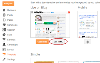
Most often when you insert a Facebook JavaScript or AdSense JavaScript in your blogger template editor, you often come across XML Parsing errors that prompts and says "The reference to entity "version" must end with the ';' delimiter." Blogger blogs are coded in XHTML and  XML is quite strict in following correct syntax formatting than HTML. XML is surely unforgiving in this case. Blogger interprets all your document as XML rather than as HTML. XML is PCDATA (Parsed Character Data) by default which means that XML parsers will normally parse all the text in a document. As a result when we insert JavaScript inside blogspot templates, all script inside the JavaScript tags is treated as a text and due to the presence of some illegal special characters like "<" , ">" and "&" , you often face the following error:


Error parsing XML, line 1458, column 64: The reference to entity "version" must end with the ';' delimiter.

error parsing xml in blogger

What are the special characters in XML that causes error?

XML is a human readable form of textual data. It parses all the text in a document and gives errors for the following 5 special characters:

  1. (<)  - less than

  2. (&) - ampersand

  3. (>) - greater than

  4. (")  - double-quote

  5. (')  - apostrophe or single-quote

The following three are more crucial:
  • "<" will generate an error because the parser interprets it as the start of a new element.
  • ">" will generate an error because the parser interprets it as the end of a start-tag or an end-tag
  • "&" will generate an error because the parser interprets it as the start of a character entity.

Two ways to fix XML errors in Blogger

XML errors can be avoided by using two methods:

  1. Use CDATA
  2. Escape HTML entities


1. Use CDATA

The term CDATA refers to (Unparsed) Character Data which is used about text data that should not be parsed by the XML parser. To avoid errors, all script code is enclosed inside a CDATA section. Everything inside a CDATA section including the 5 special characters is ignored by the parser.

A CDATA section starts with "<![CDATA[" and ends with "]]>":

Next time when you add your Facebook code, enclose it inside CDATA as shown below:

<script>
//<![CDATA[

(function(d, s, id) {
  var js, fjs = d.getElementsByTagName(s)[0];
  if (d.getElementById(id)) return;
  js = d.createElement(s); js.id = id;
  js.src = "//connect.facebook.net/en_US/sdk.js#xfbml=1&version=v2.3&appId=";
  fjs.parentNode.insertBefore(js, fjs);
}(document, 'script', 'facebook-jssdk'));


//]]>
</script>

All your script code will exists inside the CDATA and blogger editor will not parse the script code and thus wont give any errors.

The reason why Facebook script gives errors in blogger is due to the presence of a special character (&) that is used before the variable "version" as highlighted in the code above. "&" will generate an error because the XML parser interprets it as the start of a character entity and thus it prompts an error that says:

The reference to entity "version" must end with the ';' delimiter.


2. Escape HTML entities

Another simple method is to escape all 5 special characters and instead use the legal characters as alternatives to the above 5.

  • Replace < with &lt;
  • Replace  > with &gt;
  • Replace  "  with &quot;
  • Replace  '  with &#039;
  • Replace  & with &amp;

PS: Note how every alternative character set ends with a delimiter (;)

This method will help you encode your AdSense code and paste it inside your template without errors. It will also help you paste HTML code inside blogger comments!

This method is also called as HTML encoding and we have built a Special tool for this purpose to help you encode HTML characters with ease.

Need Help?

I hope now you will be able to add social media plugins and third party scripts inside your blogger templates without any errors. Do let me know if you need any further assistance or clarification on any point. Would love to give a hand buddies! =)

Make Blog Images and Post Thumbnails Responsive!

mobile friendly responsive imagesWe have covered most important core concepts of responsive designs and have shared almost every tip to design mobile friendly layouts in blogspot blogs, now it is time to learn how to make blog images to auto adjust their dimensions in mobile phones and tablets without effecting its resolution. Images with large sizes often don't fit in small screen devices and as a result gives a bad UI impression. Images must be fluid in its behavior, their width and height dimensions should be stylized such that they may instantly change their overall size as the browser screen goes smaller or bigger. Our approach is based on CSS @media Queries unlike adaptive image methods which makes use of JavaScript of php.

Tutorial Series
3. Hiding Widgets & Scripts in Mobile Templates [1], [2]
5. Using Mobile Friendly Images in Blogger.
7. Make Blog Sections Responsive: Header Widgets, Posts + Sidebar, Footer

Why do you need Mobile Friendly Images?

Your blog is being increasingly viewed on smaller, slower, low bandwidth devices. On Such small screen devices your desktop-centric images will load really slowly, which can cause UI lag, and cost you and your visitors un-necessary bandwidth and money.

Therefore responsive images is the only solution to fast load speed and better SEO ranking of your blog.

Image Size differ For Different Pages

Images are used all over your blog. Inside header, footer, sidebar and mostly inside your Post content. You may wish to display small thumbnail images on your homepage posts list but you would choose to display a large image when the post page is viewed. Thus image sizes may differ for different types of pages.

On Homepage: Index Page

index page thumbnail

On Post Page : Item page

image on item page

In order to achieve this we will make use of both @Media queries and Conditional Tags to better control image appearance of our UI.

The images in Header and Post content are often wider in size compared to images in footer and sidebar. So we will style the images accordingly.

Find Parent ID's or Classes

I have written a detailed tutorial that you can read to learn how to find what is the parent class or parent ID of any HTML element on your webpage using browser inspection method.

In our case the parent classes or IDs are as follow:

  1. The Header widgets have classes - .headerright  and .headerleft 
  2. The Sidebar Column has ID (Same for you) - #sidebar .widget-content
  3. The Footer has ID - #lowerbar-wrapper
  4. The Post has the following class (Same for you) - .post

Since we are styling images and we know that all images have the <img> tag therefore we will append img class next to all the above IDs and classes and for images which are hyperlinked we will use the class a img.

Select Device Breakpoints

Now you just need to add the following CSS codes in their respective breakpoints using the CSS Responsive Cheat Sheet (Refer Part#2) . We will choose the 786px breakpoint which is ZONE4 . You will add the following CSS code inside this zone as shown below:

/*-----iPads, Tablets ZONE4 ----------*/

@media only screen and (max-width:768px) {

.headerright a img,.headerleft a img{
  max-width: 75%!important; 
  margin-left: 0;
  position: absolute; height:auto;
  left: 30px;}

.post a img, .post img{max-width:95%; height:auto;}

#sidebar .widget-content a img , #sidebar .widget-content img { max-width:98%; height:auto;}

#lowerbar-wrapper a img , #lowerbar-wrapper img { max-width:98%; height:auto;}

}

Importance of max-width:

A max-width property of 98% will ensure that your image width may not exceed 98% of to parent container width. Never keep this property equal to 100% else the images will overlap the parent container.

In short your image will be neatly displayed on screen, no matter how big or small it be.

Display different sized images on Homepage and Posts

If you want to display thumbnails on homepage and larger images on post page or if you wish to float images to left on homepage but display them center aligned on post page then  you can make use of the conditional tags and enclose the media queries inside it as shown below:

You will need to add this code just below ]]></b:skin>


HOMEPAGE IMAGES or Thumbnails:

<b:if cond='data:blog.pageType == "index"'>

<style>

/*-----iPhone 2G, 3G, 4, 4S Landscape View ZONE2 ----------*/

@media only screen and (max-width:480px) {
.post a img, .post img {width:95%; float:none; height:auto; clear:both; margin-bottom:10px;}
}

/*-----iPads, Tablets ZONE4 ----------*/

@media only screen and (max-width:786px) {
    .post a img, .post img {max-width:50%; height:auto; float:left; margin: 0px 10px 10px 0px;}
  }
</style>
    </b:if>

In the above code:

  • the first breakpoint (480px) will give your homepage post images a 95% width and center alignment in small smartphones having width less than 480px.

Result on 480px screen - Homepage:

center aligned responsive thumbnail image

  • the second breakpoint (786px) will float your images to left of text and give it 50% max width on homepage.

Result on 786 screen - Homepage:

left aligned responsive thumbnail image

POST IMAGES:

Now for Images inside Posts you can use the following breakpoint code that we already shared earlier

/*-----iPads, Tablets ZONE4 ----------*/

@media only screen and (max-width:768px) {

.post a img, .post img{max-width:95%; height:auto;}

}

  • The code above will center align your images and give it 95% of maximum screen width

Result: Image on Post pages

image

You can do wonders with these conditional tags and customize your blogs for mobile devices the best you can! =)

Need Help?

You will never be able to succeed with responsive designs unless you remove confusions by asking us questions. Post your questions below and I would love to help you with all your queries. I hope this series may help you better understand some complex web designing terminologies and techniques. Wishing you guys the best of blogging and life! =)

Make Your Multi Column "Blog Footer" Responsive

create a responsive blog footer
 

In this tutorial you will learn how to convert your three Column footer into a responsive and auto-adjusting footer wrapper by creating separate stylesheet for different device breakpoints. Your blog footer could be a single column, 2 column, 3 or even 4 column, it may contain multiple rows and columns but the idea behind mobile optimized layouts is a simple concept which if understood would make it really simple for you to play around all elements on your blog and make them mobile responsive. I am sharing below the tutorial for blogger blogs but this methodology can be applied across all platforms. We have already learned how to mobilize Blog header and content area and now we need to play around the footer. Lets get to work then!

If you have a simple footer and looking for a multi-column footer then try one of this:
 
Tutorial Series
3. Hiding Widgets & Scripts in Mobile Templates [1], [2]
7. Make Blog Sections Responsive: Header Widgets, Posts + Sidebar, Footer

Layout of a Basic Blog Footer

The basic structure of any blog footer consists of a Parent container followed by Child containers which resides inside the parent node. The illustration below shows a 3-column footer where the black border represents the Parent container and Pink borders represent Child containers.

basic footer layout

All you need to do is to inspect and find the IDs or classes of your Parent and Child nodes using the browser inspect tool found in both Chrome and Firefox.

BEFORE: Desktop version

desktop footer with 3 columns


AFTER: mobile version

mobile layout for 3 column footer


or you can further simplify the widgets using mobile conditional tags. In our case we have shown only one widget in footer:

responsive Blogger Footer

As you can notice that we have simplified the footer to just single widget (using isMobileRequest tag) in footer because mobile browsers are quite slow machines often due to slow internet connection and it is really recommended that you provide a fast loading experience to your Mobile readers by removing as many unwanted widgets as possible in mobile view.

In our case the IDs or Classes are as follows:

  1. The Parent container has these IDs: #lower, #lower-wrapper
  2. The Child containers have this ID: #lowerbar-wrapper
  3. The menu above footer has this ID: #menubottom-container
  4. The credit links at the bottom of footer has this ID: #credits-wrap

Add Responsive Styles to Device Breakpoints

Now you just need to add the following CSS codes in their respective breakpoints using the CSS Responsive Cheat Sheet (Refer Part#2) .

Start from 786px breakpoint which is ZONE4. You will add the following CSS code inside this zone as shown below:

/*-----iPads, Tablets ZONE4 ----------*/

@media only screen and (max-width:768px) {

#lower, #lower-wrapper, #menubottom-container, #credits-wrap {overflow:hidden!important;width:100%!important;}

#lowerbar-wrapper{overflow:hidden!important;width:90%!important;padding:20px}

#credits p{text-align:center!important}

}

Thing to note:

  • At first I assigned 100% width to all parent classes so that they may fit perfectly to screen size.
  • Overflow hidden must be applied on both parent and child containers to ensure no horizontal scrollbar appears in mobile browser.
  • Then I assigned a width of 90% to Child containers to ensure they do not overlap the parent containers and go out-of-screen. The padding 20px center aligns it, making it more readable.
  • Note that I have not used display:none to remove sections that I don't want to display in mobile view, instead I have used the isMobileRequest tag to hide elements. I recommend you do the same. 
  • Finally I have centered align the text in credits container.

The footer does not need further styles to be created for smaller breakpoints. The above format of responsive styles is enough to display the footer nicely and neatly on mobile phones.

That's it! You just learned how to mobile optimize the design of your blogger footer :)

Need help?

Do let me know if you encountered problems in identifying the Parent IDs or classes of your blog footer,  I can help you with that. I am trying my best to make this advance concept as simple as possible. It may sound techy for some but if you read all parts and ask us for help, you will be able to excel the most trending skill in web designing.

Peace and blessings buddies! =)

How To Add "Read More" Link In Blogger After Post

How to add read more link in blogger after posts

You might have noticed that in most of blogs these is a small description of a post and after that there is a "Read More" button to read full post. This read more button is addedbecause of  Jump Break. If a post have no jump break your blog will show full post and it may slow down your homepage and other pages. But it happens only in simple templates, if you are using a custom template you may don't encounter this problem.

All though "Read More" button has no effect on seo but it can help you speed up your blog. You can add this to your posts very easily, there is no need to touch code. It is done when you have completed your post.

Also Read: How To Customize Read More Link/Button In Blogger

In this post I will show you how to add "Read More" in posts by using jump break. So follow below steps:

Step 1Go to blogger dashboard and write a new post or edit an existing one which doesn't have read more button.


how-to-add-read-more-button-in-blogger-101helper

Step 2: Choose the location or area of post which you want to show before "Read More"button or find the position where you want to place jump break.


Step 3: Click after that area which you have chosen to show and click on Insert jump break button as shown in below image:


Step 4: Click on publish and open your homepage to see changes.

101Helper grow. Follow and subscribe to get instant news about new posts.

Search Tags: How To Add "Read More" Link In Blogger Post, Read morebutton in blogger posts,Small post description and read morebutton,blogging tutorials 101helper

How to make 'Posts' and 'Sidebar' column responsive?

make content area responsive
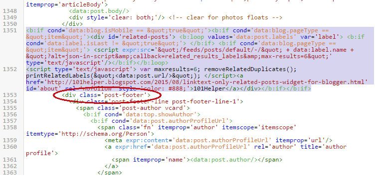
I hope you have now learnt the basic steps required to make a layout responsive. You have already learned how to create a responsive stylesheet using CSS3 media queries and choosing the right breakpoints. Now you just need to start making each section fluid by creating separate stylesheet for each section and then adding these styles to the correct breakpoints or ZONES. We have already discussed how to make header widgets responsive and now we will discuss ways to create a mobile stylesheet for Content area which includes your Blog Posts column and Sidebar Column. Lets get to work!

Tutorial Series
3. Hiding Widgets & Scripts in Mobile Templates [1], [2]
7. Make Blog Sections Responsive: Header Widgets, Posts + Sidebar, Footer

Layout of content area

A Content area in blogspot is called the section which includes your blog posts and sidebar widgets. As shown in the two-column layout below, the left column includes the main Blog Widget and the right column consists of your Sidebar. Default templates have this layout structure but custom templates could be even 3 column or multi column. No matter whether you sidebar floats to right side or left, the method we will discuss today will give you a clear idea on how to make this static layout responsive.

posts and sidebar columns

BEFORE:

Posts float to left of Sidebar


AFTER:

The Post Column will come first in the row and the sidebar column will be pushed down just below it.

responsive posts column

The sidebar column will come second in the row:

responsive sidebar column

Find Elements' Parent Classes or IDs

I have written a detailed tutorial that you can read to learn how to find what is the parent class or parent ID of any HTML element on your webpage using browser inspection method. We will use these Classes or IDs to control their appearances in mobile devices.

In our case the parent classes or IDs are as follow:

  1. #outer-wrapper : This is the parent container that holds columns of Posts and Sidebar
  2. #main-wrapper : This is Posts Column that floats to left.
    • #main-wrapper container also includes .post and .comments classes
    • .post class is used to style the Post body
    • .comments class is sued to style the comments body
  3. #sidebar-wrap : This is Sidebar Column that floats to right.

Select Device Breakpoints

Now you just need to add the following CSS codes in their respective breakpoints using the CSS Responsive Cheat Sheet (Refer Part#2) .

We will first choose the 786px breakpoint which is ZONE4. You will add the following CSS code inside this zone as shown below:

/*-----iPads, Tablets ZONE4 ----------*/

@media only screen and (max-width:768px) {

#outer-wrapper{overflow:hidden!important;width:100%!important;}

#main-wrapper, .post, .comments {width:98%!important; overflow:hidden; }

.comments .comments-content {width:98%!important;}

#sidebar-wrap{float:none;margin:0 auto}

}

Thing to note:

  • Never give the Parent and Child containers the same width in %. Always keep the First Parent container (#outer-wrapper in this case) at 100% width and Child classes at at 95% or less than 100%.
  • Not keeping a width difference will make the container borders to overlap each other.
  • This is why .post and .comments are given 95% width.
  • Since the post container is given 98% width therefore it will push down the Sidebar column.
  • For sidebar column you just need to make sure to remove the floating property by setting float:none; and center align it by setting margin:0 auto;

Keep testing and adding Styles to new breakpoints

We have set the styles to 768px screen width only i.e. ZONE4. To make sure your blog pages fit in perfectly in smaller screen sizes i.e. ZONE1 ,ZONE2 take care of the widths accordingly by reducing it further.

We have reduced the posts and comments container widths further to 94% and 96% respectively as shown below.

/*-----iPhone 2G, 3G, 4, 4S Portrait View ZONE1 ----------*/

@media only screen and (max-width:320px) {

#main-wrapper, .post, .comments{width:94%!important; overflow:hidden; }

}

/*-----iPhone 2G, 3G, 4, 4S Landscape View ZONE2 ----------*/

@media only screen and (max-width:480px) {

#main-wrapper, .post, .comments{width:96%!important; overflow:hidden; }

}

You can test and play further to make margin and padding of different elements as per your preferences.

A Post body may contain related posts widget, images, post info like labels/Date/Author name/Comments Count . You can now easily customize and optimize their widths and font sizes accordingly if needed. For images I will share a post soon on how to make all images on your blog responsive. Stay tuned for that.

Need Help?

Don't hesitate asking me for help in choosing the correct parent IDs/Classes of your blog Posts and Sidebar column. The above post gives you a clear idea of how to mobile optimize your content area for small screen devices. I hope you find it useful and worth trying. Stay tuned for a lot more fun and interesting posts!

Peace and blessings buddies! =)