Showing posts with label Mobile Blogging. Show all posts

Random Post Widget Lite Version For Blogger Mobile Version

Random posts lite version is a widget for blogger mobile version. It is called lite version because it's code is minified so that it could load faster. Also images are removed from the links for simpler look and to boost the widget's loading speed. So lite version or random post is best widget to multiply mobile page views.

Also this widget is fixed at the bottom of mobile site and floats while scrolling and has a close button for a good user experience. A "show" button is also added to let visitors to open the closed widget and read more posts.

An attribute with "install widget" text is also added to let other bloggers reach this widget when they see this cool widget on your blog's mobile site. So don't remove this text and let other bloggers to get benefit of it. Also don't use this widget without attribute because it may become irregular due to such CSS arrangement.

You can see a demo of random post widget in below image which is a screenshot taken from 101Helper's mobile site. If you want to try this widget, visit 101Helper from your phone.

This widget is fully customizable if you know CSS but you can also make changes in this widget if you don't know CSS. Changes that you can make are changing name of the widget, changing number of links(default is 2 links) etc.

Demo:

To try live demo go to 101Helper mobile site!

How To Add Random Post Widget In For Blogger Mobile Version ?

Step 1: Go to blogger dashboard > Layout.

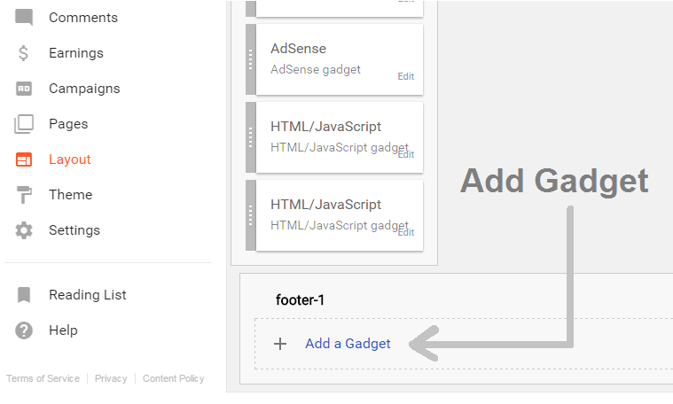
Step 2: Click on "add a gadget" in footer section or in mobile footer section if you have one in your theme's layout.
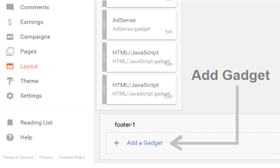
how-to-add-gadget-in-blogger

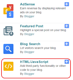
Step 3: Choose HTML/Javascript.

how-to-add-javascript-in-blogger-mobile-version

Step 4: Copy below code and paste it in the HTML/Javascript window.


<p id="show">↑ Show</p>
<ul id="random-posts">
<a href="https://101helper.blogspot.com/2017/04/random-post-widget-lite-version-for-blogger-mobile-site.html" id="credit">Install Widget!</a>
<p id="hide">✖</p>
<h3>Related links:</h3>
<script>
var randomposts_number = 2;
var randomposts_chars = 0;
var total_randomposts = 100;
var randomposts_current = new Array(randomposts_number);
function randomposts(json) { total_randomposts = json.feed.openSearch$totalResults.$t }
document.write('<script type=\"text/javascript\" src=\"https://101helper.blogspot.com/feeds/posts/default?alt=json-in-script&max-results=0&callback=randomposts\"><\/script>');
function getvalue() { for (var i = 0; i < randomposts_number; i++) { var found = false; var rndValue = get_random(); for (var j = 0; j < randomposts_current.length; j++) { if (randomposts_current[j] == rndValue) { found = true; break } }; if (found) { i-- } else { randomposts_current[i] = rndValue } }}; function get_random() { var ranNum = 1 + Math.round(Math.random() * (total_randomposts - 1)); return ranNum }; </script>
<script src="https://rawgit.com/101Helper/mobile/master/random-litev1.js"></script>
</ul>
<link rel="stylesheet" type="text/css" href="https://rawgit.com/101Helper/mobile/master/randomlitev1.css"/>

Replacements:

var randomposts_number = 2;    //////////// Number of post links

<h3>Related links:</h3>        //////////// Widget title

https://101helper.blogspot.com    //////////// Your blog URL

Step 5: Save the widget and note its ID.

How To Find ID Of A Widget In Blogger ?

Step 6: Go to theme and click on Edit HTML.
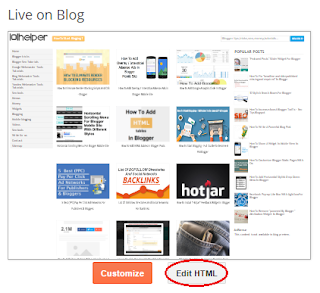

Step 7: Jump to the widget with the ID you noted in Step 5.
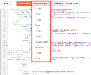
how-to-jump-to-widget-in-blogger

Step 8: Add mobile="only" after locked="false" in the code as shown in below image.

how-to-add-mobile-only-widget-in-blogger

Step 9: Save your template and you are done.

Make sure that you have enabled custom theme for your mobile site.

Search keywords: Random post widget for blogger mobile version, how to show widgets in blogger mobile version, blogger mobile site widgets, Add widgets in blogger mobile version, 101Helper blogger mobile gadgets and widgets.

Horizontal Scrolling Menu For Blogger Mobile Site


Mobile screen being small can't hold a wide horizontal menu so people add vertical menu for mobile site specially bloggers do so but there is a simple way of install a horizontal menu in blogger mobile site that is making a scrollable menu so it will show some tabs of the menu and others can be seen by touching and scrolling. As you know that almost everyone is now using a touch screen mobile so it is a good menu for your mobile site. So in this post I am going to share 4 different types of horizontal scrolling menus. Follow below steps to add any of the menu in your blog's mobile site.


Live Demo (Open In Mobile For Best Experience)

How To Add Horizontal Scrolling Menu For Blogger Mobile Site?

Step 1: Go to blogger and open Layout.

Step 2: Add a gadget just above your "Blog Posts Gadget" as shown in below image and click on Html/Javascript.

how-to-add-code-in-blogger

how to add a gadget in blogger

Note: If you are not able to add gadget above Blog Posts then simply add it in sidebar and drag it above Blog Posts because its important to keep it there

Step 3: Copy code of desired menu from below and paste it into Html/Javascript window you just opened in step 2.

Simple Scrollable Nav Without Logo.


<style>
.nav-scroll {
    background-color: #333;
    overflow: auto;
    white-space: nowrap;
    position: relative;
}
.nav-scroll a {
    display: inline-block;
    color: white;
    text-align: center;
    padding: 14px;
    text-decoration: none;
}
.nav-scroll a:hover {
    background-color: #777;
}
</style>
<div class="nav-scroll">
  <a href="https://www.blogger.com">Home</a>
  <a href="#news">News</a>
  <a href="#contact">Contact</a>
  <a href="#about">About</a>
  <a href="#support">Support</a>
  <a href="#blog">Blog</a>
  <a href="#tools">Tools</a>
  <a href="#base">Base</a>
  <a href="#custom">Custom</a>
  <a href="#more">More</a>
  <a href="#logo">Logo</a>
  <a href="#friends">Friends</a>
  <a href="#partners">Partners</a>
  <a href="#people">People</a>
  <a href="#work">Work</a>
</div>

Horizontal Scroll Nav With Scrollable Logo.

horizontal-nav-with-scrolling-logo-mobile-blogger

<style>
.nav-scroll {
    background-color: #333;
    overflow: auto;
    white-space: nowrap;
    position: relative;
}
.nav-scroll a {
    display: inline-block;
    color: white;
    text-align: center;
    padding: 14px;
    text-decoration: none;
}
.nav-scroll a:hover {
    background-color: #777;
}
.nav-scroll img {
    width: 100px;
    float: left;
    height: 48px;
    background: #fff;
}
</style>
<div class="nav-scroll">
<img alt="logo" src="https://www.servicetrade.com/wp-content/uploads/2016/04/your-logo-here.png"/>
  <a href="https://www.blogger.com">Home</a>
  <a href="#news">News</a>
  <a href="#contact">Contact</a>
  <a href="#about">About</a>
  <a href="#support">Support</a>
  <a href="#blog">Blog</a>
  <a href="#tools">Tools</a>
  <a href="#base">Base</a>
  <a href="#custom">Custom</a>
  <a href="#more">More</a>
  <a href="#logo">Logo</a>
  <a href="#friends">Friends</a>
  <a href="#partners">Partners</a>
  <a href="#people">People</a>
  <a href="#work">Work</a>
</div>


Horizontal Scroll Nav With Fixed Logo On Left.

horizontal-nav-with-logo-mobile-blogger

<div class="nav-mob">
<img alt="brand" id="brand" src="https://www.servicetrade.com/wp-content/uploads/2016/04/your-logo-here.png"/>
<div class="nav-scroll">
  <a href="https://www.blogger.com">Home</a>
  <a href="#news">News</a>
  <a href="#contact">Contact</a>
  <a href="#about">About</a>
  <a href="#support">Support</a>
  <a href="#blog">Blog</a>
  <a href="#tools">Tools</a>
  <a href="#base">Base</a>
  <a href="#custom">Custom</a>
  <a href="#more">More</a>
  <a href="#logo">Logo</a>
  <a href="#friends">Friends</a>
  <a href="#partners">Partners</a>
  <a href="#people">People</a>
  <a href="#work">Work</a>
</div></div>
<style>
#brand {
    position: static;
    float: left;
    width: 105px;
    height: 50px
}
.nav-scroll {
    background-color: #333;
    overflow: auto;
    white-space: nowrap;
    position: relative
}
.nav-scroll a {
    display: inline-block;
    color: white;
    text-align: center;
    padding: 14px;
    text-decoration: none
}
.nav-scroll a:hover {
    background-color: #777;
}
.nav-scroll img {
    width: 100px;
    float: left;
    height: 48px;
    background: #fff
}
.nav-mob {
    position: relative;
}
</style>


Horizontal Scroll Nav With Fixed Logo On Top.

horizontal-nav-with-fixed-logo-on-top-mobile-blogger

<div class="nav-mob">
<div id="slogo">
<img alt="logo" src="https://www.servicetrade.com/wp-content/uploads/2016/04/your-logo-here.png" /></div>
<div class="nav-scroll">
  <a href="https://www.blogger.com">Home</a>
  <a href="#news">News</a>
  <a href="#contact">Contact</a>
  <a href="#about">About</a>
  <a href="#support">Support</a>
  <a href="#blog">Blog</a>
  <a href="#tools">Tools</a>
  <a href="#base">Base</a>
  <a href="#custom">Custom</a>
  <a href="#more">More</a>
  <a href="#logo">Logo</a>
  <a href="#friends">Friends</a>
  <a href="#partners">Partners</a>
  <a href="#people">People</a>
  <a href="#work">Work</a>
</div></div>
<style>
.nav-mob {
    position: relative;
}
#slogo img {
    float: none;
width:100px
}
#slogo {
    position: static;
    width: 100%;
    text-align: center;
    padding: 2px 0px;
    background: #eaeaea
}
.nav-scroll {
    background-color: #333;
    overflow: auto;
    white-space: nowrap;
    position: relative
}
.nav-scroll a {
    display: inline-block;
    color: white;
    text-align: center;
    padding: 14px;
    text-decoration: none
}
.nav-scroll a:hover {
    background-color: #777
}
.nav-scroll img {
    width: 100px;
    float: left;
    height: 48px;
    background: #fff
}
</style>

Step 4: Save the gadget and note its ID or name it so that you can find it in your template for next steps.

Read: How To Find ID Of A Widget In Blogger

Step 5: Go to template and click on Edit Html.

how-to-add-edit-html-in-blogger

Step 6: Find your "Mobile Nav Gadget" in your template you just added in above steps with the help of its ID or name using Ctrl + F on your keyboard. You can directly jump to your gadget also.

how-to-search-blogger-template

Step 7: After finding the gadget copy below piece of code and paste it after locked='false' as shown in below image:

mobile="only"

how-to-show-a-gadget-in-blogger-mobile-view


Step 8: Save your template and again go to Blogger > Template > Mobile.

How-to-optimize-blogger-blogs

Step 9: Change Default template to Custom and click on Save.
mobile-templates-blogger-101helper

That's it. Now open your mobile site in your mobile to see your menu working.

I hope you liked this tutorial, for more menu tutorials go to Blogger menus

Thanks for visiting 101Helper, Share this tutorial with others.

Search Keywords: Horizontal Scrolling Menu For Blogger Mobile Site, menu for blogger mobile site,pure css menu for blogspot blog,how to add css,javascript menu in blogger mobile view,101helper menus for blogger,blogging tutorials.

How To Earn Bigger From Google Play Store Apps Using Blogger Blog

earn money from appnext googleplay store 101helper

I have shared many ways of earning online with blogger blog but today I am sharing something unique and different which is good to earn bigger amounts. With this amazing network you can earn money for each cpi(cost per install) and it is only for blogger mobile sites not for desktop site. Also its not only for blogger but all mobile websites can be integrated with these ads.

These ads are powered by APPNEXT. With AppNext ads you can show ads of Google Play apps and you get paid for every download. This ad network is good for those who have a more good mobile site and get more visitors on mobile sites. With Appnext you have full control over your ads. You have following benefits:

1. Ads don't slow down your mobile site.
2. You can show apps ads from specific category e.g games, social networking, sports, videos and audio apps etc.
3. You can install page over ads as well as video and banner ads.
4. Appnext finds high rate ads automatically and display it on your site.
5. All ads work on IOS as well as Android platforms.

More over you can show ads of a specific app which is paying a high rate, you need to get that app from marketplace in Appnext.

So Appnext is really a good network for mobile sites and a good network to earn bigger.

Benefits Of Appnext:

Appnext ads types for websites

1. Page over, banner, video ads.
2. Easy implementation.
3. No minimum traffic required.
4. High rates per CPI(cost per install).
5. Full control over ads.

Payment Methods:

Wire transfer - $200.
Paypal - $20
Credit Card - Coming soon!

Payment Proof:

paypal-prove-appnext-payment-101helper

How To Earn Money From AppNext?


(1): CREATE AN APPNEXT ACCOUNT:

Step 1: Go to AppNext and click on Join Now

how to sign up at appnext

Step 2: Fill up the signup form and confirm it from your email.

how to sign up at appnext 101helper

Step 3: Login to your Appnext account, you will find two IDs from appnext one will be for IOS and other for Android, Copy and save them.

Note:  If you didn't get any ID then leave it.

(2). SUBMIT YOUR WEBSITE/BLOG TO APPNEXT:

Step 1: Login to your Appnext account.

Step 2: Click on Add New App in the menu on top.

how to earn bigger money from website

Step 3: Choose Website as your platform, enter its URL and click on Next.

earn money form blogger

Step 4: Type your Site or Blog name and upload its logo if you like.

appnext apps for cpi

Step 5: Select up-to three categories for IOS.

earn money from google ios, andoid apps

Step 6: Select up-to three categories for ANDROID.

how to earn money from blog, website

Step 7: Give a message to your advertisers in the next step or just process away by clicking on next.

how to earn money from blogger blogs.png

After submitting your site you will get submission completed dialog along with two IDs one with the name Android Placement ID and other with IOS Placement ID. Copy both of these IDs, you will need them at the time of implementation of ads.


(3). IMPLEMENTING APPNEXT ADS IN BLOGGER MOBILE SITE:

Step 1: Go to Integration Tools page.

Step 2: Choose type of ads which you want to implement in the menu on left side under Websites heading. I am choosing Interstitial JS Tag because it will give you more downloads rather than other types of ads.

how to add appnext ads in blogger mobile site

Step 3: Scroll down and copy the javascript code. Your code will be as shown below.

<script type="text/javascript">
 var Appnext = {
       android_id: 'Your Android Code Here',
       ios_id: 'Your IOS Code Here',
       cat: 'Category Name(If necessary) E.g Social Networking, Games, Casino',
       pbk: '',
       b_title: '',
       b_color: '',
       skip_url: '',
       skip_title: '',
       mute: '',
       timeout: '',
       times_to_show: '',
       times_to_show_reset: '',
       creative:'managed',
       subid: ''
     };
 (function(){
 var _s=document.createElement('script');
 _s.type='text/javascript';
 _s.async=true;
        _s.src='https://appnext.hs.llnwd.net/tools/tags/video/manage_script.js';
 (document.body)?document.body.appendChild(_s):document.head.appendChild(_s);
 })();
</script>

Step 4: Replace the Your Android Code Here and Your IOS Code Here with ID's you just provided with at the time of submission of your website. Place your ID's carefully don't place Android ID in IOS and IOS ID in Android place.

Step 5: Copy your final code and go to blogger layout and click on add a gadget > Html/Javascript.

Step 6: Paste the code and click on save.

Step 7: Go to template and search for your gadget by ID or by name you just given to it.

Step 8: Type mobile='only' after locked='false'.


Step 9: Click on save and you are done.

Make sure that you have enabled Custom mobile template for your mobile site otherwise you will not see any ads.

You can implement other ads in your mobile site too but video ads and banner ads may slow down your site which is not good for mobile users. Follow our mobile tutorials to get more help about implementing ads in your mobile site!

1. How To Show Ads Above Comments In Blogger Mobile Site

2. How To Show Ads In Mobile View In Blogger

3. How To Optimize Blogger Blog For Mobile Phones

That's it. I hope you liked this post and found it helpful. If not please let me know.

Thanks for visiting 101Helper. Do follow us on social media and keep visiting us.

Search Tags: Mobile blogging tutorials for blogger, how to earn money from appnext, appnext review for publishers, minimum payout, earn money from google appstore, mobile ad networks, high rates paying networks,cost per install networks, earn money from websites,blogs

Swiper Featured Posts Widget For Blogger Mobile Site

featured posts swiper widgets for blogger mobile site

This is a quick post about featured post swiper for blogger mobile site. So in this post I am going to share different types of mobile swipers and there features. I hope you will like them. Other bloggers and webmasters are requested to not copy and share this code without 101helper tag below each code, if found to be copied it will be against 101Helper's copyright violation and action will be taken!

Featured Posts Mobile Swiper Features:

1. It is free of cost.
2. 4 different designs.
3. Fully customizable.
4. Doesn't affect blog speed.
5. 100% optimized for all mobile screens.
6. Unlimited featured posts can be added.
7. Thumbnails ready.
8. Touch enabled for mobiles.

How To Add Featured Posts Swiper In Blogger Mobile Site?

Follow below steps to add featured posts swiper in blogger mobile site.

Step 1: Go to blogger dashboard and navigate to Template.

Step 2: Click on Edit Html.

how to edit html in blogger

Step 3: Search for <head> and just below it paste the following code.
<link href='https://rawgit.com/101Helper/mobile/master/swiper.css' rel='stylesheet'/>
<script src='https://rawgit.com/101Helper/mobile/master/swiper.js'/>

how to add javascript and css code in blogger

Step 4: Click on Save template.

Step 5: Go to Layout, click on add a gadget and open Html/Javascript.

Step 6: Copy code of desired swiper from below and paste it into Html/Javascript.

Mega Swiper Compatible With Desktop Site:

swiper featured post widget for blogger compatible with desktop site
<style>
.swiper-slide a {width: 100%;}
.swiper-container.swiper-container-horizontal {background: #eee;padding: 10px 0px;}
.swiper-container{width:100%;height:280px;margin:20px auto;}.swiper-slide{height: 270px;padding: 5px;text-align:center;font-size:18px;background:#fff;display:-webkit-box;display:-ms-flexbox;display:-webkit-flex;display:flex;}
.swiper-container.swiper-container-horizontal img {width: 100%;height:176px;margin: 0;right: 0.5px;position: relative;}
.swiper-container.swiper-container-horizontal h3 { position: absolute; left: 2px; top: 190px; font-size: 17px; width: 95%; padding: 5px; font-weight: normal; text-align: left; }
</style>
<div class="swiper-container swiper-container-horizontal" style="cursor: -webkit-grab;">
<div class="swiper-wrapper" style="transform: translate3d(-562px, 0px, 0px); transition-duration: 0ms;">
<div class="swiper-slide" style="margin-right: 30px;"><a href="YOUR POST LINK HERE"><img src="YOUR IMAGE LINK HERE"/><h3>YOUR POST TITLE</h3></a></div>
<div class="swiper-slide swiper-slide-prev" style="margin-right: 30px;"><a href="YOUR POST LINK HERE"><img src="YOUR IMAGE LINK HERE"/><h3>YOUR POST TITLE</h3></a></div>
<div class="swiper-slide swiper-slide-active" style="margin-right: 30px;"><a href="YOUR POST LINK HERE"><img src="YOUR IMAGE LINK HERE"/><h3>YOUR POST TITLE</h3></a></div>
<div class="swiper-slide swiper-slide-next" style="margin-right: 30px;"><a href="YOUR POST LINK HERE"><img src="YOUR IMAGE LINK HERE"/><h3>YOUR POST TITLE</h3></a></div>
<div class="swiper-slide" style="margin-right: 30px;"><a href="YOUR POST LINK HERE"><img src="YOUR IMAGE LINK HERE"/><h3>YOUR POST TITLE</h3></a></div>
</div>
</div>
    <!-- Initialize Swiper -->
    <!-- Swiper JS -->
    <script src="../dist/js/swiper.min.js"></script>
    <script>
    var swiper = new Swiper('.swiper-container', {
        pagination: '.swiper-pagination',
        slidesPerView: 1.5,
        centeredSlides: true,
        paginationClickable: true,
        spaceBetween: 30,
        grabCursor: true
    });
    </script>

Mega Swiper Non-Compatible With Desktop Site:

featured post widget for mobile minified version

Note: This swiper will show only in mobile not in desktop site.
<style>
@media only screen and (min-width: 800px) {
.swiper-container.swiper-container-horizontal{display:none;}}
.swiper-slide a {width: 100%;}
.swiper-container.swiper-container-horizontal {
background: #eee;
padding: 10px 0px;
}.swiper-container{width:100%;height:280px;margin:20px auto;}.swiper-slide{height: 270px;padding: 5px;text-align:center;font-size:18px;background:#fff;width:250px;display:-webkit-box;display:-ms-flexbox;display:-webkit-flex;display:flex;}
.swiper-container.swiper-container-horizontal img {width: 100%;height:160px;margin: 0;right: 0.5px;position: relative;}
.swiper-container.swiper-container-horizontal h3 { position: absolute; left: 2px; top: 190px; font-size: 17px; width: 95%; padding: 5px; font-weight: normal; text-align: left; }
</style>
<div class="swiper-container swiper-container-horizontal" style="cursor: -webkit-grab;">
<div class="swiper-wrapper" style="transform: translate3d(-562px, 0px, 0px); transition-duration: 0ms;">
<div class="swiper-slide" style="margin-right: 30px;"><a href="YOUR POST LINK HERE"><img src="YOUR IMAGE LINK HERE"/><h3>YOUR POST TITLE</h3></a></div>
<div class="swiper-slide swiper-slide-prev" style="margin-right: 30px;"><a href="YOUR POST LINK HERE"><img src="YOUR IMAGE LINK HERE"/><h3>YOUR POST TITLE</h3></a></div>
<div class="swiper-slide swiper-slide-active" style="margin-right: 30px;"><a href="YOUR POST LINK HERE"><img src="YOUR IMAGE LINK HERE"/><h3>YOUR POST TITLE</h3></a></div>
<div class="swiper-slide swiper-slide-next" style="margin-right: 30px;"><a href="YOUR POST LINK HERE"><img src="YOUR IMAGE LINK HERE"/><h3>YOUR POST TITLE</h3></a></div>
<div class="swiper-slide" style="margin-right: 30px;"><a href="YOUR POST LINK HERE"><img src="YOUR IMAGE LINK HERE"/><h3>YOUR POST TITLE</h3></a></div>
</div>
</div>
    <!-- Initialize Swiper -->
    <!-- Swiper JS -->
    <script src="../dist/js/swiper.min.js"></script>
    <script>
    var swiper = new Swiper('.swiper-container', {
        pagination: '.swiper-pagination',
        slidesPerView: 2,
        centeredSlides: true,
        paginationClickable: true,
        spaceBetween: 30,
        grabCursor: true
    });
    </script>

Mini Swiper Non-Compatible With Desktop Site - Dark Theme:

featured posts swiper for mobile site dark theme

Note: This swiper will show only in mobile not in desktop site.

<style>
@media only screen and (min-width: 800px) {
.swiper-container.swiper-container-horizontal{display:none;}}
.swiper-slide a {width: 100%;}
.swiper-slide a,.swiper-container.swiper-container-horizontal h3 {color: #fff;}
.swiper-container.swiper-container-horizontal {background: #222;padding: 10px 0px;}
.swiper-container{width:100%;height:200px;margin:20px auto;}.swiper-slide{height: 190px;padding: 5px;text-align:center;font-size:18px;width:250px;display:-webkit-box;display:-ms-flexbox;display:-webkit-flex;display:flex;}
.swiper-container.swiper-container-horizontal img { width: 100%; height: 130px; margin: 0; right: 0.5px; position: relative; }
.swiper-container.swiper-container-horizontal h3 { position: relative; font-size: 17px; width: 95%; padding: 5px; font-weight: normal; text-align: left; }
</style>
<div class="swiper-container swiper-container-horizontal" style="cursor: -webkit-grab;">
<div class="swiper-wrapper" style="transform: translate3d(-562px, 0px, 0px); transition-duration: 0ms;">
<div class="swiper-slide" style="margin-right: 30px;"><a href="YOUR POST LINK HERE"><img src="YOUR IMAGE LINK HERE"/><h3>YOUR POST TITLE</h3></a></div>
<div class="swiper-slide swiper-slide-prev" style="margin-right: 30px;"><a href="YOUR POST LINK HERE"><img src="YOUR IMAGE LINK HERE"/><h3>YOUR POST TITLE</h3></a></div>
<div class="swiper-slide swiper-slide-active" style="margin-right: 30px;"><a href="YOUR POST LINK HERE"><img src="YOUR IMAGE LINK HERE"/><h3>YOUR POST TITLE</h3></a></div>
<div class="swiper-slide swiper-slide-next" style="margin-right: 30px;"><a href="YOUR POST LINK HERE"><img src="YOUR IMAGE LINK HERE"/><h3>YOUR POST TITLE</h3></a></div>
<div class="swiper-slide" style="margin-right: 30px;"><a href="YOUR POST LINK HERE"><img src="YOUR IMAGE LINK HERE"/><h3>YOUR POST TITLE</h3></a></div>
</div>
</div>
    <!-- Initialize Swiper -->
    <!-- Swiper JS -->
    <script src="../dist/js/swiper.min.js"></script>
    <script>
    var swiper = new Swiper('.swiper-container', {
        pagination: '.swiper-pagination',
        slidesPerView: 2,
        centeredSlides: true,
        paginationClickable: true,
        spaceBetween: 30,
        grabCursor: true
    });
    </script>

Freestyle Only Text/Links Without Thumbnails Swiper:

featured posts swiper for mobile with text only blogger

<style>
.swiper-container.swiper-container-horizontal {background: #eee;padding: 10px 0px;}
.swiper-container{width:100%;height:200px;margin:20px auto;}
.swiper-container.swiper-container-horizontal img { width: 100%; height: 130px; margin: 0; right: 0.5px; position: relative; }
.swiper-slide {
    height: 190px;
    padding: 5px;
    text-align: center;
    font-size: 18px;
    display: -webkit-box;
    display: -ms-flexbox;
    display: -webkit-flex;
    display: flex;
    background: url(https://blogger.googleusercontent.com/img/b/R29vZ2xl/AVvXsEgBIRV_V3Jz3buUr83DCKWMj_BKtDkvuiZ-0fMZDK4vcCb6bQ_QYANwMNkgRYr0b2pERaPuz1fq8QhJApwZqjB0aVgfK-J_kE8H3iZS5NNTtV_pQiRQji6m9gjC6W8efHQnWtWE9tiObcI/s1600/more.png) no-repeat #fff;
    background-position: 93% 94%;
}
.swiper-container.swiper-container-horizontal h3 {
    font-size: 15px;
    line-height: 1.2;
    text-align: left;
    position: relative;
    color: #2288bb;
    float: left;
}
.swiper-container.swiper-container-horizontal p {
    color: #666;
    font-size: 14px;
    padding: 0;
    text-align: left;
    margin: 0;
    float: left;
    padding-top: 5px;
    height: 93px;
    overflow: hidden;
}
@media only screen and (min-width: 800px) {
.swiper-container.swiper-container-horizontal{
display:none;
}
}
</style>
<div class="swiper-container swiper-container-horizontal" style="cursor: -webkit-grab;">
<div class="swiper-wrapper" style="transform: translate3d(-562px, 0px, 0px); transition-duration: 0ms;">
<div class="swiper-slide" style="margin-right: 30px;"><a href="YOUR POST LINK"><h3>YOUR POST TITLE</h3></a><p>YOUR POST TEXT(SMALL INTRO)</p></div>
<div class="swiper-slide swiper-slide-prev" style="margin-right: 30px;"><a href="YOUR POST LINK"><h3>YOUR POST TITLE</h3></a><p>YOUR POST TEXT(SMALL INTRO)</p></div>
<div class="swiper-slide swiper-slide-active" style="margin-right: 30px;"><a href="YOUR POST LINK"><h3>YOUR POST TITLE</h3></a><p>YOUR POST TEXT(SMALL INTRO)</p></div>
<div class="swiper-slide swiper-slide-next" style="margin-right: 30px;"><a href="YOUR POST LINK"><h3>YOUR POST TITLE</h3></a><p>YOUR POST TEXT(SMALL INTRO)</p></div>
<div class="swiper-slide" style="margin-right: 30px;"><a href="YOUR POST LINK"><h3>YOUR POST TITLE</h3></a><p>YOUR POST TEXT(SMALL INTRO)</p></div>
</div>
</div>
<script>
    var swiper = new Swiper('.swiper-container', {
        scrollbarHide: true,
        slidesPerView: '2',
autoplay: true,
speed: 2000,
        centeredSlides: true,
        spaceBetween: 30,
        grabCursor: true
    });
    </script>

Step 7: Click on save and note the ID of your gadget or give it a title so that you could find it easily for next steps.

Step 8: Go to template and find the swiper gadget which you just added by its ID or by its Title.

Step 9: After finding the swiper gadget in your template, you will see a line of code like this:

<b:widget id='HTML1' locked='false' title='Swiper' type='HTML' visible='true'>

You need to add mobile='yes' after locked='false' like this:

<b:widget id='HTML1' locked='false' mobile='yes' title='Swiper' type='HTML' visible='true'>

swiper in blogger mobile site

Step 10: Click on save and you are done, now you just need to enable mobile custom template for your blog and swiper will start showing up in your phone.

Step 11: Go to template and click on settings icon below mobile template.

how to change mobile template in blogger

Step 12: Choose Custom template for your mobile template and click on save button.

how to enable custom template for blogger mobile site

That's it! you are done.

I hope you like this post, if yes then share it with others. Thanks for visiting 101Helper.

NOTE: Never remove the Light blue highlighted area of the code!

How To Customize Mobile Swiper?

Handle the codes carefully incase of any removal of a single code can result in stopping of the swiper!

1. Replace YOUR IMAGE LINK HERE with your image links

2. Replace YOUR POST LINK HERE with your post links

3. Replace YOUR TITLE HERE with your post title.

4. Replace YOUR POST TEXT HERE with your post text.

5. To add more slides add below piece of code above the highlighted area(yellow).

For Only Text Swiper.

<div class="swiper-slide" style="margin-right: 30px;"><a href="YOUR POST LINK"><h3>YOUR POST TITLE</h3></a><p>YOUR POST TEXT(SMALL INTRO)</p></div>

For Image Swiper.

<div class="swiper-slide" style="margin-right: 30px;"><a href="YOUR POST LINK HERE"><img src="YOUR IMAGE LINK HERE"/><h3>YOUR POST TITLE</h3></a></div>

Search Tags: carousel slider for blogger mobile site, multiple posts slider for blogspot mobile site,touch slider for blogger,jquery,javascript,css touch slider for blogger mobile view,gadgets for blogger mobile site,101Helper blogging tutorials

How To Show Ads Above Comments In Blogger Mobile Site

how to show ads in blogger mobile above comments 101helper

Placing ads in blogger mobile site is always difficult for every newbie because handling blogger template is not easy especially in case of mobile blogging it becomes more difficult so bloggers either avoid placing ads in blogger mobile site or add ads as a gadget or try to show infolinks ads in mobile site. Adding ads in gadget is not a problem but it may slow down your mobile site. But its important also to show ads on mobile site specially those bloggers which have majority of visitors on mobile site really need to show ads in mobile to get a maximum benefit from blog. So this tutorial is to show you how to place ads in blogger mobile site just above the comment box below every post. It will boost your blog revenue to a great extend. So lets start!

Steps To Follow To Show Ads In Blogger Mobile Site Above Comments:

Step 1: Go to blogger dashboard and navigate to template.

Step 2: Click on edit html and click inside the template code.


how to edit mobile tempate in blogger

Step 3: Search for below piece of code by pressing CTRL+F on your keyboard.

<b:if cond='data:post.allowComments'><h4><data:post.commentLabelFull/>:</h4>

Step 4: Copy below code and paste it just above the above code.

<b:if cond='data:blog.isMobile == &quot;true&quot;'>
<b:if cond='data:blog.pageType == "item"'>
---YOUR AD CODE HERE---
</b:if>
</b:if>

how to show ads in blogger mobile above comments

Step 5: Replace "---YOUR AD CODE HERE---" with your ad code.

Step 6: Save your template and you are done.

Ad Not Displaying In Mobile?

Follow below steps if your ad is not showing in mobile:

Step 1: Go to template and click on setting icon below the mobile site preview.

how to edit mobile tempate in blogger

Step 2: Enable custom template for your mobile site as shown in below image.

how to apply custom template in blogger mobile site

Step 3: Click on save and you are done.

Search Tags: how to show ads in blogger,show ads in blogger mobile,display adsense ads in blogger mobile,how to show adsense on blogspot mobile site,101helper make money blogging,ads below footer,above comments blogger mobile site.

Slideout Menu For Blogger Mobile Site With Social Buttons

Slideout Menu For Blogger Mobile Site With Social buttons

My recent post for mobile blogging was about a slide down menu which is really appreciated by visitors as it got more than 1000 views so I decided to create another menu for blogger mobile site. Slide down menu was too simple and it didn't have other features like social media buttons and search box so I decided to create a menu which have these features and an exiting look. As responsiveness is also very important for a menu so i made it responsive too. You can read its major features below. For a live demo you can visit 101Helper's mobile site. I am sure you'll like this menu. Don't forget to give your feedback by leaving a comment below.

Slideout Mobile Menu Features:

☆ Easy installation.
☆ Responsive design.
☆ Social media buttons ready.
☆ Fast(doesn't affect blog's loading speed).
☆ Low size.
☆ Responsive search box.
☆ Compatible with all smart phones.
☆ Scrollable tabs and floating on page scroll.
☆ It fits all screen sizes(ipad,iphone,tablets etc).
☆ It has space for Logo.

See Live Demo

Screenshot:

slide out menu for blogger mobile site

How To Add Slide Out Menu In Blogger?

Its very easy to install this menu in your blog. You just have to follow below steps. Note that we have to hide blog header in mobile site as this menu has a space for logo so you don't need blog header in mobile site any more so we will hide the header in mobile site too while installing this menu. Lets begin!

Step 1: Go to blogger dashboard and navigate to layout.

how to add a gadget in blogger blog

Step 2: Click on add a gadget below your blog's header in the layout.

`how to add slide out menu in blogger tutorial

Step 3: Click on Html/Javascript.

how to add gadgets and ads in blogger

Step 4: Copy the below code and paste it into Html/Javascript window.
<link rel="stylesheet" type="text/css" href="https://rawgit.com/101Helper/docs/master/slideout-nav-public.css" />
<nav id="nava" role="navigation" class="sticky-nav" style="top: 0px;">
<form id="searchbox" method="get" action="/search">
<input name="q" type="text" id="search-in" size="19" required />
<input name="m" type="hidden" value="1" />
<button type="submit"  class="_54k8 _56bs _56b_ _56bw _56bu"  id="u_0_1" data-sigil="touchable"><span class="_55sr">Go!</span></button>
<img id="hide-search" src="https://blogger.googleusercontent.com/img/b/R29vZ2xl/AVvXsEjVSAjrYj8iOWwiJdhtDvQLvfLlu3vd3DxK09gmTXZLcK66vzlJk7M3-A-KZNYDCHGUlCDgmF9iRaFiZH4efPNaAmCX1mjZ4ng_M35jxcxRInvmuhTqjODkMNnSFoikcha4azxVyV1JRd4/s1600/rsz_close-icon.jpg" />
<div id="search-height"></div>
</form>
<div class="prl-container">
<div class="nav-wrapper clearfix">
<img id="show-search" src="https://blogger.googleusercontent.com/img/b/R29vZ2xl/AVvXsEh-F4KBXB1GdgenxJz-Q4XRb_GrlifxWoMvXONQnEUYBoNP5BVWttLf6zVEX8iG8VhgjbSca9wjeEarrtZ-zvPelgZuNoJ37gTvS3FuxdeKJapimW5MtpslTxbm0yROzoq1IcNUb-fNaf8/s1600/rsz_search-icon.png" />
<div style="float:left;">
<div class="nav_menu_control"><a href="#" data-prl-offcanvas="{target:'#offcanvas'}"><img src="https://blogger.googleusercontent.com/img/b/R29vZ2xl/AVvXsEgtwbF9tplNPSZZsodHXfMQItu8s2H_famOywLwsxHnYm-UL9llcAP3BD0GW0vpIWcXdmWS3foqVvizRKXcUGUe9Qvgl4jxNGx0G9b23dr1fTvg24p3d9ru1wLQGdsyx69NeNF1enIIvgk/s1600/rsz_mobile-menu-icon.png"/></a></div>
</div>
<div class="container">
<div class="left">
<a href="/?m=1"><img src="https://blogger.googleusercontent.com/img/b/R29vZ2xl/AVvXsEg2nrKb0yj-txeVUkLXtOOVcwLNHZtv1-14vkAFbGoGxI57jindJP9JLwX1QfjD8mqF7SfX0MhQ9X93GbulGNEBEl6aKxjkJ9jLIhGimV4oUlzisCXspI3kJzsgZkNyWfJHwwarm35wLqs/s1600/rsz_1101helper.png" class="logo" alt="101Helper"/></a>
</div>
<div class="clear"></div></div></div></div></nav><div style="clear: both;"></div>

 <div id="offcanvas" class="prl-offcanvas">
<div class="prl-offcanvas-bar">
<div class="social-icons" style="padding-top: 5px;background: #fff;padding-left: 5px;">
<p>Follow us:</p>
<a href="https://www.fb.com/pages/101Helper/623626157780837"><img border="0" src="https://blogger.googleusercontent.com/img/b/R29vZ2xl/AVvXsEhSjUg3ZJsKwfCW2qGLa_U-f3SDTiOcMqBDJCH4txVrkxlmULDdt8FEULl7tV3FLlnTNyGiLsz_iHGSdIIWDHkiieOKLFavO44Z3Zti0pchSvgMj_DtCIjFH9z-y1jvCO0C-BrobKdiD8M/s1600/facebook.png" /></a>
<a href="https://twitter.com/101helperblog"><img border="0" src="https://blogger.googleusercontent.com/img/b/R29vZ2xl/AVvXsEg55JuHMddBOOCBAnxCBQSnxzK1WjNIsXKfkcvVBnMeK95tecMLUlVp3ofgLI4tmW8sSYeb5qhl-bcKFo0td_VHBc6hsT-2qF4OvugiocPGtd9Dvr4uGBZernQZs2JuJff547muuf4EsrE/s1600/Twitter-Logo.png" /></a>
<a href="https://www.pinterest.com/101helper"><img border="0" src="https://blogger.googleusercontent.com/img/b/R29vZ2xl/AVvXsEg_NvELEmPBaMbytEvdq2nAHs_5L7pVF-I-znLtwLMVHXnws1FUWIOMTojAZc4rTu9tsYXLm9lX0A9-DxnCL7V1_Twqcfdsn6AfOgtMLPl7W92ToEutev5mQUGoWu8iKtiA4fDs7gd2r5I/s1600/App-Pinterest-icon.png" /></a>
<a href="https://plus.google.com/+101helperBlogspot"><img border="0" src="https://blogger.googleusercontent.com/img/b/R29vZ2xl/AVvXsEi8NuQl_U1FCP8ZkbK7kgzSN-HTOsH9tLDCNRUwYwhc-NUduiFGrqtVcRuZzun_sEQpdR7vfLro6l8lObwxpimAvD2s8CB6bh_512QBYrgfhROtXtBhADQIfRZQ_Rh28_05dFGWC-P-o44/s1600/rsz_circle-google-plus-128.png" /></a>
</div>
<nav class="side-nav">
<ul id="nav-list" class="nav-list">
<li><a href="/?m=1">Home</a></li>
<li><a href="/search/label/Blogger%20Tips%20And%20Tricks?m=1">Blogger tips and tricks</a></li>
<li><a href="/search/label/Blogger%20Seo%28Search%20Engine%20Optimization?m=1">Blogger seo</a></li>
<li><a href="/search/label/Google%20Webmaster%20Tools%20tutorials?m=1">Google webmaster tools tutorials</a></li>
<li><a href="/search/label/Bing%20Webmaster%20Tools%20Tutorials?m=1">Bing webmaster tools tutorials</a></li>
<li><a href="/search/label/Blogger%20menus?m=1">Blogger menus</a></li>
<li><a href="/search/label/earn%20money%20blogging?m=1">Earn money blogging</a></li>
<li><a href="/search/label/Blogger%20Widgets%20And%20Gadgets?m=1">Blogger gadgets</a></li>
<li><a href="/search/label/Beginner%20to%20blogging?m=1">How to's/Blogging</a></li>
<li><a href="/search/label/Mobile%20Blogging?m=1">Mobile blogging</a></li>
<li><a href="/p/menusitemap.html?m=1">Sitemap</a></li>
<a class="abt" href="https://101helper.blogspot.com/"><img src="https://blogger.googleusercontent.com/img/b/R29vZ2xl/AVvXsEgfgQbdzjspa_FL4Eot7vj1GBPlKXelQ7JMOQnxVwDVRV7f12Ba1MQUeLk44ovIy-MrwZ1Lluh612ik9ripSUTftCrGmNW5QoNQrud-cB1iKj1n9s2ldhDhrSqZCuZxNfymzblrQy4tGnII/s1600/abt.png"/>101Helper</a>
</ul>
</nav>
</div></div>
<script src="https://ajax.googleapis.com/ajax/libs/jquery/1.11.3/jquery.min.js"></script>
<script type='text/javascript' src='https://rawgit.com/101Helper/docs/master/slideout_mobile_menu.js'></script>
<script>
$(document).ready(function(){
    $("#hide-search").click(function(){
        $("#searchbox").hide();
    });
    $("#show-search").click(function(){
        $("#searchbox").show();
    });
});
</script>
<div id='menu-height'/></div>

Step 5: Replace the highlighted piece of code with your blogs info eg:
  • Replace green color links with your fan pages links.
  • Replace orange color link with your blog's logo image link.
  • Make changes in tabs e.g change links and text of your menu tabs - (Highlighted with yellow color).
Note: You can see a link in the menu highlighted with red color, don't try to remove it its against 101Helper Copyright Policy, if found your blog will be reported for copyright violation and action will be taken.

<a class="abt" href=""><img src="https://blogger.googleusercontent.com/img/b/R29vZ2xl/AVvXsEgfgQbdzjspa_FL4Eot7vj1GBPlKXelQ7JMOQnxVwDVRV7f12Ba1MQUeLk44ovIy-MrwZ1Lluh612ik9ripSUTftCrGmNW5QoNQrud-cB1iKj1n9s2ldhDhrSqZCuZxNfymzblrQy4tGnII/s1600/abt.png"/>101Helper</a> // Copyright link ---- Don't remove this!

Step 6: Click on save button.

Step 7: Go to template and Edit html.

how to edit html in blogger

Step 8: Jump to header and type mobile='no' after locked='true' as shown in below image:

how to hide header in blogger

Step 9: Search for the id of your mobile menu gadget and find it in your template.

Check out: How to find ID of a gadget in blogger

Step 10: After finding your mobile menu gadget in your templae type mobile="only" after locked='true' as shown in below image.

how to show gadgets in blogger mobile site

Step 11: Now cut the mobile menu gadget and paste it below header as shown in below image. This is the most important step if you skip it or don't do it right your menu tabs will be irregular. You have to do it in two steps see below images for instance.

Step A: Jump to your menu gadget by its id and cut menu gadget code:


slide out menu in blogger

Step B: Jump to header and paste the copied code below it:

slide out menu in blogger 101helper

Step 11: Click on save template and you are done!


WATCH MORE BLOGGING VIDEOS!

Open your blog in your phone and check if your menu is working fine or not. If you have any question or confusion ask me in comments or contact me at fahimraza101@gmail.com. If you found this post helpful please recommend it on Google and share it with others. Thanks for visiting 101Helper. Keep visiting us. Follow and subscribe to stay updated.

Search tags: responsive menu css,jquery,slide out menu ios,android,slide out menu for website,blogger slide out menu, mobile site navigation 101helper,menus for blogger