Keyword Difficulty Analysis: How to Choose the right SEO keywords

A successful SEO campaign almost always relies on the keywords used. As elements that search strings are matched against, they can propel a website forward, helping it rank on search engines. The significance of individual keywords, however, is slowly dwindling, and keyword-based search engine optimization is losing its strength. Blame it on black hat practices that, even when they're being cracked down, have left lasting effects. This is because there are now factors that are far more important than keyword presence:
  • Keyword placement matters more than usage frequency. That is, using keywords in the title tag and header has more weight than using them five times in the content.
  • Using synonyms is more than acceptable. Now that Google is more sophisticated in interpreting data of a website, keyword specificity is fading. So even if different key phrases are used, as long as they have similar context, Google can place them in the exact same category, theoretically.
  • Semantic search is making a huge difference on user searches. In the past, Google dissects search queries by words. A search query about "running shoes Utah", for example, would return anything that may be related with running, shoes and even events in Utah. But with search semantics, Google interprets the meaning of the whole search query rather than just the individual words.
Along with these changes is the need to take a different approach to keyword research. Keywords still matter, but they need to be perfect to be really effective. So whatever process you have been following for as long as you can remember, you should completely forget. Even if you did rank, it turns out that you have been doing keyword research all wrong. Rather than research for high volume, low competition and good CPC keyword, or effective latent semantic index keywords, you should use keyword difficulty analysis instead.

What does Keyword Difficulty Analysis mean?

keyword difficulty analysis

Keyword difficulty is defined as a factor that helps determine how easy or difficult it is for a website to rank based on a particular keyword. So it's no longer about short-tail or long-tail, and high or low, because other factors now come into play, such as the following:
  • The number of pages currently ranking for a specific keyword
  • The number of pages bidding on a keyword in paid search campaigns
  • The volume and cost per click of a keyword for a particular month
If you want to go down to specifics, you also need to look into queries that you must compete for based on three elements:
  1. Your competition or the number of indexed pages for a particular query
  2. The authority or ranking strength of a website based on the quantity and quality of incoming links
  3. The relevance of well-ranking websites in terms of how they match certain search queries with consideration to factors, such as on-page ranking and off-page signals.
Difficulty analysis also entails estimating keyword difficulty. The easiest way to do this is to check out strong and weak search results based on a keyword or key phrase that is widely used. Between "running shoes Utah" and "Nike running shoes", the latter is harder to rank with, especially for normal and less-popular blogs. There is no way you can compete with high authority blogs.

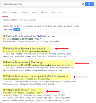
A search query on "Pebble Time review" would return the following results:
free keyword difficulty analysis

All of these make up the top 10 strong results, which is clearly hard to outrank by less authoritative websites.

But if you use long-tail keywords, there is a possibility that the results will include forums, non-relevant sites, YouTube videos, Yahoo Answers and other websites that will be easier to outrank or those that make up weak results. So, what you want is a keyword that will return weak search results.

But because there are no hard-and-fast rules in difficulty analysis, you need to use tools at your disposal. A keyword difficulty tool can come in many shapes and sizes, so to speak. It's not just a specific type of software, but a set of procedures that lets you identify keyword difficulty.

Perform difficulty analysis based on several principles


Competing Pages

Find out who your competitions are for a particular keyword or phrase. Simply type in the search terms you want to use on a search engine and check out the results. As a blog or a business, your competitors are other blogs or companies that are providing the same products or services, and using the same set of keywords. The top ten is your strongest competition.

You can further narrow down your search by looking into the number of pages being indexed that use the same search terms on the title. To do this, use one of Google's advanced search operator "allintitle", which will display websites where the keywords appear in the title.

Now that you know your competitors, it is important that you don’t make any decisions based solely on the data that you collected. Just use them as an indicator, since there are plenty of other elements that will keep you off the first page.

Top 10 Search Results

If you want to determine the metrics involved in keyword difficulty, determine the top ranking sites related to the terms you intend to use. Getting results is easy. It is making the searches non-personalized that is challenging, although not impossible. You just need to use the right tools to de-personalize your search and get the results that matter more. Using Chrome browser in incognito mode is one good example. What this does is to remove results returned based on search data and preferences, such as ads, news, images and YouTube videos.

Number of Links

Top-ranking pages are likely to have a significant number of external and domains pointing links based on certain key terms. If you use the same keywords, you would definitely have a hard time ranking. But if there is a top-ranking website with just a few direct links, you have a door of opportunity. Using Open Site Explorer or Majestic SEO, you can acquire a number of linking domains a website has. But know that a site with few high quality links can have the same authority as one with plenty of low quality links, which is why further analysis is necessary.

Off-Page Optimization

How strong a competitor website's off-page optimization is reflected on the number, authority and type of links it has, including the backlinks. Keyword difficulty analysis will look into page authority, domain authority, keyword in anchor text and the diversity of unique linking root domain.

On-Page Optimization

Now that you know who your competitors are, find out how well optimized they are. Think like a search engine and look for different signals that will help your keywords rank easily and effectively.
  • Keyword in title tag
  • Length of the title tag
  • Keyword in H1
  • Keyword in image alt text
  • Keyword in domain or URL
  • Keyword representation in anchor text or external links
  • Content quality
  • Optimization level (over optimized or not)
  • Use of questionable SEO practices
  • Internal linking architecture of a website
You can also keep your evaluation simple by just ranking each page's optimization as none, minimal, over, fair, decent or good, and excellent. Regardless of which step you take, however, this process takes a lot of work. If you want to cut down on the amount of effort and time you spend, you should filter your keyword list to a manageable size.

Perform difficult analysis using Google search operators

Google can be your best friend in difficulty analysis, and not just in knowing your competitions or the keywords they use. To maximize Google, however, you must use three of its special operators.

As already mentioned, allintitle returns results that contain your search terms on the title. allinurl, on the other hand display results with the keyword included in the URLs, and allintext returns search results with the keyword appearing within the content.

How do you use them to your advantage? Using the keywords "nike running shoes", for example, run a keyword difficulty analysis in Chrome. Don't forget to search in incognito mode to keep results organic and non-personalized. Take note of the total results and those that returned using Google's advanced search tools. The data you collect will look similar to the one below:

Keyword: nike running shoes

keyword difficulty analysis for total results

Results with allintext: nike running shoes

keyword difficulty analysis for results with allintext

Results with allinurl: nike running shoes

keyword difficulty analysis for results with allinurl

Results with allintitle: nike running shoes

keyword difficulty analysis for results with allintitle

What do the figures tell you?
  • If the total results are equal or close to 1,000,000, you have higher chances of ranking on the first page.
  • If the results with allintext are just 50% more than the total results, keyword difficulty is very high.
  • If the results with allinurl and results with allintitle is less or close to 1,000, the chances of ranking on the first page is high provided that certain criteria are met:
    • 2000+ words in-depth blog post
    • Proper image optimization
    • High Flesch Reading Score
    • Quick Load Spee
    • Good Social Shares
    • Efficient Inter Linking
    • Several high DA, PA Backlinks
    • Perform difficulty analysis using specialized checker
What is great about using Google search operators is that you will know your competitors during your research. But you can always take a shortcut through a keyword difficulty tool.

Perform keyword difficulty analysis using difficulty tools

Keyword Inspector
This is a free tool that you can use to analyze how difficult it is to rank a specific keyword. Every search term is ranked as Very Easy, Easy, Moderate, Difficult and Very Difficult.

Keyword Inspector keyword analysis tool

To start using it, you must first create an account. Once that is done, you can then run an analysis by typing in the keyword on the input box, choosing a country and then hit "Submit". You will get a tabulated result, with the keyword difficulty analysis indicated at the last column. It is highly recommended that you use search terms that is ranked moderate or less difficult.

Take note, however, that search results may vary from one country to the next. So don't make decisions based on them alone. Instead, combine it with other keyword difficulty tool.

MOZ Keyword difficulty tool
This tool is more comprehensive and comes with other useful features, making it an ideal choice. It may not be free, but it does give good value for your money. You can run 20 reports at one time, and a standard subscription has a daily limit of 400 reports.

To run a difficulty analysis, simply type in one or more keywords on the input box. You can separate the terms using a comma, tab or by typing it on a new line. Choose a search engine (Google, Bing, etc.) and country, and then hit "Check Difficulty" button. You will then get a report with the difficulty score and ranking factor indicated. The score is between 1% and 100%, with 1% as being easy and 100% as being very competitive.

What is great about this difficulty analysis tool is that you have the option to export the report as CSV, in case you want to run you own analysis. There is also a "Compare" button that will give you an idea which keyword has the lowest difficult score, yet has the most search volume - an excellent combination. Simply check on the keywords you want to compare, two or more at a time, and then hit Compare.

Take note that the data of search volume will always be for Bing even if you choose Google as your search engine. Don't worry though, since this would not affect the results in any way.

SEMrush
Originally a professional SEO tool designed for digital marketers, SEMrush has recently introduced a tool for keyword difficulty analysis where you can bulk check ranking of multiple keywords. It is not free, but you do get a 14-day free trial period. Look for the keyword difficulty analyzer under Tools, type in your keywords and then search for their difficulty score. You can put in a maximum of 100 search terms per line.

The great thing about this tool is that you get more in one go. That is, you not only learn about Keyword difficulty, but also Keyword Research, Competitors Analysis, and even Backlink Opportunities.

There are just a few examples of keyword difficulty tools that you can use. Among the three options, SEMrush is considered the simplest to use and is highly recommended for affiliate marketers and bloggers.

Keyword difficulty analysis can be done for app store optimization as well. Check out the result count to determine the number of apps targeting a particular keyword. Simply type in the search terms on the app store and both Apple and Google will show which apps use certain keywords. Another factor is volatility that provides a good indicator of how difficult it is to rank for a particular search term. Because finding volatility manually is hard, look for tools that you can use.

Once you have a list of keywords, sort and filter them out into different categories, such as immediate and short-term keyword targets, medium-term keyword targets that need to be groomed and grown, and long-term keyword targets that can be obtained through sustained effort.

Keyword difficulty analysis may seem like a new concept, but it is the new way of ranking in search engine results, which is why it is worth implementing in your SEO campaign.

How To Optimize Blogger Blog For Mobile Phones

how-to-optimize-blogger-blog-for-mobile-sites

Many blogging networks like wordpress, weebly, hostgator etc provides mobile sites to their users, similar to them blogger also provides this feature to its users. Blogger provides mobile site as well as templates for mobile sites which are well made for all mobile phone screens. Although blogger is good for blogging as it has desktop and mobile sites but like desktop template you have to optimize your blog for mobile phones. And for this you need to add some Gadgets, so that you could get benefit of your desktop as well as mobile site. 

Initially all blogger mobile sites have simple or default templates which allow only specific gadgets such as: 
  • Header(logo)
  • Footer(powered by blogger)
  • Page list
  • Blog(posts)
  • Adsense
  • Profile
So you can't get full benefit of your mobile site until you have optimized it. So in this post I will help you to optimize your blog for mobiles so that you could get benefit from your mobile visitors.

In this post you will learn following things:
  • How to optimize mobile template(basics).
  • How to hide all useless things in mobile site which shouldn't appear on mobile site.
  • How to show essential gadgets in mobile template(Related posts, Ads, Follow/Share buttons, Search box).
So lets begin, we will start from optimizing mobile template.

Optimizing Mobile Template In Blogger:

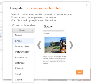
Blogger has many mobile templates e.g simple, dynamic, picture view, Awesome inc, Water mark tec.

mobile-templates-blogger-101helper

And all the templates have different views, all blogger templates have an awesome look but they do not give you full benefit as they don't allow ads and other custom gadgets. So you can't add related posts widget(which is essential to increase page-views). 

So you need to use custom template and optimize it. Follow below steps to switch on your custom mobile template.

Step 1: Go to template and click on the icon shown below mobile template.

How-to-optimize-blogger-blogs

Step 2: Choose the custom template and click on save.

Blogger-mobile-template-101helper

Congratulations! you have successfully switched on custom template for your blogger mobile site.

Hiding Things In Blogger Mobile Site:

Every blog has something that should be only on desktop such as a gadget. But when a blogger mobile template is switched to custom every thing you have added in your blog template will start appearing in mobile view too. Here I have to mention that only those things appear in mobile sites also if you have added it in template, but if you have added something in layout as a new gadget, it won't appear in mobile site until you have enabled it. So here I am going to show you how to hide something in mobile view of blogger by using xml.

Step 1: Go to template and click on edit html.

Step 2: Click inside the code and search for something which you want to show only in desktop and hide it in mobile site.


OR

Add something to your template for example a gadget or a comment or a picture.

Step 3: Now just before the code which you want to hide in mobile site paste the following piece of code:

<b:if cond='data:blog.isMobile == &quot;false&quot;'>

and after the code(which you want to hide in mobile site) type </b:if>

Explanation:

For example you have following code and you want to hide it in your mobile site:

<html>
<body>

<em>Emphasized text</em><br>
<strong>Strong text</strong><br>
<code>A piece of computer code</code><br>
<samp>Sample output from a computer program</samp><br>
<kbd>Keyboard input</kbd><br>
<var>Variable</var>

</body>
</html>

Then according to above method your code should look like below code:

<b:if cond='data:blog.isMobile == &quot;false&quot;'>
<html>
<body>

<em>Emphasized text</em><br>
<strong>Strong text</strong><br>
<code>A piece of computer code</code><br>
<samp>Sample output from a computer program</samp><br>
<kbd>Keyboard input</kbd><br>
<var>Variable</var>

</body>
</html> 
</b:if>

Gadgets For Blogger Mobile Site:

Blogger gadgets created by blogger or other websites aren't compatible with mobile sites so you have to use special gadgets for blogger mobile site you can find some mobile site gadgets here.

Showing Things Only In Blogger Mobile Site:

If your blog has something that you would like to show in mobile site only then its possible now, how? Just use the below piece of code above the content which you would like to show only in mobile site:

<b:if cond='data:blog.isMobile == &quot;true&quot;'>

and after it just add this piece of code:

</b:if>

For example I want to show this line in mobile site only "I am fahim, you can call me FK" then in my template it should be like this:

<b:if cond='data:blog.isMobile == &quot;true&quot;'>
I am fahim, you can call me FK
</b:if>

Now it will be shown only in mobile site. You can use this to show related posts widget in blogger mobile site.

Check out: More Mobile Blogging Tutorials To Improve You Mobile Site!

Hope you like this post. If you have any question please help me know by leaving a comment below.

Seach tags: Blogger mobile site,Blogger mobile site,Optimize Blogger Blog For Mobile Phones,Blogger mobile site gadgets,101helper

Create Shortcode For Responsive HTML Tables!


HTML Table ShortcodeAn HTML Table is the most important part of a webpage design that helps you organize content in rows and columns. If you have large HTML Tables then they can barely fit in small Mobile screens and if you try to squeeze it up, the tables either crash or becomes unreadable. Today we will help you create dynamic and Fancy Mobile Responsive HTML Tables using Shortcodes that are naturally fluid and responsive by nature. Instead of squeezing the Table we will let your mobile readers to horizontally scroll Table data using their Thumbs. Responsive Tables are touch sensitive and they can be scrolled to left or right, thus making your content both viewable and readable. All these thanks to Blogger Shortcode Plugin that helps you create amazing design tools with a simple one line code!

You will be able to insert HTML Tables inside your Blog Posts, widgets and guess what? You can even add Tables inside your blogger comments!


What is HTML Table Shortcode?


The table shortcode is a simple textual shortcut code that lets you create fancy Tables without using complex HTML. You can create tables directly from your Blogger Editor composer without needing to switch to the HTML mode.

You all know that a table consists of three important elements which are:


Element Definition
Row In HTML syntax we call it the <tr> tag but in our Shortcode we renamed it as [row]
Column In HTML DOM it is known as <td> which is the data container or data cell. You can insert text, images, lists, other tables or shortcodes here etc. In our shortcode we simplified it to [col]
Heading This tag is written as <th> In our shortcode you will call it [heading] which sounds much more readable.


Instead of using a complex ugly HTML code to design a table you can use a human readable shortcode that does wonders. Our Shortcode is not platform dependent. You can use it anywhere you like, may it be Wordpress, Joomla, Drupal, Blogger or a simple Static HTML webpage. It works great everywhere.


For The Record


So far this is the first Shortcode for HTML tables that does not uses the complex method of passing data as a long sequential array.  Instead you will construct the layout for your HTML Table using rows and columns to clearly organize data. Lets create one instantly!


1. Install Blogger Shortcode Plugin


In order to use Table shortcode you must first install the shortcode plugin for your blogspot blog by following 7 easy steps shared in the link below:


Skip installing it if you have already added it in your blogger template


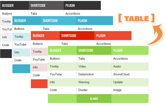
2. Add Color Themes


We have created 4 Color Themes.


  1. theme1 - Default Black

  2. theme2 - Blue

  3. theme3 - Green

  4. theme4 - Red


Add them to your templates by following these steps:


1 Go To Blogger > Template > Backup your Template


2 Click "Edit HTML"


3 Search for this code ]]></b:skin>


4 Paste the following Code just above it


/*----------HTML Table Shortcode--------*/


#theme1, #theme2,#theme3,#theme4{width:100%;font-family:sans-serif,arial; block;border-spacing: 0;}


#theme1, #theme2,#theme3,#theme4,#theme1 th, #theme2 th,#theme3 th,#theme4 th,#theme1 td, #theme2 td,#theme3 td,#theme4 td{border:1px solid #ddd;border-collapse:collapse}


#theme1 td, #theme2 td,#theme3 td,#theme4 td{padding:10px}


#theme1 th, #theme2 th,#theme3 th,#theme4 th{padding:12px 10px;text-align:left;font-family:oswald;font-weight:400; font-size: 17px;}


#theme1 tr:nth-child(odd){background-color:#f1f1f1}


#theme1 tr:nth-child(even),#theme2 tr:nth-child(even),#theme3 tr:nth-child(even),#theme4 tr:nth-child(even){background-color:#fff}


#theme1 th{background-color:#333;color:#fff;border:1px solid #333}


#theme1 th:nth-child(even){background-color:#555}

/*Blue*/


#theme2 tr:nth-child(odd){background-color:#d3ecf2}


#theme2 th{background-color:#42b0c9;color:#fff;border:1px solid #42b0c9}


#theme2 th:nth-child(even){background-color:#4bbad3}


/*Green*/


#theme3 tr:nth-child(odd){background-color:#e2f2d3}


#theme3 th{background-color:#a3e264;color:#fff;border:1px solid #a3e264}


#theme3 th:nth-child(even){background-color:#85c942}


/*Red*/


#theme4 tr:nth-child(odd){background-color:#efddda;}


#theme4 th{background-color:#ef4832;color:#fff;border:1px solid #ef4832}


#theme4 th:nth-child(even){background-color:#de1f05}

@media only screen and (max-width:768px) {#theme1,#theme2,#theme3,#theme4 {overflow-x: auto;display: block;}}


5 Save your template and all done!


Finally Create HTML Table Shortcode


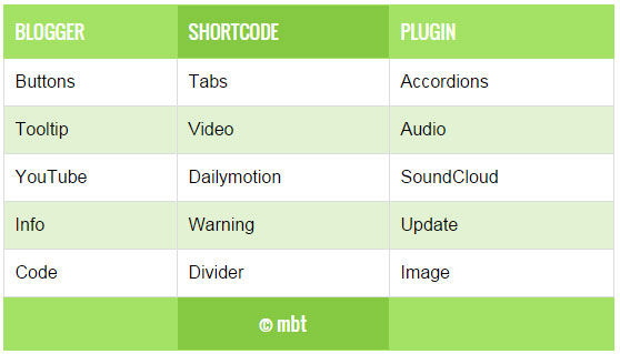
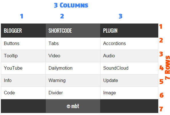
HTML Table Layout


  • The above image shows a Responsive Table with 7 Rows and 3 Columns.

  • Where each row contains three columns.

  • Columns are vertical and Rows are horizontal.


Headings are created using the following shortcode


[heading]Title[/heading]

Data inside table cells is inserted using the following shortcode


[col]Cell[/col]

FULL CODE

Now when you wish to add a Table inside your blog post, you will add the full shortcode in this format.


[table color="theme3"] 

[row] [heading]Title 1[/heading] [heading]Title 2[/heading] [/row] 

[row] [col]Cell 1[/col] [col]Cell 2[/col] [/row]


[/table]   

The above Shortcode will create a Green (theme3) Table with 2 rows and 2 columns as shown below

2 rows 2 columns


  • To choose a different theme color simply replace theme3 with theme4 or theme2

  • The default theme is theme1 for which you can use simply [table], no need to mention color attribute.


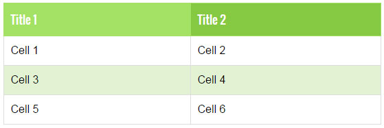
To Create a Table with  4 Rows and 2 columns you will use the shortcode in this format


[table color="theme3"]


[row] [heading]Title 1[/heading] [heading]Title 2[/heading] [/row]


[row] [col]Cell 1[/col] [col]Cell 2[/col] [/row]


[row] [col]Cell 3[/col] [col]Cell 4[/col] [/row]


[row] [col]Cell 5[/col] [col]Cell 6[/col] [/row]


[/table]

4 rows 2 columns

Lets Create a table with 4 Rows and 3 columns.


[table color="theme3"] 

[row] [heading]Title 1[/heading] [heading]Title 2[/heading] [heading]Title 3[/heading] [/row] 

[row] [col]Cell 1[/col] [col]Cell 2[/col] [col]Cell 3[/col] [/row] 

[row] [col]Cell 4[/col] [col]Cell 5[/col] [col]Cell 6[/col] [/row]


[row] [col]Cell 7[/col] [col]Cell 8[/col] [col]Cell 9[/col] [/row]


[/table]

4 rows 3 columns


Wasn't that easy? You just need to keep care of the pattern in which you organize the cells. The table will take the shape of the pattern you create using the shortcode. You can insert images, text, lists, videos, other shortcodes and almost any HTML you want!. Sky is the limit with Table Shortcode =)

List of Blogger Shortcodes


Need Help?


If you need any further help do let us know. You can also join our 24/7 Free help and support forum to ask for further technical assistance.


Blogger shortcode Plugin have been our biggest contribution to Blogspot blogs. We hope to bring and introduce more such amazing plugins and tools to make your blogging journey worthwhile. Peace and blessings buddies! =)


Search Box For Blogger Mobile Site

Search Box For Blogger Mobile View

Like other blogging networks blogger also has mobile view for mobile users. It loads very quickly as it is in kilo-bites so mobile users can also read blogs by wifi connections or by mobile data. Blogger provides mobile view and also templates for it, but you have to optimize it in your way to get benefit of it e.g enabling ads, enabling essential gadgets(follow button, search box, related posts etc). It will help you to get more traffic as after optimizing your blog for mobile phones, you will be able to get mobile views too instead of loosing it. The default gadgets aren't optimized for mobile view so you need to use optimized gadgets for mobile view, One of the most essential gadgets(search box) which is powered by blogger doesn't work in all mobiles, it works only in smartphones like Iphone, Android, Htc, Nokia lumia phone etc but the phones which don't have android or ios aren't optimized for the common search box so you have to optimize search box to make it work in all mobile phones whether it is smart or not. Although the default search box works in smartphones but if it is used to search something, it works very slowly and the pages take too much time to load because the page is first searched for desktop fist and then converted to mobile view. So in this post I will share a well optimized search box for blogger mobile view which will work in all mobile phones.

How to add search box in blogger mobile view:

Step 1: Go to blogger dashboard and navigate to layout:

search-box-for-mobile-view-blogger

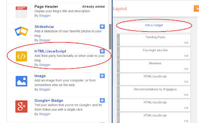
Step 2: Click on Add a gadget > Html/javascript.

how-to-add-a-gadget-in-blogger
Step 3: Copy below code and paste it into Html//javascript window:

<!-- Search box for blogger mobile by 101helper.blogspot.com -->

<form id="searchbox" method="get" action="/search">

<input name="q" type="text" id="search-in" size="19" required />

<input name="m" type="hidden" value="1" />

<button type="submit"  class="_54k8 _56bs _56b_ _56bw _56bu"  id="u_0_1" data-sigil="touchable"><span class="_55sr">Go!</span></button>

</form>

<style>

form#searchbox {
  position: relative;
  left: -40px;
  right: 0px;
  margin-left: 24%;
  margin-right: 24%;
width: 85%;
}
button#u_0_1 {
  position: relative;
  width: 45px;
  height: 25px;
color:white;
background:#4491f0;
border-color:#4491f0;
}
input#search-in {
  height: 20px;
}
</style>
<!-- Search box for blogger mobile by 101helper.blogspot.com -->

Step 4: Click on save and you are almost done but it will show up in desktop so you have to hide it from desktop and show it only in mobile view, follow next step to move ahead!

Related post: How to show a widget in mobile view only in blogger?

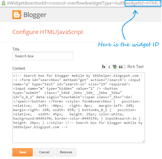
Step 5: Edit the mobile search box gadget which you added now and search for the widget id, see below image for instance.

how-to-find-id-of-a-widget-in-blogger


Step 6: Note the widget ID and go to template > Edit Html:

how-to-edit-html-in-blogger

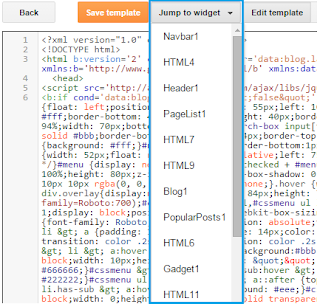
Step 7: Click on Jump to widget and click on the widget ID of search box gadget which you found in step 5.
how-to-find-a-widget-in-blogger-template

Step 8: After finding the widget type mobile='only' beside locked='false'.

enable-a-widget-in-blogger-mobile-only

Step 9: Click on save template and you are done.

If the search box still fails to appear in mobile view of your blog then go to template > Click on Customize mobile template icon > Switch default template to custom and click on save.

custom-template-blogger-mobile

custom-template-blogger

Open your blog by using this link http://myblog.blogspot.com/?m=1 to see your search box. This search box will work in all mobile phones and will work fast.

Hope you like this article and it was helpful to you, if you have any question please help me know by leaving a comment below.

How To Optimize Post Links In Blogger For Higher Search Results

How-To-Optimize-Post-Links-in-Blogger-seo


For higher search results seo optimization is very important and for that you have to keep all things in mind like description, title and links. As description and title optimization is discussed before so in this post we will talk about link optimization only. So in this post I will tell you how to optimize your blogger blog post links for higher results and also how does it help in search results.

How It Works?

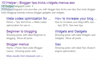
It works in a very simple way for example if you search "101helper" on Google you will find following results:

Optimize-Post-Links-in-Blogger-seo

In above search results "101helper" is shown in bold style(highlighted) which we searched on Google. You can see that "101helper" is highlighted two times one in description and other in link so in this way link optimization is good for seo.

How To Optimize Post Links In Blogger: 

Follow below steps to optimize your blog post's links for seo. You have to follow it whenever you are going to publish a post:

Step 1: Go to blogger dashboard > Posts > New post.

Step 2: write title of your post and click on save:

How-To-Optimize-Post-Links-in-Blogger-seo-101helper

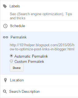
Step 3: Click on Permalink on right side of the editor below Schedule:

Seo-tutorials-blogger-101helper

Step 4: Switch to Custom Permalink from Automatic Permalink.

How-To-Optimize-Post-Links-in-Blogger-seo-blogspot

Step 5: Type keywords of your post which are searched on Google more frequently and click on Done.

Note: Use a hyphen(-) after each keyword you write. For example if your link is http://myblog.blogspot.com/2015/05/this-is-my-link and you want to optimize it by adding some keywords to it then you have to type a hyphen after each word e.g http://myblog.blogspot.com/2015/05/this-is-my-link-fully-optimized

If you use dots(.) or blank space blogger won't accept it.

http://myblog.blogspot.com/2015/05/this-is-my-link-fully-optimized 

http://myblog.blogspot.com/2015/05/this is my link and its not optimized 
http://myblog.blogspot.com/2015/05/this.is.my.link.and.its.not.optimized 

Step 6: Publish your post and you are done.

Don't try to use underscores(_) in your links its not good for seo. 

Hope you like this post and it was helpful to you. Follow and subscribe to get more seo tutorials in your inbox. Share this post with others and visit 101Helper again for new posts.

How To Safely Hide AdSense Ads using "Display:none" ?

hide Adsense ads using "display none"AdSense new policy allows publishers to only hide Responsive Ads using CSS media queries. You can choose to control the display of your Ad visibility on different mobile devices. You can now choose when to show or hide an ad unit. All these is now possible thanks to the Responsive Ad units. We recently shared a tutorial on how to create responsive ad spots and how to stop AdSense from serving blank space on Responsive ad units by fixing the blank space error. Today we will take a step ahead and share the trick of hiding AdSense Ads  on any screen size you want using simply CSS "Display:none" property.  Note that Google only allows you to hide the content using the CSS property of display and it does not yet allow using "visibility:hidden" property so we will only follow techniques which goes in accordance with AdSense Program policies. Sites which are hiding the AD code using "visibility hidden" are surely not following recommended methods and pose a serious thread to your accounts so always follow authentic methods to manage your monetization strategies.

In this tutorial we will share how you can set a parameter with CSS media queries for smaller mobile devices so that no ad request is made and no ad is shown. We have applied it on our blog and have set ads not to display on small screens.

Isn't it illegal To Hide AdSense Ads?

Yes it is but only for synchronous ads but not for asynchronous which is the new code AdSense creates to render responsive ads on your blogger blog or website.

The official support site of Google says that it allows publishers to modify the Ad by hiding it using CSS3 Media queries for responsive Ad units (asynchronous) only but it disallows it for synchronous ads. Here is the block quote for verification:

Techniques to avoid

Here are some techniques you’ll want to avoid:

  • Hiding ad units at anytime (e.g., display:none), unless you're implementing a responsive ad unit.
  • Implementing AdSense ad code in a way that covers content
  • Using any means to force the display of more than three AdSense ad units on a page
  • Manipulating the ad targeting using hidden keywords, IFRAMEs, or any other method
  • Distributing ads in emails or software
  • Floating ads or units that slide to attract unwarranted attention

Google has suggested itself the technique of using display:none on one of its support page

If you want to only show ads for certain screen sizes you can use CSS to accomplish this. The following example shows you how to modify your ad code to use CSS3 media queries to hide ads for specific screen sizes..

Now when we have learnt that the method of using CSS display:none is completely Safe, allowed and legal, we can then proceed towards our tutorial.

Hide AdSense Responsive ADs

I assume that you have read our tutorial on creating responsive ad units, if not kindly read it first

You just need to make a slight modification to the CSS code of your ad code and mention on which Screen Size would you like to hide displaying ads. All code is same that we shared earlier except the yellow highlighted section

<style type="text/css">
.adslot_1 { max-width: 300px; height: auto; margin:10px 0px; }

@media (max-width:99px) { .adslot_1 { display:none; } }

@media (min-width:100px) { .adslot_1 { width:125px; height:125px; } }
@media (min-width:180px) { .adslot_1 { width:180px; height:150px; } }
@media (min-width:200px) { .adslot_1 { width:200px; height:200px; } }
@media (min-width:250px) { .adslot_1 { width:250px; height:250px; } }
@media (min-width:300px) { .adslot_1 { width:300px; height:600px; } }
@media (min-width:336px) { .adslot_1 { width:336px; height:280px; } }
@media (min-width:468px) { .adslot_1 { width:468px; height:60px; } }
@media (min-width:728px) { .adslot_1 { width:728px; height:90px; } }

</style>

<script async src="//pagead2.googlesyndication.com/pagead/js/adsbygoogle.js"></script>
<ins class="adsbygoogle adslot_1"
     style="display:inline-block;"
     data-ad-client="xxxxxxx"
     data-ad-slot="xxxxxx"></ins>
<script>
(adsbygoogle = window.adsbygoogle || []).push({});
</script>


The above code has no changes except the yellow highlighted section where I have set ads not to display for screen sizes less than 99px. For sizes greater than 99px, ads will display normally. I have chosen 99px because normally all smart phones today have a wider screen size and day by day screen sizes are getting bigger except for some old sets which have an extremely small size and it makes no sense displaying ads on smaller screen sizes.

Hiding them will block the ad from rendering and loading. The JavaScript will not load this time unlike in synchronous where the JS still loads despite setting display:none. This is one extra benefit of using async codes. So you are not actually setting Ads to not show or disappear you are actually telling AdSense not to load Ads for a specific screen size.

You can also set a custom width to hide ads on a specific screen size. Suppose you wish to Hide ADs on a screen size between 250px but wish to display it for other screen sizes  so you will edit the code as shown below

PS: I am just sharing the CSS code here for simplicity:

<style type="text/css">
.adslot_1 { max-width: 300px; height: auto; margin:10px 0px; }

@media (min-width:100px) { .adslot_1 { width:125px; height:125px; display:block; } }
@media (min-width:180px) { .adslot_1 { width:180px; height:150px; display:block; } }
@media (min-width:200px) { .adslot_1 { width:200px; height:200px; display:block; } }
@media (max-width:250px) { .adslot_1 { display:none; } }
@media (min-width:300px) { .adslot_1 { width:300px; height:600px; } }
@media (min-width:336px) { .adslot_1 { width:336px; height:280px; } }
@media (min-width:468px) { .adslot_1 { width:468px; height:60px; } }
@media (min-width:728px) { .adslot_1 { width:728px; height:90px; } }

</style>

The code above will hide ads for a screen size 250px or less than 250px but will show ads for 200px, 180px and 100px or for screen sizes greater than 250px.

Note that we are using max-width to hide ads and not min-width condition. This is important because Ads are hidden and no AD request is made only when you use the max-width condition.

That's it!

Need Help?

Hope this tutorial may help you understand how to better control the display of Ads on your web pages. I am open for as many questions as you may wish to ask. Feel free to post your queries in the comment box below.

Peace and blessings buddies! =)

AdSense Responsive Ad Units Showing Blank Space in Blogger - [Fix]

Adsense Ads show blank spaceIt is almost a year since Google introduced Responsive Ad units for Mobile friendly weblogs and sites. Previously the Ads were synchronous which had a fixed ad size and were slow too in loading but now all responsive Ad units are  asynchronous in nature which means they will render and load seamlessly without effecting other elements from loading on your web page, this immensely reduces your blog load time.  One of the problems linked with Responsive Ad units is that most bloggers found it difficult displaying the async code on their blogspot blogs. For many users the responsive Ad unit shows a blank space or gives an error on browser console.

Many blogspot users contacted us how we managed to show responsive ad units on all our sites So today we will share the solution that will help you display responsive AdSense Ads in Blogger that is the only Fix to avoid the vacant space issue  (no Ad being displayed) and you will also learn how to hide AdSense ads using the display:none property which is now amazingly allowed only for asynchronous ads by Google.

Update : Safely Hide AdSense Ads using "Display:none"

DEMO: All Ads that you see on this blog are Responsive. Due to Low CTR we have reverted back to Synchronous
Tutorial Series
3. Hiding Widgets & Scripts in Mobile Templates [1], [2]
6. Create Mobile Responsive AdSense Ads and Safely Hide AdSense units
7. Make Blog Sections Responsive: Header Widgets, Posts + Sidebar, Footer

Why Should You use Responsive Ad Units?

Just like how a Responsive web design allows you to dynamically control the presentation of your webpage according to the properties of the screen size that it’s being viewed on similarly a responsive ad unit allows you to control the ad size on your page. You can choose which Ad size to display on your iPhone, Samsung, Tablet or iPad. You can also decide when to display ads and when to hide it for small screen devices.

Following are reasons why you should use responsive units

  1. Your Ads load asynchronously, thus making your page load faster as opposed to the Old Adsense Code which slows down web page loading.
  2. Automatic sizing based on the space available, shows high resolution ads to your visitors thus increasing overall CTR. Your ads will not look chopped or cut from edges on small screens.
  3. You can now Hide Ads! Google now allows users to use the display:none CSS property to hide Ad units. This is only allowed for responsive units.
  4. Mobilegeddon Penalty punishes sites that are not mobile friendly and which do not load fast. Responsive Ad units makes your ads fluid and flexible and make pages load faster, thus providing the best user interface.

The only drawback is that Adsense responsive Ads do not change size on device orientation unless page is reloaded. So same ad will be displayed in both landscape and portrait view when the user rotates the device without page reloading.

Why Do you See a Blank Space?

If you are seeing a blank space or empty Ad spot with no ad being displayed then you are probably making one of these mistakes:

Popular Reasons

  1. The Parent container has no width set: Async Ad code won’t load if you have not mentioned a width to the container where you placed the ad. You must define a class for your Ad code to control its display using CSS Media Queries.
  2. You didn't remove the data-ad-format tag: You will see the following error on your browser console when you forget to mention a width to the Ad container or when you have not removed the smart-sizing tag i.e. data-ad-format="auto" This tag is the major reasons for Ad not being displayed. Google need to work on it to make it work better.

    responsive-ad-size-console-error

  3. If ads are displaying fine on your sidebar widgets but not working inside blogger template then the only reason this is happening could be that you did not encode the HTML code correctly. We will discuss below how to do it.

Less Popular Reason

Your site uses third-party JavaScript: If you are using scripts to hide ads until all page content have loaded then Async Ad code won't load because it will not be able to calculate the required size for the responsive ad unit.

In both these cases, you will see a blank space and no Ad being displayed. We will guide you how to fix the first reason and for the 3rd-Party JavaScript thing, I am sure this does not apply to most users because rarely would anyone use such a script. So lets go straight to the solution!

Create a Responsive Ad Unit

Note: The method described below abides by the Google AdSense Program Policy rules and is safe and tested.

You will Create an ad unit in the usual way:

  1. Go To your Adsense Account
  2. Click My Ads tab
  3. Click "New Ad unit"
  4. Choose “Responsive” from the Ad size options
  5. Fill other details and click Save and get code.

select responsive Ad size


Your code will look quite similar to this:

<script async src="//pagead2.googlesyndication.com/pagead/js/adsbygoogle.js"></script>
<ins class="adsbygoogle"
     style="display:block"
     data-ad-client="ca-pub-5679872456940800"
     data-ad-slot="4890310675"
     data-ad-format="auto"></ins>
<script>
(adsbygoogle = window.adsbygoogle || []).push({});
</script>

From the above code you just need your data-ad-client alpha-numeric code and your data-ad-slot numeric code as shown bolded in the code above. Copy these two codes from the Adsense code you generated and keep them safe inside a notepad because we will need them later.

Add Responsive Ad Units inside Blogger Widgets

If you wish to add AdSense Content unit inside a widget on your sidebar then follow these steps:

1. Go To Blogger > Layout

2. Click "Add a Gadget"

3. Select "HTML/JavaScript" Widget

4. Paste the following code inside it

<style type="text/css">
.adslot_1 { max-width: 300px; height: auto; margin:10px 0px; }

@media (min-width:100px) { .adslot_1 { width:125px; height:125px; } }
@media (min-width:180px) { .adslot_1 { width:180px; height:150px; } }
@media (min-width:200px) { .adslot_1 { width:200px; height:200px; } }
@media (min-width:250px) { .adslot_1 { width:250px; height:250px; } }
@media (min-width:300px) { .adslot_1 { width:300px; height:600px; } }
@media (min-width:336px) { .adslot_1 { width:336px; height:280px; } }
@media (min-width:468px) { .adslot_1 { width:468px; height:60px; } }
@media (min-width:728px) { .adslot_1 { width:728px; height:90px; } }

</style>

<script async src="//pagead2.googlesyndication.com/pagead/js/adsbygoogle.js"></script>
<ins class="adsbygoogle adslot_1"
     style="display:inline-block;"
     data-ad-client="xxxxxxx"
     data-ad-slot="xxxxxx"></ins>
<script>
(adsbygoogle = window.adsbygoogle || []).push({});
</script>

Make these changes:

  • Set 300px equal to your sidebar width. If your sidebar is 400px in size then set width to 400px. Suppose If you want to display ads on Footer or Header where you may even display large Leaderboard ads then you may set the width to 800px.
  • Replace xxxxxxx with the alpha-numeric code of Client ID that you saved inside a notepad.
  • Replace xxxxxx with the numeric code of your Ad slot that you saved inside a notepad.

5. Save your widget and you are all done!

The code above will display a Half Page Ad, Squares and Rectangles for small, medium and large sizes based on the Mobile Device Screen size.

The above code will display best performing Adsense ads on your sidebar. I have assigned the best performing Larger Ad units to the code above to give a higher CTR. The table below shows how great larger ad units perform compared to smaller units.

best performing AdSense ad units

The above chart was shared by the AdSense optimization team in an online webinar.

Want to Add more Ad units?

If you want to add another Ad unit on your sidebar then you can use the same code as I shared above with a slight change.

  • You will replace adslot_1 with adslot_2 everywhere. To add a third unit replace adslot_1 with adslot_3 and so on..

Add Responsive Ad Units inside Blogger Template

To ad responsive Ads inside the blogger template you need to make a slight modification to the code above. We need to encode the JavaScript code which renders the ads. I have made all changes for you. You just need to use the code below instead:

<style type="text/css">
.adslot_1 { max-width: 300px; height: auto; margin:10px 0px; }

@media (min-width:100px) { .adslot_1 { width:125px; height:125px; } }
@media (min-width:180px) { .adslot_1 { width:180px; height:150px; } }
@media (min-width:200px) { .adslot_1 { width:200px; height:200px; } }
@media (min-width:250px) { .adslot_1 { width:250px; height:250px; } }
@media (min-width:300px) { .adslot_1 { width:300px; height:600px; } }
@media (min-width:336px) { .adslot_1 { width:336px; height:280px; } }
@media (min-width:468px) { .adslot_1 { width:468px; height:60px; } }
@media (min-width:728px) { .adslot_1 { width:728px; height:90px; } }

</style>
&lt;script async src=&quot;//pagead2.googlesyndication.com/pagead/js/adsbygoogle.js&quot;&gt;&lt;/script&gt;

<ins class="adsbygoogle adslot_1"
     style="display:inline-block;"
     data-ad-client="xxxxxxx"
     data-ad-slot="xxxxxx"></ins>
<script>
(adsbygoogle = window.adsbygoogle || []).push({});
</script>

The yellow highlighted region shows the encoded code. You will make same changes to the above code as you did for the sidebar. No extra steps involved here. Simply copy the code, make changes as guided and start enjoying a better Mobile revenue thanks to Google Adsense Responsive Ads!

See them in action!

The ad in the footer of this blog is responsive so I am sharing some screenshots from iPhone devices to show how the ads auto adjusts itself based on device screen size.

Actual size on laptops and Tablets (728 X 90 Ad Size)

Adsense ads on ipad mini


iPhone Portrait view  (300 X 250 Ad Size)

Adsense ads in portrait view


iPhone Landscape view (468 x 60 Ad size)

Adsense ads in landscape view

Need Help?

This is the first and only tutorial which guides you properly on how to setup Responsive Ads on blogspot blogs, if you need any help or further assistance then please feel free to let us know by posting your question in the comment box below or by joining our 24/7 Free Help forum.

In our next tutorial, we will discuss how to use display:none property to hide Adsense on small screen devices. Till then do experiment with the code above and do let us know your feedback. Peace and blessings buddies! =)