Showing posts with label CSS and HTMLTricks. Show all posts

5 Cool CSS Tricks To Spice Up Your Website


CSS tricks

CSS is a basic part of any webpage, and is what gives the page its distinctive look. CSS can be simple yet complicated at the same time, from a simple typography rule to a complex animation. It can be used to create amazing things. Today, we'll share some CSS styles which you might useful, and may use on your website to spice things up a bit.


1. Blurry text


Blurry text has a certain appeal, and is often used to direct attention towards a specific piece of text. Not to mention it looks cool :) Here's the CSS for making some text blurry. The trick is to fist make the text transparent, then add a drop shadow like so;


.blurry-text {


   color: transparent;


   text-shadow: 0 0 5px rgba(0,0,0,0.5);


}


Here's a sample text that is really blurry.


2. Animated gradient


Sounds cool, right? Well it is. Strictly speaking, you cannot animate a gradient color unlike some of the other CSS properties. You can, however, move the background around to make it look like it's animated.


button {


    background-image: linear-gradient(#518712, #124555);


    background-size: auto 200%;


    background-position: 0 100%;


    transition: background-position 0.5s;


}


button:hover {


    background-position: 0 0;


}


3. Image Grayscale


Grayscale tones up an image and makes it look classy and cool. You can apply an SVG filter to an image to turn it into grayscale.


<svg xmlns="http://www.w3.org/2000/svg">


    <filter id="grayscale">


        <feColorMatrix type="matrix" values="0.3333 0.3333 0.3333 0 0 0.3333 0.3333 0.3333 0 0 0.3333 0.3333 0.3333 0 0 0 0 0 1 0"/>


    </filter>


</svg>


img {


    filter: url(filters.svg#grayscale); /* Firefox 3.5+ */


    filter: gray; /* IE6-9 */


    -webkit-filter: grayscale(1); /* Google Chrome, Safari 6+ & Opera 15+ */


4. Customizing link types


You can use CSS to customize how different types of links appear based on their file formats. You can set http:// links to appear a certain way, and mailto: and .pdf files to appear another. Here's the CSS;


a[href^="http://"]{


    padding-right: 20px;


    background: url(external.gif) no-repeat center right;


}


/* emails */


a[href^="mailto:"]{


    padding-right: 20px;


    background: url(email.png) no-repeat center right;


}


/* PDFs */


a[href$=".pdf"]{


    padding-right: 20px;


    background: url(pdf.png) no-repeat center right;


}


5. Vertical alignment


Vertically aligning something can be a real pain. There's no simple property you can apply to everything. Here is, however, a CSS3 transform style which you can use to vertically align anything.


.verticalcenter {


    position: relative;


    top: 50%;


    -webkit-transform: translateY(-50%);


    -o-transform: translateY(-50%);


    transform: translateY(-50%);


}


Got any more cool CSS tricks you want to share with us? Let us know in the comments section below! Cheers :)

Drawbacks of JQuery Lazy Load Plugin For Posts and Images

Lazy Load For blogger blogsJquery and CSS3 has enabled front end developers and even designers to create amazing effects but unless you check the compatibility of the code, never play with such plugins and tools because there are still people who don't use JavaScript in their browsers and your blog will look no less than a mess to them. This effects both your readership and blog pageviews. We are observing a growing trend of Jquery implementation on both Blogger and Wordpress blogs. A Famous known plugin is Lazy Load for images (inspired from Yahoo plugin) and Lazy Load for blogger posts (Also called infinite scrolling). Lazy load for images delays loading of images in long web pages and makes the page load faster, on the other hand Infinite Scrolling plugin for Blogger keeps on loading posts as you scroll down the page just like you scroll down to load more tweets in twitter.

Note: Jquery is a library of JavaScript which is a simplified version JavaScript. It simplfies calling complex functions and saves time.

Most of MBT readers often complain why we don't publish such plugins and why we don't write tutorials on blogger Dynamic Views. The answer is simple, we are very careful when we suggest widgets and resources to our readers and we will never encourage them to apply a script on their blog that may cause harm to them in one way or the other. Even a Google employee himself commented on our post when we openly discouraged readers not to apply Dynamic views unless they are willing to accept its pitfalls behind the attractive AJAX look.

One of the bitter truth is that blogs using Dynamic views don't even load if JavaScript is disabled on a page! Imagine those thousands of views that you might be loosing because of using a Jquery script that does not take care of what-to-do if-JavaScript disabled scenarios. Today I will talk from development perspective and I really recommend that you read and understand this post clearly and clear your doubts.

How to view your blog by disabling JavaScript?

In order to check if your blog at least is loadable and provides fair interface to your visitors with JavaScript-disabled browsers, I will guide you by giving several examples. Lets take an example of the Gmail blog which uses the Jquery Easy Load effect and also runs on a Dynamic Theme.

What did you observe?

You observed a lazy loading effect as you kept on scrolling down. The posts kept on loading infinitely. Interesting isn't it? But now lets viist the same blog with JavaScript enabled.

Disable JavaScript:

For simplicity I am assuming you are using Google Chrome Browser. Following these steps to disable JavaScript in chrome.

  1. Go To Settings
  2. Click Advanced Settings
  3. Click Content settings under Privacy
  4. Then inside the popup window you will find an option to turn Off  JavaScript as shown in the image below:

Turn Off JavaScript in chrome

   5. Hit the Done button

Now visit the same Gmail blog again. Refresh the page and tell me what do you see?

You see a blank page! This explains everything to you. In Custom Blogger templates which are using Infinite Scrolling effect and if JavaScript is disabled by user then only the first post or second post will display and the remaining posts wont even show up on your homepage . Consequences are such that you lose precious Page Views.

What would you see on blogs where Image Lazy load effect is used?

You will see only first image or second image being displayed the other image wont event appear. If the plugin developer was clever enough to set conditional statements for JavaScript Disabled browsers, all your images will display just fine else your readers would be lost with no image being displayed.

When and How to use JQuery?

With all that being said, we leave the decision on you whether you wish to use this trending Loading effect for your blogger posts/image or not, but at least this explains now why we don't write tutorials on such tools.

You can surely add Jquery to add some cool effects to your blog design as long as the object using it loads fine even if JavaScript is disabled. Normally you can use JavaScript to create widgets like Recent comments, Popular Posts, Related Posts etc. because even if they don't load, they will at least not return a blank Page or effect your pageviews.

If you are developer then I recommend to add conditions to how your code may react in case of No JavaScript support. Instead of using just the display:none property in your stylesheet also add an extra div section for your object and control its behaviour using JQuery. Follow this Psedudo code:

If JavaScript Supported

Do this

Else

If JavaScript not supported

Do this

Now you would wonder how to check whether a browser supports JavaScript or not. If a browser supports it then it will surely execute the code else it wont. So if you don't want a div section to display when Jquery is supported simply add display:none property to it using Jquery AddClass() function. This Jquery function won't execute if JavaScript is disabled and thus the div section will show up correctly on screen  but this div section will not display if Javascript is enabled because the Addclass() function will execute and hide it on screen. That's how I personally handle this problem. You can surely apply different logics.

An Honest Advice:

The number of internet users are turning into publishers at a fastest rate, therefore you must be careful when applying a tutorial to your blog and extra careful when the tutorial talks of Jquery and SEO. I am observing baseless SEO tips coming from new bloggers that causes more harm to blogs at long term then a short term relief. Almost every new blogger has started sharing his own ideas of SEO and writing codes. This is surely encouraging but on the other side incorrect knowledge has caused several blogs to be hit by Google penalties such as Panda and Penguin. Be extra careful whom you read and follow. I am here for any help you may need and wish to hear your views on this topic. Wish you good health and peace buddies. :)

The same problem is seen with latest GooglePlus comments Plugin!

Animation using CSS3 KeyFrames and jQuery's scrollTop() function

css3 keyframesJquery is indeed the most compressed and efficient library of JavaScript introduced so far that has made a web developer's job more easy. Its built in functions of show(), hide(), AJAX() and my beloved scrollTop() are indeed the most used functions that gives a new life to user interface (UI). CSS3 animations using @Keyframes rule is one of the most innovative things I came across so far. Pseudo elements such as :before and :after are increasingly being used now because they eliminated the use of unnecessary div tags.

These days since  I am on vocations I am trying to improve skills of both Jquery and CSS3. From the combination of beautiful web tricks that I learnt so far, I managed to design a simple scroll to top button that uses JQuery's scrollTop function to produce smooth scrolling and is spiced up with CSS3 effects to make it stand out. I have created just two sample versions with circular and rectangular shapes. The Styles are extremely easy to be customized. Lets first see a demo for the circular one:


Live Demo

Don't forget to check our previously released versions of back to top buttons:


How to add it to Blogger?

  1. Go To Blogger > Template
  2. Back up your template
  3. Click Edit HTML
  4. Search for <head>
  5. Just below it paste the following scripts:

<script src='http://ajax.googleapis.com/ajax/libs/jquery/1/jquery.min.js' type='text/javascript'/>
<script src='http://downloads.mybloggertricks.com/scrolltop.js' type='text/javascript'/>

Note: I have included the dynamic link for jquery so you wont need to update it when a new version of Jquery is released. It will update automatically.

   6.  Now Search for ]]></b:skin>

   7. Just above it paste one of the following styles

For circular one use this code:

/* ----- MBT's Back-To-Top Button Circular version -----*/

@-webkit-keyframes arrow_to_top{
    0%{
        top:10px
    }
    50%{
        top:5px
    }
    100%{
        top:10px
    }
}
@-moz-keyframes arrow_to_top{
    0%{
        top:10px
    }
    50%{
        top:5px
    }
    100%{
        top:10px
    }

}
@keyframes arrow_to_top{
    0%{
        top:10px
    }
    50%{
        top:5px
    }
    100%{
        top:10px
    }

}

#back-top, #back-top:hover{
    position: fixed;
    display:block;
    display:none;
    bottom: 20px;
    right:20px;
    cursor:pointer;
    width: 52px;
    height:52px;
    text-align: center;
    text-decoration: none;
    color: #797e82;
    color: rgba(100,100,100,0.8);
    font-size:16px;
    border:1px solid #c5ccd3;
    border-radius:30px;
    z-index:9999;
    padding-top:35px;
    -webkit-box-sizing: border-box; 
    -moz-box-sizing: border-box;    
    box-sizing: border-box;             
    background: #dee1e7;
    background: rgba(208,215,222,0.5);
}


#back-top:hover{
    color:#000;
    text-shadow:1px 1px 0 #fff;
    background: #d0d7de;
    background: rgba(208,215,222,0.9);
    border-color:#8fa8c1;
}
#back-top:before{
    display:block;
    content:"";
    position:absolute;
    z-index:998;
    background: #e2e3e6;
    background: rgba(222,225,231,0.3);
    width: 66px;
    height:66px;
    border-radius:35px;
    border:1px solid #c5ccd3;
    top:-9px;
    left:-9px
}
#back-top:hover:before{
    border-color:#8fa8c1
}
#back-top:after{
    display:block;
    content:"";
    position:absolute;
    z-index:10000;
    background: url(https://blogger.googleusercontent.com/img/b/R29vZ2xl/AVvXsEhFuOVRzhMhBC95-xzx7XQsdM8WPQX5Z-8mE__Zvs_qxReSicbX8bsSdR8FCgXDWv_0KhaA5xDqmgsP2Tk3t9gI_YkxOQt2oe5kiCD5-kMuhbai1YY9HHR5p4MnCS5GTqi5mLnVIdiOSAkQ/s400/sprite-mbt.png) -10px -5px no-repeat;
    opacity:0.5;
    width: 10px;
    height:23px;
    top:10px;
    left:50%;
    margin-left:-5px;
}

#back-top, #back-top:after, #back-top:before{
    -webkit-transition: 0.5s;
    -moz-transition: 0.5s;
    -o-transition: 0.5s;
    -ms-transition: 0.5s;
    transition: 0.5s;
}
#back-top:hover:after{
    opacity:1;

    -moz-animation-duration: .5s;
    -moz-animation-iteration-count: infinite;
    -moz-animation-name: arrow_to_top;
    -moz-animation-timing-function: linear;

    -webkit-animation-duration: .5s;
    -webkit-animation-iteration-count: infinite;
    -webkit-animation-name: arrow_to_top;
    -webkit-animation-timing-function: linear;

    animation-duration: .5s;
    animation-iteration-count: infinite;
    animation-name: arrow_to_top;
    animation-timing-function: linear;
}

For Rectangular one use this code:


/* ----- MBT's Back-To-Top Button Rectangular version -----*/

@-webkit-keyframes arrow_to_top{
    0%{
        top:10px
    }
    50%{
        top:5px
    }
    100%{
        top:10px
    }
}
@-moz-keyframes arrow_to_top{
    0%{
        top:10px
    }
    50%{
        top:5px
    }
    100%{
        top:10px
    }

}
@keyframes arrow_to_top{
    0%{
        top:10px
    }
    50%{
        top:5px
    }
    100%{
        top:10px
    }

}

#back-top, #back-top:hover{
    position: fixed;
    display:block;
    display:none;
    bottom: 20px;
    right:0px;
    cursor:pointer;
    width: 24px;
    height:34px;
    text-align: center;
    text-decoration: none;
    color: #797e82;
    color: rgba(100,100,100,0.8);
    font-size:16px;
    border:1px solid #c5ccd3;
    border-radius:2px;
    z-index:9999;
    padding-top:35px;
    -webkit-box-sizing: border-box; /* Safari/Chrome, other WebKit */
    -moz-box-sizing: border-box;    /* Firefox, other Gecko */
    box-sizing: border-box;         /* Opera/IE 8+ */
    margin:0px;
    background: #dee1e7;
    background: rgba(208,215,222,0.5);
}


#back-top:hover{
    color:#000;
    text-shadow:1px 1px 0 #fff;
    background: #d0d7de;
    background: rgba(208,215,222,0.9);
    border-color:#8fa8c1;
}
#back-top:before{
    display:block;
    content:"";
    position:absolute;
    z-index:998;
    background: #e2e3e6;
    background: rgba(222,225,231,0.3);
    width: 37px;
    height:50px;
    border-radius:2px;
    border:1px solid #c5ccd3;
    top:-9px;
    left:-9px
}
#back-top:hover:before{
    border-color:#8fa8c1
}
#back-top:after{
    display:block;
    content:"";
    position:absolute;
    z-index:10000;
    background: url(https://blogger.googleusercontent.com/img/b/R29vZ2xl/AVvXsEhFuOVRzhMhBC95-xzx7XQsdM8WPQX5Z-8mE__Zvs_qxReSicbX8bsSdR8FCgXDWv_0KhaA5xDqmgsP2Tk3t9gI_YkxOQt2oe5kiCD5-kMuhbai1YY9HHR5p4MnCS5GTqi5mLnVIdiOSAkQ/s400/sprite-mbt.png) -10px -5px no-repeat;
    opacity:0.5;
    width: 10px;
    height:23px;
    top:7px;
    left:50%;
    margin-left:-5px;
}

#back-top, #back-top:after, #back-top:before{
    -webkit-transition: 0.5s;
    -moz-transition: 0.5s;
    -o-transition: 0.5s;
    -ms-transition: 0.5s;
    transition: 0.5s;
}
#back-top:hover:after{
    opacity:1;

    -moz-animation-duration: .5s;
    -moz-animation-iteration-count: infinite;
    -moz-animation-name: arrow_to_top;
    -moz-animation-timing-function: linear;

    -webkit-animation-duration: .5s;
    -webkit-animation-iteration-count: infinite;
    -webkit-animation-name: arrow_to_top;
    -webkit-animation-timing-function: linear;

    animation-duration: .5s;
    animation-iteration-count: infinite;
    animation-name: arrow_to_top;
    animation-timing-function: linear;
}


        8.   Now just one last step. Paste the following HTML code just below <body>


<a href='#top' id='back-top' style='right:0px; display: inline;'/>

Tip: Play with border-radius property to design more creative shapes yourself!

       9.    Save your template and you are all done!

Visit your blog and scroll to bottom to see it working just fine!

How it works?

The script shows and hides the button based on the position of the window. As soon as the user scrolls down, the script will activate the button through .show() function and as soon as the user moves up, the button disappears due to activation of .Hide() function. The soft fading effect also depends on the inner width of the window (i.e 1600px and 812px) and button location. The effects are introduced using simple Jquery built-in functions of fadeIn() and fadeOut().

The button will display to the bottom right corner of the page.

The opacity in button's background colors is introduced using rgba colors. Where thanks to the alpha channel the opacity of the object is easily controlled without introducing a separate property for it. In order to avoid IE's opacity issues I have included a separate property for background color using rgb settings. So the button would look the same in all browsers. However since IE does not support Keyframes animation, therefore the arrow wont animate in IE alone.

Questions?

I just hope this little object may help in adding a new spice to your blog's appearance. If you have any problems installing the widget, just post me a query. If you carefully observe the stylesheet & the scrolltop.js script for this widget, you will be able to learn almost everything about CSS3 and JQuery's widely used functions. Wish you great health and peace buddies. Peace and blessings. :)

Don't forget to check this beautiful image effects using CSS:

Fancy Black Skin For LinkWithin Gadget

linkwithin black skinLinkWithin is an excellent plugin that can be integrated in both Wordpress and Blogger to display related stories by fetching posts that belong to the same category/label or tag. It really loads fast and do help in increasing reader engagement in reading more and more and helps build pageviews. Months ago we introduced a way by which you can customize the look and feel of this plugin by overriding its default stylesheet. You can surely override any Class or ID by simply using the !important property.
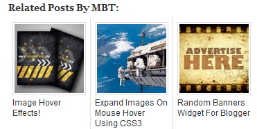
The custom CSS code we offered enabled users to change font colors of the text title, edit thumbnail sizes, borders and change background with an image. Today I am sharing the stylesheet for the Black color theme of linkWithin related post widget used on our blog. We coded it using simple styles and effects. It attracts visitors more and provide some neat and clean suggestions. The steps are really easy, so lets make it Fancy!

Without the custom Code the gadget looks as dull and grey as this one:

linkwithin widget  in original look

Step1: Adding the LinkWithin Widget

In order to apply this skin you will first need to install the linkWithin widget to your blog. The tutorial below will help you to add this plugin to your BlogSpot blogs. The plugin will appear in post pages only and will remain hidden on homepage.

Step2: Applying the Black Skin

Now you just need to follow the easy steps below to install the black Skin and change over all dull and grey look of the widget.

  1. Go To blogger > Template
  2. Backup your template
  3. Click Edit HTML > Proceed
  4. Search for this style tag:
]]></b:skin>

   5.  Just above it paste the following big chunk of Code:

/*---Related Posts---*/

#linkwithin_logolink_0 {
display:none!important;
}

#lws_0 {

clear: both!important;       

margin: 0 0 20px 0!important;    

}


.linkwithin_outer {
    margin: 1px 0px !important;
   background:url("https://blogger.googleusercontent.com/img/b/R29vZ2xl/AVvXsEiRtKtL6WmbiDcoIP1PpeEbibBYW4ULMqo7NkIHA-_6gWUOkiGbqViYVMUrLwFjGnim0B7TS86IFZuAlzsHe6N2-8vrTex1VMkevuB82bDAaGn9jXkHq1BNnlbV-w3Aj_itUuomI2Dk8b4/s400/mbt-related-posts.gif") repeat scroll rgb(42, 42, 42);
    height: 260px;

      width:590px!important;

    padding: 0px !important;
    box-shadow: 0px 4px 4px -4px rgba(0, 0, 0, 0.7) !important;
    border-radius: 5px 5px 5px 5px;
    }


.linkwithin_inner {
width:590px!important;
}


.linkwithin_text {
margin: 0px !important;
    padding: 10px !important;
    font-family: "Droid Sans",Helvetica,Arial,sans-serif;
    font-size: 1.35em;
    color: rgb(255, 255, 255);
    font-weight: 700;
    line-height: 1.35em;
    text-transform: capitalize;
    background-color: rgb(18, 18, 18);
    border-bottom: 1px solid rgb(0, 0, 0);
    border-top-right-radius: 5px;
    border-top-left-radius: 5px;
    background-image: -moz-linear-gradient(center top , rgb(36, 36, 36), rgb(18, 18, 18));
}

.linkwithin_posts a {
   border-right:0px!important;
    margin: 10px 0px 10px 20px !important;
}


.linkwithin_posts a:hover {
   border-right:0px!important;
    margin: 10px 0px 10px 20px !important; background:none!important;
}

#linkwithin_logo_0 {display:none;}

.linkwithin_img_0 {
    border: 1px solid #666 !important;
    padding: 1px !important;
    width: 100px !important;
    height: 70px !important;
    margin-right: 20px !important;
    overflow: hidden;
   background:#666!important;
}

.linkwithin_img_0:hover {
  border: 1px solid #666!important;
opacity:0.8;
}
.linkwithin_img_0 div {
    width: 100px !important;
    height: 70px !important;
}

.linkwithin_title {
    color: rgb(255, 255, 255) !important;
    font-size: 1.1em !important;
    display: block;
    padding: 0px 10px 0px 0px !important;
    font-weight: 700 !important;
    line-height: 1.45em !important;
    margin-top: 10px !important;
    font-family: "Droid Sans",Helvetica,Arial,sans-serif !important;
   text-decoration:none!important;
  width:120px!important;
}

.linkwithin_title:hover {
text-decoration:underline!important;

}


     6.  Hit save and you are all done!

Visit any of your post page to see it working just perfectly. Enjoy the new colors. :)

Suggested Reading:

You may also like checking the first Custom Skin we introduced in august 2012.

You May also find the following widget useful:

Questions?

The widget will display up to 4 thumbnails. If you wish to show more thumbnails  then simply increase the width size highlighted in yellow.  Also set the number of stories to 4 on linkWithin homepage as mentioned in the tutorial where you learnt how to install the widget on your blog.

Despite setting number of stories to 4, our widget displays 4 thumbnails. We have contacted the LinkWithin team to fix this bug on their side. Its not important that the widget will display 3 thumbnails for you as well because such bugs occur rarely for some websites/IDs and requires manual fix from linkwithin team.

If you have any questions then please do not hesitate to let me know. I hope with this new Fancy theme, your readers would enjoy clicking between posts and would spend more time on your blog. Peace and blessings buddies. :)

Reposition Navigation Buttons in Blogger!

reposition navigation links in bloggerThe navigation buttons or links that are displayed at the bottom of each comment section in BlogSpot blogs enable visitors to switch between new and old posts or move from one post page to another ordered by date and time. These buttons become less of use when number of comments increase too much. Normally readers do not even observe the navigation deep down and this results in loss of precious pageviews. I have always emphasized that value pageviews more than unique visitors because it is indeed pageviews that turns into revenue generating page impressions both for AdSense or any other Ad Network.  You might have seen the More, Next and Previous button showing inside the top black sticky bar on MBT homepage and post pages. It is really not possible to shift a Post data item to any other widget section in blogger. Doing such results in "Data variable not found in dictionary" error or similar.

We played a work around and used Cascading stylesheet Position properties to allocate fixed positions to these buttons anywhere on the page. This is again a unique addition to Blogger Customization and being implemented for the first time. The tutorial today will not only help you change the position of navigation links but will also teach you to install a custom sticky bar just like the one we are using on our blog. We are pretty sure you will find today's tutorial really easy yet delicious!

PS: Tested with Chrome, Firefox, IE9 & Safari.

STEP1: Adding the sticky bar

First comes first. I have already shared a detailed tutorial on adding a stickybar to blogger. Please first install a stickybar on your blogs and then try step#2 of today's tutorial.

Note: The style that I am using on MBT is different from that of the tutorial so if you want a similar color theme then simply copy the stylesheet from MBT source file or let me know to help you.

STEP2:

Now comes the interesting part. What we will do here is simply shifting your current Newer, Older & Home buttons to the top left of the stickybar and replace them with more fancy buttons like the one we are using.  Follow these steps:

  1. Go To Blogger > Template
  2. Backup your template
  3. Click Edit HTML and then check "Expand Widget Templates"
  4. Search for the following CSS classes and delete them all: You will find three such classes or more starting with either #blog-pager or .blog-pager

#blog-pager {
------
}


#blog-pager-newer-link {
----

---

--
}

#blog-pager-older-link {
-----

---


--
}


   5.   Now after you have deleted them, add the following code in their place:

#blog-pager {
text-align:center;
}
#blog-pager-newer-link {
position:fixed;
z-index:9999;
margin-left:-320px;
top:0px;
margin-top:5px;
}

#blog-pager-older-link {
position:fixed;
z-index:9999;
margin-left:-290px;
top:0px;
margin-top:5px;
}

#blog-pager-more-link {
position:fixed;
z-index:9999;
margin-left:-20px;
top:0px;
margin-top:5px;
}

@media screen and (-webkit-min-device-pixel-ratio:0) {
#blog-pager-newer-link {
position:fixed;
z-index:9999;
margin-left:-627px;
top:0px;
}

#blog-pager-older-link {
position:fixed;
z-index:9999;
margin-left:-597px;
top:0px;
}
}


What we did in step4 and step5 was simply replacing your old code with the new one.

    6.   Next search for the following chunk of code:

Note: You are only concerned with finding the two highlighted codes. The code inside them may look different for your template so just finding these two highlighted tags and then follow step7.

<b:includable id='nextprev'>
  <div class='blog-pager' id='blog-pager'>
    <b:if cond='data:newerPageUrl'>
      <span id='blog-pager-newer-link'>
      <a class='blog-pager-newer-link' expr:href='data:newerPageUrl' expr:id='data:widget.instanceId + &quot;_blog-pager-newer-link&quot;' title='Previous'>&#171; Prev</a>
      </span>
    </b:if>

    <b:if cond='data:olderPageUrl'>
      <span id='blog-pager-older-link'>
      <a class='blog-pager-older-link' expr:href='data:olderPageUrl' expr:id='data:widget.instanceId + &quot;_blog-pager-older-link&quot;' title='Next'>Next &#187;</a>
      </span>
    </b:if>
<span id='home-link'>
    <a class='home-link' expr:href='data:blog.homepageUrl'><data:homeMsg/></a>
</span>
    <b:if cond='data:mobileLinkUrl'>
      <div class='blog-mobile-link'>
        <a expr:href='data:mobileLinkUrl'><data:mobileLinkMsg/></a>
      </div>
    </b:if>
  </div>
  <div class='clear'/>
</b:includable>

     7.  Replace the code inside them with the following code as shown below:

<b:includable id='nextprev'>

<b:if cond='data:blog.url == data:blog.homepageUrl'>
   <b:if cond='data:olderPageUrl'>
      <span id='blog-pager-more-link'>
      <a class='blog-pager-more-link' expr:href='data:olderPageUrl' expr:id='data:widget.instanceId + &quot;_blog-pager-older-link&quot;'><img src='https://blogger.googleusercontent.com/img/b/R29vZ2xl/AVvXsEhi3m-8vZEXeMa-kcCyO6Nub8NBvtNhvU7OLcmh7je06X6BWzHps1TsRNdz5bTLgCpDJMSCOw36l93_Z11yHwHn1ZKDTA8HHhYibEjW-vLkUslIPWaMI8lZD8kyLJiOJixa8nyr5lqVqOeL/s400/more.png'/></a>
      </span>
      </b:if>
</b:if>


<b:if cond='data:blog.url != data:blog.homepageUrl'>
  <div class='blog-pager' id='blog-pager'>
    <b:if cond='data:newerPageUrl'>
      <span id='blog-pager-newer-link'>
      <a class='blog-pager-newer-link' expr:href='data:newerPageUrl' expr:id='data:widget.instanceId + &quot;_blog-pager-newer-link&quot;'><img src='https://blogger.googleusercontent.com/img/b/R29vZ2xl/AVvXsEjKxOy-0ivAbGCqGZOmr49nlqJG-pwGghjnetL6ub3XV86UUlDeJbYFbMi5tv6TMevlHJehwMRaTS5nS1xdH1xVF3sC9eUG6gZ4tag7rrHQQr2SZgDGaRVae3LDnPpk029Chu4yRv2LIOoP/s400/Previous.png'/></a>
      </span>
    </b:if>

    <b:if cond='data:olderPageUrl'>
      <span id='blog-pager-older-link'>
      <a class='blog-pager-older-link' expr:href='data:olderPageUrl' expr:id='data:widget.instanceId + &quot;_blog-pager-older-link&quot;'><img src='https://blogger.googleusercontent.com/img/b/R29vZ2xl/AVvXsEhAjYypyGwzx8T5tb0Q1i8YUJkEex5sjg5hN5GBKsm_QLdKHey1MD2GPE2bWHnwalWUUrQ73cLs8CSjmKe2x7K3VPH1cT_VU4yRfGG9aF07KXR9h-_UrOVLt4__rlx3aT2YriiRH2WfFqCW/s400/Next.png'/></a>
      </span>
      <b:else/>
 
    </b:if>

  </div>
  <div class='clear'/> </b:if>

</b:includable>

It was that easy!

   8. All done! Visit your Blog to see it functioning just fine. :)

How it works?

Previous Previous will display newer posts

Next Next will display Older posts

more More will display on homepage alone.

  • Button More is responsible for displaying the next set of previously published posts. It will show a bunch of posts depending on the number of posts you allowed to be displayed on homepage.
  • The other two buttons will help the visitor to navigate between next and previous page. If the visitor is on your newly published post then the Previous button will not show up and Next will show alone.

Everything is operated using conditional statements provided by XHTML 1.0.

If you are looking for read more buttons then do check our Icons and buttons category that has been downloaded over thousands of times and found on almost every Blogger blog today: Download from here

navigation buttons

Questions?

I have one last paper on 29th Nov  after which I will be free for one month to help you all with every query you may have. The blog is being maintained by co-authors because I am not currently available. I am writing posts as soon as I get some spare time. You are most welcomed to ask any question you may have related to this post. Off-topic questions should kindly be avoided. I just hope you find this new addition useful to your overall Pageviews. Wish you more power buddies. Peace and blessings. :)

Create Static HTML Design Of your Blogger Template

design blogger templateThis is part 2 of our series "XHTML to HTML" . We have already learned how to turn blogspot's layout into blank HTML page but we have no yet shared how to remove the dynamic XML tags alone leaving behind the stylesheet, scripts and html design. In today's tutorial I will try to share the basic way of understanding a websites core structure by identifying the important div sections that make up the structure. I hope you have followed part one of the series and have downloaded your blogspot template. I also assume you have Dreamweaver or Codelobster installed on your desktop computers or laptops.


Live Demo
XHTML To HTML
Part2: Create a HTML Design Of your Blogger Template
Part3: In progress

Identify the Div Sections

Div sections are division blocks or containers that hold elements inside it to layout a web page. The <div> tag defines a division or a section in an HTML page. It starts with a <div> tag and ends with a </div> tag.  When a div section is styled, we add the CSS ID or class to it as follows:

If you want to introduce a class in Div, do this:

<div class="class-name">

...

...

..

</div>


If the Div section is styled using an ID, it will look like this:

<div id="id-name">

...

...

..

</div>

In CSS code a class always starts with a dot at its beginning and Id starts with a hash sign as shown below:

For class:

.class-name {

---

---

-

}


For Id:

#id-name {

----

--

--

}


Now when you have understood what a Div section is, you will be able to identify these slices (div) that define your overall blog layout.

  1. View your blog either in Firefox or Chrome. I prefer Firefox
  2. On an empty section (the background) of your blog right click and choose "Inspect Element"

inspect element

    3. Two windows will open. The bottom window will highlight the core HTML of the blog and the area on your right highlights the CSS.

firefox inspect element

In the HTML section you will see important div sections. If you click any div tag, all html inside it will expand and when you click back it will contract. The important thing to note is what section is highlighted on your blog when you click a div. Note down that section for that particular div and save it in a notepad. Start from Divs at the top to divs at bottom. Go in sequential order.

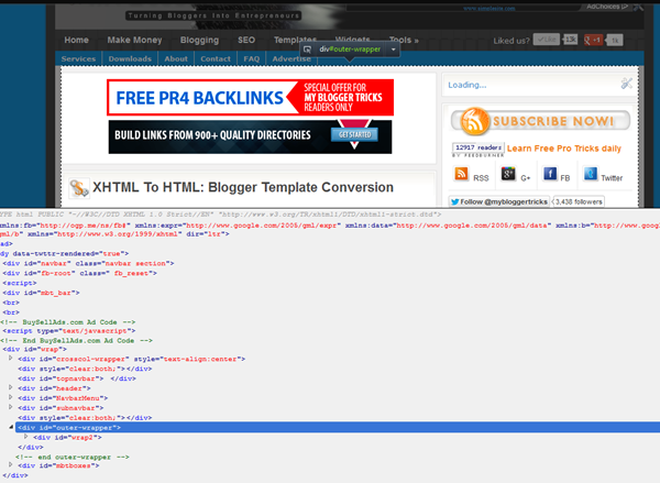
For example if I click on the div tag for mbt highlighted below as <div id="wrap">  the entire container holding all the blog contents except the top-sticky-bar are highlighted. That's how I identified what this div does and what sections can be styled using it.

highlighted div section

Use the same method to identify the divs for Header, Navigation, Post container, Sidebar Container and finally the footer. The divs must go in order and keep track of which div is nested under another div. For example in my case the navigation, header, post body and sidebar all comes under the wrap div. So I will insert the remaining divs inside it.

This may sound a little techy for people not familay with HTML tag priorities but for developers who wish to understand how to create a clone design the method above can't be more clear than this.

Remove the Dynamic Tags

  1. Use Dreamweaver or Codelobster to open the xml file you downloaded
  2. Find each div tag and edit the code inside each one of them.
  3. For example for the outer-wrapper div tag I delete the div tags for post body and sidebar leaving the entire area vacant and then I add the contact form inside it. Visit our contact page to see the wide area with no sidebars and post-section.

identify the nested div containers

The dynamic code is easy to identify because all widgets have this basic structure:

<b:section ........................>
<b:widget ......................................../>

<b:widget ......................................../>


</b:section>


A widget container is initiated using the b:section tag and widget content is initiated using the b:widget tag. Find them all and replace the b:section tags with static div tags like the following:


<div ........................>


Delete all code inside B:widget tags found here


</div>


Once you are done with this, you will find your template looking neater and getting in shape if you are using code lobster or dreamweaver. It took me 4 hours to clean up MBT's code so it should not take you long. Its lengthy process but extremely interesting and worth trying. Once you have learnt how to do this, in our next part, I will teach you how to add a PHP contact form inside the Cloned Blogger template that looks exactly like the original blog, giving the user a great experience. 

I know you have tons of questions!

Of course this method is a little techy for newbies and would have given a headache to most of you but you may not panic and just post me a comment. I will be at your service. I reply late but I do reply! =)

I wish this tutorial may help you better understand the possibilities of customizing the Google hosted free blogs. There is no end to Blogger customization and you must try every possible tutorial that comes along your way because only Blogspot layouts can turn you into a brilliant web developer. Peace and blessings buddies. :)

Color Variations For Fluid Text Resizer Widget

FLUID TEXT RESIZER

Since it is weekend so we should better not let it go in vain. I played around that Text Resizer widget we published today and managed to create different color themes of the same widget. Since blogger templates used by you all comes in various backgrounds therefore it was important to create a ready made code. The themes below are just what I thought would look good, in case you want to customize anyone of them then feel free to let me know. I will be discussing the customization guide too so that you may know how to make your preferred changes. To understand this tutorial you will first need to carefully understand the instructions mentioned on my earlier post. So kindly read that first.

Tutorial: Add Fluid Text Resizer To Blogger

Customization Guide

The CSS code in step#5 for Fluid text resizer that I shared in earlier tutorial looks like this,

<style type='text/css'>

/*----- Text Resizer By MBT ------*/

.controlstyle a{ /*links inside DIV sizecontroldiv*/
outline:none;
}

.controlstyle a img{ /*image links inside DIV sizecontroldiv*/
border-width:0;
}

.controlstyle a.selectedcontrol img{ /*selected control&#39;s image*/
border-bottom:4px solid darkred;
}

.mbt-text-resizer{
font-weight:bold!important; color:#F07727!important; text-decoration:none!important; font-family:arial,tahoma !important; font-size:16px!important;
}

#mbt-text-resizer-container {
margin:4px 0px;
padding:4px;
border-top:1px solid #ddd;
border-bottom:1px solid #ddd; width:100%;
}
</style>

<script src='http://ajax.googleapis.com/ajax/libs/jquery/1.4.2/jquery.min.js' type='text/javascript'/>

<script src='fluidtextresizer.js' type='text/javascript'>

</script>

<script type='text/javascript'>

var mytextsizer=new fluidtextresizer({
    controlsdiv: &quot;sizecontroldiv&quot;, //id of special div containing your resize controls. Enter &quot;&quot; if not defined
    targets: [&quot;body&quot;], //target elements to resize text within: [&quot;selector1&quot;, &quot;selector2&quot;, etc]
    levels: 10, //number of levels users can magnify (or shrink) text
    persist: &quot;session&quot;, //enter &quot;session&quot; or &quot;none&quot;
    animate: 200 //animation duration of text resize. Enter 0 to disable
})

</script>

We are interested only in the upper highlighted CSS part so we would ignore the rest. Lets discuss this CSS part.

<style type='text/css'>

/*----- Text Resizer By MBT ------*/

.controlstyle a{ /*links inside DIV sizecontroldiv*/
outline:none;
}

.controlstyle a img{ /*image links inside DIV sizecontroldiv*/
border-width:0;
}

.controlstyle a.selectedcontrol img{ /*selected control&#39;s image*/
border-bottom:4px solid darkred;
}

.mbt-text-resizer{
font-weight:bold!important; color:#F07727!important; text-decoration:none!important; font-family:arial,tahoma !important; font-size:16px!important;
}

#mbt-text-resizer-container {
margin:4px 0px;
padding:4px;
border-top:1px solid #ddd;
border-bottom:1px solid #ddd; width:100%;
}
</style>


Note these:

  • To change color, font size, font family of the RESET text edit .mbt-text-resizer
  • To change border colors, background colors of the box that contains everything within it edit #mbt-text-resizer-container

Now lets discuss the HTML code in step#7 of the previous tutorial

<b:if cond='data:blog.pageType == &quot;item&quot;'>

<div id='mbt-text-resizer-container'>
<div class='controlstyle' id='sizecontroldiv'>
<font style='color:#666; font-weight:bold;'>Adjust the font size:</font>  <a class='mbt-text-resizer' href='#smaller'><img src='https://blogger.googleusercontent.com/img/b/R29vZ2xl/AVvXsEgIXWP5c6ILOjFub0rivpbgHFntzVdZx_zY_NEVAVQHZnAWEerbrP5aA0_GBwO4_Y2wozAGqOjZaYu2PtzI4X6FBEEC2vKYLJRl9a5eDQGZPRYFv3LknF_sCzBiTGG6qbHBb1vCRO19Qn0/s400/oranged.png'/>&#160;</a>  <a class='mbt-text-resizer' href='#bigger'><img src='https://blogger.googleusercontent.com/img/b/R29vZ2xl/AVvXsEhBIheQa08a-NBfP1quJpLZJbt4jeF5rGdbqouzza_b-EYynVDlc4XaE6Tr_F3iZ45lRMVTD31X5zQYWi9HTfISle-yP8KETZDHYwjkmnfGe94XzG43fGamU2xOJ2wPBQd00iZEFFJhcYM/s400/orangei.png'/>&#160;&#160;</a><a class='mbt-text-resizer' href='javascript:mytextsizer.setFontLevel(0)' rel='nofollow'>Reset &#8597;</a>
</div>
</div>

</b:if>


Note these:

  • To change the color of the text "Adjust the font size" simply edit color:#666; font-weight:bold;
  • To change the image of A- change the image link in orange color with an image of your choice.
  • To change the image of A+ change the image link in blue color with an image of your choice.

That's all for customization. You only need to edit the CSS and HTML part in the full code I shared in the previous post. Lets see some sample color themes to give you an idea of what you can do.


Dark Theme

dark theme for font resizer


CSS Code

<style type="text/css">

/*----- Text Resizer By MBT ------*/

.controlstyle a{ /*links inside DIV sizecontroldiv*/
outline:none;
}

.controlstyle a img{ /*image links inside DIV sizecontroldiv*/
border-width:0;
}

.controlstyle a.selectedcontrol img{ /*selected control's image*/
border-bottom:4px solid darkred;
}

.mbt-text-resizer {
font-weight:bold; color:#66B7E7; text-decoration:none; font-family:arial,tahoma; font-size:16px;
}

#mbt-text-resizer-container {
margin:4px 0px;
padding:4px;
border-top:1px solid #66B7E7;
border-bottom:1px solid #66B7E7; width:100%; -moz-box-shadow:0px 0px 20px #333;
background:#333;
}

</style>


HTML Code

<b:if cond='data:blog.pageType == &quot;item&quot;'>
<div id="mbt-text-resizer-container">
<div id="sizecontroldiv" class="controlstyle">
<font style="color:#E4E4E4; font-weight:bold;">&#160;&#160;Adjust the font size:</font> <a class="mbt-text-resizer"  href="#smaller"><img src="https://blogger.googleusercontent.com/img/b/R29vZ2xl/AVvXsEgIXWP5c6ILOjFub0rivpbgHFntzVdZx_zY_NEVAVQHZnAWEerbrP5aA0_GBwO4_Y2wozAGqOjZaYu2PtzI4X6FBEEC2vKYLJRl9a5eDQGZPRYFv3LknF_sCzBiTGG6qbHBb1vCRO19Qn0/s400/oranged.png" />&#160;</a>  <a  class="mbt-text-resizer"  href="#bigger"><img src="https://blogger.googleusercontent.com/img/b/R29vZ2xl/AVvXsEhBIheQa08a-NBfP1quJpLZJbt4jeF5rGdbqouzza_b-EYynVDlc4XaE6Tr_F3iZ45lRMVTD31X5zQYWi9HTfISle-yP8KETZDHYwjkmnfGe94XzG43fGamU2xOJ2wPBQd00iZEFFJhcYM/s400/orangei.png" />&#160;&#160;</a><a rel="nofollow" class="mbt-text-resizer" href="javascript:mytextsizer.setFontLevel(0)">Reset ↕</a>

</div></div>
</b:if>


Light Theme

light theme for text resizer

CSS Code

<style type="text/css">

/*----- Text Resizer By MBT ------*/

.controlstyle a{ /*links inside DIV sizecontroldiv*/
outline:none;
}

.controlstyle a img{ /*image links inside DIV sizecontroldiv*/
border-width:0;
}

.controlstyle a.selectedcontrol img{ /*selected control's image*/
border-bottom:4px solid darkred;
}

.mbt-text-resizer {
font-weight:bold; color:#7BB626; text-decoration:none; font-family:arial,tahoma; font-size:16px;
}

#mbt-text-resizer-container {
margin:4px 0px 4px 5px;
padding:4px;
border-top:1px solid #7BB626;
border-bottom:1px solid #7BB626; width:100%;
background:#fff;
border-radius:10px;
-moz-border-radius:10px;
}

</style>


HTML Code

<b:if cond='data:blog.pageType == &quot;item&quot;'>
<div id="mbt-text-resizer-container">
<div id="sizecontroldiv" class="controlstyle">
<font style="color:#289728; font-weight:bold;">&#160;&#160;Change Font Size:</font> <a class="mbt-text-resizer"  href="#smaller"><img src="file:///c:/Users/mustafa/Desktop/images2/greend.png" />&#160;</a>  <a  class="mbt-text-resizer"  href="#bigger"><img src="file:///c:/Users/mustafa/Desktop/images2/greenI.png" />&#160;&#160;</a><a rel="nofollow" class="mbt-text-resizer" href="javascript:mytextsizer.setFontLevel(0)">« Reset »</a>

</div></div>
</b:if>


Text Resizer Icons

Right click and select "Save Image as"

blueDblueIgreendgreenIorangedorangei

How did you find them?

The efforts we put in in bringing these widgets make no sense without your feedback and consistent motivation. Do let me know if I could be of any assistance. Try them on your blogs and give your blogs a new dress and color. Peace pals. :>

Heading Tag With Drop Shadow and Mouse Hover Effect

HEADING TAGS

Blogger blogs has the free option of editing the style sheet. Fortunately you can play around the codes to give your blog any look you want. Last year I shared various ways of customizing the heading tags i.e. H3. We use H3 tags inside posts to write headlines and important sections of the posts. Today we would learn how to create a custom headline that will change colour on mouse hover. We will use CSS3 effects to produce a drop shadow effect along with mouse hover effect. This will give your headlines a neon look. So lets do it!


Create Post Heading Tags In Blogger

  1. Go To Blogger > Design > Edit HTML
  2. Backup your Template
  3. Search for this,

]]></b:skin>

    4.    Just above it paste the following code,

/*----MBT Heading Tag----*/


h3{
font-family:veranda !important;
font-style:italic !important;

}
.post h3 {
color:#666;
border-left:10px solid #666;
border-right:10px solid #666;
padding:3px 5px 3px  20px;
border-radius:15px;
-moz-border-radius:15px;
box-shadow:0px 0px 13px #666;
-webkit-box-shadow:0px 0px 13px #666;
-moz-box-shadow:0px 0px 13px #666;


}

.post h3:hover {
color:#FF133F;
border-left:10px solid #FF133F;
border-right:10px solid #FF133F;
box-shadow:0px 0px 13px #FF133F;
-webkit-box-shadow:0px 0px 13px #FF133F;
-moz-box-shadow:0px 0px 13px #FF133F;

}


Note:- Delete any code inside your template that may look like .post h3

Make these changes:

  • To Change font type edit verdana and replace it with any font family you like.
  • To change font style replace italic with either normal or bold
  • To change text color and left/right border colors in active mode then change #666 and replace it with a color of your choice
  • To replace text and border colors on mouse hover then change #FF133F
  • To change box shadow color in active mode change #666
  • To change box shadow color on mouse hover mode change #FF133F

     5.    Save your template and you are almost done!

How to use Heading Tags inside Posts?

  1. Create a new post as you normally do
  2. Now use the following code wherever you want to add a headline

<h3>Write Headline Text here</h3>

     3.  When you publish the post, you will find the magic working just perfectly. Enjoy!

I hope this little trick helps you in better writing quality posts. More variation will be introduced soon. Do let me know if you needed any help.

Please change your post title tags to h2 from h3 for better SEO and traffic value. Read this post:

Change Size, Font Family and Color Of Custom Search Engine

Custom Search EngineGoogle Custom Search Engine is another option that Adsense provides to increase your blog revenue. I shared detailed posts on how to create a custom search engine and integrate adsense in it. However the problem with the customization and editing options that Google provides lacks complete control over the margining and padding of the search box. Today we will learn on how to change the look of the search box using our own custom styles and change the size and alignment of the box elements. It is perfectly alright to edit the stylesheet (i.e. CSS Code) of the search engine because it is just a design change and therefore it does not violate any of Adsense terms of service. So lets get going!

DEMO: You will find the Minimalist Theme of the Search box on my sidebar.

Customize Google Search Box

I assume you have already tried our tutorial on Custom Search engines and have installed the search box on your blog sidebars. If not then you may first try them.

  1. Create a Custom Google Search Box
  2. Make Money With Google Custom Search Engine

The code that Google provides you will look slightly similar to this one,

Note: You are not going to use the code shared here. It only gives you idea on how to edit your own Google code for your search engine.

<div id="cse-search-form" style="width: 100%;">Loading</div>
<script src="http://www.google.com/jsapi" type="text/javascript"></script>
<script type="text/javascript">
  google.load('search', '1', {language : 'en', style : google.loader.themes.MINIMALIST});
  google.setOnLoadCallback(function() {
    customSearchControl.setResultSetSize(google.search.Search.FILTERED_CSE_RESULTSET);
    var options = new google.search.DrawOptions();
    options.setSearchFormRoot('cse-search-form');
    customSearchControl.draw('cse', options);
  }, true);
</script>

<style type="text/css">
  .gsc-control-cse {
    font-family: Arial, sans-serif;
    border-color: #ffffff;
    background-color: #ffffff;
  }


input.gsc-input {
    border:1px solid #c7c7c7; padding:5px 0px 4px 0px; color:#666;
  }


  input.gsc-search-button {
    border-color: #333333;
    background-color: #333333; margin-left:1px;
  }


  .gsc-tabHeader.gsc-tabhInactive {
    border-color: #0080ff;
    background-color: #289728;
  }
  .gsc-tabHeader.gsc-tabhActive {
    border-color: #0080ff;
    background-color: #0080ff;
  }
  .gsc-tabsArea {
    border-color: #0080ff;
  }
  .gsc-webResult.gsc-result,
  .gsc-results .gsc-imageResult {
    border-color: #FFFFFF;
    background-color: #FFFFFF;
  }
  .gsc-webResult.gsc-result:hover,
  .gsc-imageResult:hover {
    border-color: #0080ff;
    background-color: #E0F0FF;
  }
  .gs-webResult.gs-result a.gs-title:link,
  .gs-webResult.gs-result a.gs-title:link b,
  .gs-imageResult a.gs-title:link,
  .gs-imageResult a.gs-title:link b {
    color: #0080ff;
  }
  .gs-webResult.gs-result a.gs-title:visited,
  .gs-webResult.gs-result a.gs-title:visited b,
  .gs-imageResult a.gs-title:visited,
  .gs-imageResult a.gs-title:visited b {
    color: #666666;
  }
  .gs-webResult.gs-result a.gs-title:hover,
  .gs-webResult.gs-result a.gs-title:hover b,
  .gs-imageResult a.gs-title:hover,
  .gs-imageResult a.gs-title:hover b {
    color: #444444;
  }
  .gs-webResult.gs-result a.gs-title:active,
  .gs-webResult.gs-result a.gs-title:active b,
  .gs-imageResult a.gs-title:active,
  .gs-imageResult a.gs-title:active b {
    color: #777777;
  }
  .gsc-cursor-page {
    color: #0080ff;
  }
  a.gsc-trailing-more-results:link {
    color: #0080ff;
  }
  .gs-webResult .gs-snippet,
  .gs-imageResult .gs-snippet {
    color: #333333;
  }
  .gs-webResult div.gs-visibleUrl,
  .gs-imageResult div.gs-visibleUrl {
    color: #333333;
  }
  .gs-webResult div.gs-visibleUrl-short {
    color: #333333;
  }
  .gs-webResult div.gs-visibleUrl-short {
    display: none;
  }
  .gs-webResult div.gs-visibleUrl-long {
    display: block;
  }
  .gsc-cursor-box {
    border-color: #FFFFFF;
  }
  .gsc-results .gsc-cursor-box .gsc-cursor-page {
    border-color: #0080ff;
    background-color: #FFFFFF;
    color: #0080ff;
  }
  .gsc-results .gsc-cursor-box .gsc-cursor-current-page {
    border-color: #0080ff;
    background-color: #0080ff;
    color: #666666;
  }
  .gs-promotion {
    border-color: #0080ff;
    background-color: #ffffff;
  }
  .gs-promotion a.gs-title:link,
  .gs-promotion a.gs-title:link *,
  .gs-promotion .gs-snippet a:link {
    color: #0080ff !important;
  }
  .gs-promotion a.gs-title:visited,
  .gs-promotion a.gs-title:visited *,
  .gs-promotion .gs-snippet a:visited {
    color: #666666;
  }
  .gs-promotion a.gs-title:hover,
  .gs-promotion a.gs-title:hover *,
  .gs-promotion .gs-snippet a:hover {
    color: #666666;
  }
  .gs-promotion a.gs-title:active,
  .gs-promotion a.gs-title:active *,
  .gs-promotion .gs-snippet a:active {
    color: #0080ff;
  }
  .gs-promotion .gs-snippet,
  .gs-promotion .gs-title .gs-promotion-title-right,
  .gs-promotion .gs-title .gs-promotion-title-right *  {
    color: #0080ff;
  }
  .gs-promotion .gs-visibleUrl,
  .gs-promotion .gs-visibleUrl-short {
    color: #289728;
  }
</style>


The CSS code is the one enclosed between the two yellow highlighted lines. This code is responsible for the over all look of your box. To keep things simple we will be focusing only on the three coloured sections of the code and I will refer them as Purple, Orange and Green section.


If you want your search box to look exactly like mine then create a search box as instructed in our previous tutorial and choose the style as "Minimalist" Then replace the first three sections of your CSS code with the ones I shared above as purple, orange and green. That's it.

However if you wish to edit the style of your current search box then you only need to change the CSS properties which are enclosed between the curly brackets i.e. {}

Lets first understand the three sections.

  • The Purple section is responsible for the look of the box that contains the Input rectangle and search button.
  • The Orange section is responsible for look of the input box where users write query.
  • The Green section is then responsible for the look of the Search/Submit button

The purple CSS code is as follows:

.gsc-control-cse {
    font-family: Arial, sans-serif;
    border-color: #ffffff;
    background-color: #ffffff;
  }

In my case I have kept border color as white and background color as white. To Change the border and background colors simply change the hexadecimal code by using our color generator Tool. If you wish to use a background image instead and you wish to change the box height and width then you may alter the same purple code as follows.

.gsc-control-cse {
    font-family: Arial, sans-serif;
    border-color: #ffffff
;


    background: url(ADD IMAGE LINK HERE) no-repeat;

    height:25px;

    width:300px;


  }


Replace ADD IMAGE LINK HERE with image direct link and change the width and height size to suit your alignment.

The Orange CSS Code is as follows:

input.gsc-input {
    border:1px solid #c7c7c7; padding:5px 0px 4px 0px; color:#666;
  }

This will style the rectangular input box where you write query text. Now here we can introduce and change several new styles like font size, font type, text area size, text color etc. You can also set a gap between the text area and the search button using padding. You can make these alterations if you wish else you can use the code in its default form and replace your input section with this orange one. Altered code is:

input.gsc-input {
    border:1px solid #c7c7c7; padding:5px 0px 4px 0px; color:#666;

font-size:12px;

font-family:arial;

font-weight:normal;
  }


I am sure the code is easy enough to be edited. You can choose the following font families as standards: Arial, Verdana or sans-serif. Font weight turns the text thickness. You can choose normal or bold. To change to text color simply change color:#666

The padding is actually the distance between the outline of the input box (Text Area box) and the text. Keep it as default. If you wish to change it then it follows this order:

padding:Top Right Bottom Left; In my case I have set them as padding:5px 0px 4px 0px;

The Green CSS Code is as follows:

input.gsc-search-button {
    border-color: #333333;
    background-color: #333333; margin-left:1px;
  }


This code changes the look and appearance of the Search/Submit button. You can edit it as there is nothing new except the margin property.

A margin is the gap distance between the search button and Text Input Box. You can set other margins too. Altered code is here:

input.gsc-search-button {
    border-color: #333333;
    background-color: #333333; margin-left:1px;

margin-right:0px;

margin-top:0px;

margin-bottom:0px;

font-size:12px;

font-family:Arial;

font-weight:bold;


  }

Start playing with these and keep saving your widget to see the preview.

Need Help?

Try customizing your search box using the simple method shared above. If you needed any help then feel free to let me know. Do share the CSS code of your search box while asking a question. I hope this helps most of you. Peace brothers.