Showing posts with label Web Designing. Show all posts

Launching Service: Vector Face Art


Mohammad Mustafa Ahmedzai

Can you recognize this man up here? Yup that's me! ;p Colored in almost just black and white. We are glad to introduce today yet another additional service being offered by STC Network. Apart from the huge list of services we offer like designing icons, logos and web templates, we have stepped into Vector Face Designing. An art that is a mixture of limited flavors of colors that combine to produce a compelling digital image. Whether it be you, your pet or your company's CEO, just submit his photo to us and get him an artistic digital Personality!

A vector image as you may know could be resized to any dimension, small or big, without any loss in picture quality. Company CEOs, webmasters, internet marketers could use these images in promoting their campaigns by giving it a more personal touch.

What Makes it different?

Traditional JPEG, GIF, PNG computer graphic formats can not be resized to bigger sizes because they involve pixel loss problems. A JPEG if stretched would loose its color quality and would look dull and blurred. On contrary a vector image is easily printable and could easily be resized to as big a resolution as you want. So be it your Large sized PanaFlex Banners for local street advertisement or your T-shirts or Standard Ad Banners for your website, the Vector Image would blend in just perfectly.

Tools used:

When it comes to art, we take you to Abdul Rahman Majeedi, our company's senior Graphic Designer. The images displayed on this post are a gift from Abdul Rahman for my engagement. Can't thank you [Abdul Rahman] enough man! :)

To produce a Vector image we make use of the following tools:

  • WACOM Graphic Tablet
  • Adobe Illustrator CS5
  • Corel Draw

Pricing Details:

Our Price quotes for all services depend on the quality and depth of the order placed. If you wish to place an order the early possible, kindly contact us via the services page.

Your Views?

I guess we have now a clear vector photo to use in our promotional campaigns coming this year. Always wanted a personal touch in banners and power point presentations, I have now a good way to say it loudly: "I Blog for living!" ;)

I just hope you find this service useful. I would really appreciate a feedback on the imagery being displayed today. Your valuable reviews would surely help us a lot in improving things more. About those Delicious Kitchen Recipes? Stay tuned! We have a lot to share this month. Peace and blessings buddies. =)

From this:

Mohammad Mustafa Photo

To This:


blogging for living

Releasing Blogger Notification Bar!


Blogger Notification BarLooks like the new year is near! Out of the premium sets of design resources in our repository, we often share one of them as a freebie when the occasion is precious. There are many creative premium widgets, tools and plugins that we managed to develop this month for our regular clients and out of these I will be sharing just two such resources as a new year gift. They are: (1) Blogger Notification bar widget that you can see live on our blog at the top and (2) a Blogger Template entitled "Salahuddin Ayubi" which is far better than any of the templates we designed so far and makes us really jealous when we compare it to our current design of MBT blog itself!


Copyright


Bloggers and developers are hereby advised not to sell or redistribute the widget codes. You are also instructed not to remove MBT's watermark from the notification bar. Removing the watermark will break the entire code, leaving all your efforts in vain.


Premium version includes no watermarks. If you wish to buy the widget for Wordpress, Joomla or even Blogger Blogs, then you may kindly contact us via our services page.


What's New in it?


This notification bar works best by grabbing readers attention and helps you to focus readers towards important deals, announcements or any story. It functions on pure JQuery light-weight functions and is compatible with all major browsers including IE9.


Custom, unique and non-commercial plugins are always better then public designs. HelloBar is now too common and used everywhere and you may not like the limited design customizations offers provided by them along with their logo on the plugin. HelloBar also requests URL redirection and you need to register to use it. Scripts are stored at Hellobar server and the browser needs to send a request in order to display it on your blog or site. Really not appropriate if you don't like redirections and attribution links.


Blogger Notification bar requires no registration and provides far better design flexibility. The scripts are less than 6KB in size and fully hosted at your server.  You can change its look and theme to any color that may blend your layouts. Every single element is well structured and can easily be configured. A perfect tool to play with.


I will be always available to provide any help required here on this page.

You may also enjoy trying out some of our previous stickybars:


Installing Notification Bar on blogger


You may follow the easy steps mentioned below in order to add the widget to your blogger blogs. Same procedure will work for any other platform like Wordpress.


  1. Go To Blogger > Template

  2. Backup your template

  3. Click Edit HTML

  4. Search for <head>

  5. Paste the following scripts just below it:


<script src='http://ajax.googleapis.com/ajax/libs/jquery/1/jquery.min.js' type='text/javascript'></script>

<!--Blogger Notification Bar by www.MyBloggerTricks.com-->

<script language='JavaScript'>

//<![CDATA[

;;(function(_0xce58x0){_0xce58x0["\x66\x6E"]["\x62\x6C\x6F\x67\x67\x65\x72\x6E\x6F\x74\x69\x66\x69\x63\x61\x74\x69\x6F\x6E"]=function(_0xce58x1){var _0xce58x2={duration:500,position:"\x74\x6F\x70",closeable:true,showAfter:0,keepHidden:false,borderSize:3,height:40,easing:"\x6C\x69\x6E\x65\x61\x72"},_0xce58x3=_0xce58x0["\x65\x78\x74\x65\x6E\x64"]({},_0xce58x2,_0xce58x1);if(_0xce58x3["\x65\x61\x73\x69\x6E\x67"]=="\x73\x77\x69\x6E\x67"){_0xce58x3["\x65\x61\x73\x69\x6E\x67"]=""};_0xce58x3["\x74\x6F\x74\x61\x6C\x48\x65\x69\x67\x68\x74"]=parseInt(_0xce58x3["\x68\x65\x69\x67\x68\x74"],10)+parseInt(_0xce58x3["\x62\x6F\x72\x64\x65\x72\x53\x69\x7A\x65"],10);_0xce58x3["\x64\x75\x72\x61\x74\x69\x6F\x6E"]=parseInt(_0xce58x3["\x64\x75\x72\x61\x74\x69\x6F\x6E"],10);_0xce58x3["\x73\x68\x6F\x77\x41\x66\x74\x65\x72"]=parseInt(_0xce58x3["\x73\x68\x6F\x77\x41\x66\x74\x65\x72"],10)*1000;var _0xce58x4=_0xce58x0(this),_0xce58x5=_0xce58x4["\x66\x69\x6E\x64"]("\x23\x62\x6C\x6F\x67\x67\x65\x72\x6E\x6F\x74\x69\x66\x69\x63\x61\x74\x69\x6F\x6E"),_0xce58x6=_0xce58x5["\x66\x69\x6E\x64"]("\x2E\x6C\x69\x6E\x6B"),_0xce58x7=_0xce58x5["\x66\x69\x6E\x64"]("\x23\x63\x6C\x6F\x73\x65\x62\x6C\x6F\x67\x67\x65\x72\x6E\x6F\x74\x69\x66\x69\x63\x61\x74\x69\x6F\x6E"),_0xce58x8=_0xce58x4["\x66\x69\x6E\x64"]("\x23\x6F\x70\x65\x6E\x62\x6C\x6F\x67\x67\x65\x72\x6E\x6F\x74\x69\x66\x69\x63\x61\x74\x69\x6F\x6E"),_0xce58x9={},_0xce58xa="",_0xce58xb={},_0xce58xc="",_0xce58xd=function(){_0xce58xb[_0xce58xc]=_0xce58x3["\x74\x6F\x74\x61\x6C\x48\x65\x69\x67\x68\x74"];_0xce58x8["\x61\x6E\x69\x6D\x61\x74\x65"](_0xce58xb,(_0xce58x3["\x64\x75\x72\x61\x74\x69\x6F\x6E"]/2),_0xce58x3["\x65\x61\x73\x69\x6E\x67"]);_0xce58x4["\x72\x65\x6D\x6F\x76\x65\x43\x6C\x61\x73\x73"]("\x6F\x70\x65\x6E\x62\x6C\x6F\x67\x67\x65\x72\x6E\x6F\x74\x69\x66\x69\x63\x61\x74\x69\x6F\x6E");},_0xce58xe=function(){_0xce58xb[_0xce58xc]=-Math["\x61\x62\x73"](34-_0xce58x3["\x68\x65\x69\x67\x68\x74"]);_0xce58x8["\x61\x6E\x69\x6D\x61\x74\x65"](_0xce58xb,(_0xce58x3["\x64\x75\x72\x61\x74\x69\x6F\x6E"]/2),function(){_0xce58xf()});},_0xce58xf=function(){_0xce58x9[_0xce58xa]=0;_0xce58x4["\x61\x6E\x69\x6D\x61\x74\x65"](_0xce58x9,_0xce58x3["\x64\x75\x72\x61\x74\x69\x6F\x6E"],_0xce58x3["\x65\x61\x73\x69\x6E\x67"],function(){_0xce58x4["\x61\x64\x64\x43\x6C\x61\x73\x73"]("\x6F\x70\x65\x6E\x62\x6C\x6F\x67\x67\x65\x72\x6E\x6F\x74\x69\x66\x69\x63\x61\x74\x69\x6F\x6E")});},_0xce58x10=function(){_0xce58x9[_0xce58xa]=-_0xce58x3["\x74\x6F\x74\x61\x6C\x48\x65\x69\x67\x68\x74"];_0xce58x4["\x61\x6E\x69\x6D\x61\x74\x65"](_0xce58x9,_0xce58x3["\x64\x75\x72\x61\x74\x69\x6F\x6E"],function(){_0xce58xd()});},_0xce58x11=false;switch(_0xce58x3["\x70\x6F\x73\x69\x74\x69\x6F\x6E"]){case "\x74\x6F\x70":_0xce58xa="\x6D\x61\x72\x67\x69\x6E\x54\x6F\x70";_0xce58xc="\x74\x6F\x70";break ;;case "\x74\x6F\x70\x5F\x66\x69\x78\x65\x64":_0xce58xa="\x74\x6F\x70";_0xce58xc="\x74\x6F\x70";break ;;case "\x62\x6F\x74\x74\x6F\x6D\x5F\x66\x69\x78\x65\x64":_0xce58xa="\x62\x6F\x74\x74\x6F\x6D";_0xce58xc="\x62\x6F\x74\x74\x6F\x6D";break ;;};_0xce58x4["\x64\x65\x74\x61\x63\x68"]();_0xce58x4["\x70\x72\x65\x70\x65\x6E\x64\x54\x6F"]("\x62\x6F\x64\x79")["\x63\x73\x73"]({display:"\x62\x6C\x6F\x63\x6B"});if(_0xce58x5["\x66\x69\x6E\x64"]("\x2E\x6D\x75\x6C\x74\x69\x4D\x65\x73\x73\x61\x67\x65\x73")["\x6C\x65\x6E\x67\x74\x68"]){bloggernotificationExtras["\x6D\x75\x6C\x74\x69\x70\x6C\x65\x4D\x65\x73\x73\x61\x67\x65\x73"]["\x69\x6E\x69\x74"]()};if(_0xce58x11&&_0xce58x3["\x6B\x65\x65\x70\x48\x69\x64\x64\x65\x6E"]&&_0xce58x3["\x63\x6C\x6F\x73\x65\x61\x62\x6C\x65"]){setTimeout(function(){_0xce58xd()},_0xce58x3["\x73\x68\x6F\x77\x41\x66\x74\x65\x72"])}else {setTimeout(function(){_0xce58xf()},_0xce58x3["\x73\x68\x6F\x77\x41\x66\x74\x65\x72"])};_0xce58x7["\x63\x6C\x69\x63\x6B"](function(){_0xce58x10();setCookie();});_0xce58x8["\x63\x6C\x69\x63\x6B"](function(){_0xce58xe();setCookie();});_0xce58x6["\x63\x6C\x69\x63\x6B"](function(){_0xce58x0["\x61\x6A\x61\x78"]({type:"\x70\x6F\x73\x74",data:"\x63\x6C\x69\x63\x6B\x3D\x74\x72\x75\x65",success:function(_0xce58x12){}});return true;});}})(window["\x6A\x51\x75\x65\x72\x79"]);jQuery(document)["\x72\x65\x61\x64\x79"](function(_0xce58x0){_0xce58x0("\x23\x62\x6C\x6F\x67\x67\x65\x72\x6E\x6F\x74\x69\x66\x69\x63\x61\x74\x69\x6F\x6E")["\x70\x72\x65\x70\x65\x6E\x64"]("\x3C\x61\x20\x73\x74\x79\x6C\x65\x3D\x22\x6D\x61\x72\x67\x69\x6E\x2D\x74\x6F\x70\x3A\x35\x70\x78\x3B\x20\x6D\x61\x72\x67\x69\x6E\x2D\x6C\x65\x66\x74\x3A\x37\x70\x78\x3B\x20\x63\x6F\x6C\x6F\x72\x3A\x23\x36\x36\x36\x36\x36\x36\x3B\x20\x66\x6C\x6F\x61\x74\x3A\x6C\x65\x66\x74\x3B\x22\x20\x74\x61\x72\x67\x65\x74\x3D\x22\x5F\x62\x6C\x61\x6E\x6B\x22\x20\x68\x72\x65\x66\x3D\x22\x68\x74\x74\x70\x3A\x2F\x2F\x77\x77\x77\x2E\x6D\x79\x62\x6C\x6F\x67\x67\x65\x72\x74\x72\x69\x63\x6B\x73\x2E\x63\x6F\x6D\x2F\x32\x30\x31\x32\x2F\x31\x32\x2F\x72\x65\x6C\x65\x61\x73\x69\x6E\x67\x2D\x62\x6C\x6F\x67\x67\x65\x72\x2D\x6E\x6F\x74\x69\x66\x69\x63\x61\x74\x69\x6F\x6E\x2D\x62\x61\x72\x2E\x68\x74\x6D\x6C\x22\x3E\x3C\x69\x6D\x67\x20\x73\x72\x63\x3D\x22\x68\x74\x74\x70\x3A\x2F\x2F\x34\x2E\x62\x70\x2E\x62\x6C\x6F\x67\x73\x70\x6F\x74\x2E\x63\x6F\x6D\x2F\x2D\x36\x44\x37\x6D\x2D\x69\x74\x57\x64\x6E\x6F\x2F\x55\x4E\x32\x77\x30\x54\x54\x33\x5A\x6C\x49\x2F\x41\x41\x41\x41\x41\x41\x41\x41\x49\x59\x63\x2F\x43\x4A\x78\x64\x73\x4C\x72\x57\x6B\x51\x67\x2F\x73\x34\x30\x30\x2F\x6D\x62\x74\x2E\x70\x6E\x67\x22\x2F\x3E\x3C\x2F\x61\x3E");if(!_0xce58x0["\x65\x61\x73\x69\x6E\x67"]["\x68\x61\x73\x4F\x77\x6E\x50\x72\x6F\x70\x65\x72\x74\x79"]("\x65\x61\x73\x65\x4F\x75\x74\x42\x6F\x75\x6E\x63\x65")){_0xce58x0["\x65\x78\x74\x65\x6E\x64"](_0xce58x0["\x65\x61\x73\x69\x6E\x67"],{easeOutBounce:function(_0xce58x13,_0xce58x14,_0xce58x15,_0xce58x16,_0xce58x17){if((_0xce58x14/=_0xce58x17)<(1/2.75)){return _0xce58x16*(7.5625*_0xce58x14*_0xce58x14)+_0xce58x15}else {if(_0xce58x14<(2/2.75)){return _0xce58x16*(7.5625*(_0xce58x14-=(1.5/2.75))*_0xce58x14+0.75)+_0xce58x15}else {if(_0xce58x14<(2.5/2.75)){return _0xce58x16*(7.5625*(_0xce58x14-=(2.25/2.75))*_0xce58x14+0.9375)+_0xce58x15}else {return _0xce58x16*(7.5625*(_0xce58x14-=(2.625/2.75))*_0xce58x14+0.984375)+_0xce58x15}}}}})};_0xce58x0("\x23\x62\x6C\x6F\x67\x67\x65\x72\x6E\x6F\x74\x69\x66\x69\x63\x61\x74\x69\x6F\x6E\x57\x72\x61\x70")["\x62\x6C\x6F\x67\x67\x65\x72\x6E\x6F\x74\x69\x66\x69\x63\x61\x74\x69\x6F\x6E"]({position:"\x74\x6F\x70",showAfter:0,keepHidden:true,duration:300,closeable:true,height:40,borderSize:1,easing:"\x73\x77\x69\x6E\x67"});});


//]]>
</script>

      6.   Next search for ]]></b:skin>

      7.   Just above it paste the following styles:


/* ----Blogger Notification bar by www.MyBloggerTricks.com----- */

#bloggernotificationWrap{

    display: none;

    margin: 0;

    padding: 0;

    position: fixed;

    margin-top: -41px;

    z-index: 999999;

    width: 100%;

    height: 41px;

}

#bloggernotification {

    width: 100%;

    height: 28px;

    margin: 0px;

    padding-top: 7px;

    text-align: center;

    background: none repeat scroll #2E2F2E;

    position: relative;

    box-shadow:0px 1px 3px #666;

    z-index: 9998;

    text-decoration: none;

    color: #cccccc;

    font-family: arial,sans-serif;

    font-size: 13px;

    font-weight: bold;

    text-shadow: 1px 1px 1px #000;

    border-bottom:2px solid #fff;

}


#bloggernotification a{

    text-decoration: none;

    color:#FFFC00;

     font-family: arial,sans-serif;

    font-size: 13px;

    font-weight: bold;

    text-shadow: 1px 1px 1px #000;

    outline: none;

}

#bloggernotification a:hover{

    text-decoration: underline;

}

#bloggernotificationWrap #closebloggernotification{

    display: block;

    position: absolute;

    top: 0;

    right: 23px;

    height: 40px;

    width: 21px;

    background: url(https://blogger.googleusercontent.com/img/b/R29vZ2xl/AVvXsEjJKIEip3O_M81B6OkfzvgoScCN5wBp2cydQ1jUdUCbRKEr5_L1UnkzoTcJdNt02EtcGrpXQ5RwTdFo2B1OF3ku55TLe6v7wq1mmPR7qqqMSX4fi38dEnhx3ltUYDRHaIuaQ1Qr1MBx27LW/s400/light.png) no-repeat 0 center;

    cursor: pointer;

}

#bloggernotificationWrap #closebloggernotification:hover{

    background-position: -21px 50%;

}

#bloggernotificationWrap.bottomPosition #closebloggernotification{

    background-position: right 50%;

}

#bloggernotificationWrap.bottomPosition #closebloggernotification:hover{

    background-position: -42px 50%;

}

#bloggernotificationWrap #openbloggernotification{

    display: block;

    position: absolute;

    top: -6px;

    right: 15px;

    padding: 0 7px;

    background: #2E2F2E;

    border-left: 3px solid #fff;

    border-right: 3px solid #fff;

    border-bottom: 3px solid #fff;

    cursor: pointer;

    z-index: 1;

    -webkit-border-bottom-right-radius: 5px;

    -webkit-border-bottom-left-radius: 5px;

    -moz-border-radius-bottomright: 5px;

    -moz-border-radius-bottomleft: 5px;

    border-bottom-right-radius: 5px;

    border-bottom-left-radius: 5px;

       box-shadow:0px 1px 3px #666;

}

#bloggernotificationWrap #openbloggernotification span{

    display: block;

    width: 21px;

    height: 34px;

    background: url(https://blogger.googleusercontent.com/img/b/R29vZ2xl/AVvXsEjJKIEip3O_M81B6OkfzvgoScCN5wBp2cydQ1jUdUCbRKEr5_L1UnkzoTcJdNt02EtcGrpXQ5RwTdFo2B1OF3ku55TLe6v7wq1mmPR7qqqMSX4fi38dEnhx3ltUYDRHaIuaQ1Qr1MBx27LW/s400/light.png) no-repeat right 50%;

}


Make these Design changes if you wish:


  • To change the background color of the bar simply edit #2E2F2E

  • To change text color edit #cccccc

  • To change hyperlink color edit #FFFC00

  • To change anything else, just post me your query in the comment form below! :)


      8.  Finally to make the bar appear just add the following code below <body>


<div class='openbloggernotification' id='bloggernotificationWrap' style='display: block; margin-top: 0px;'><div id='bloggernotification'>


Write Your Notification Message Here

<span id='closebloggernotification'/></div><span id='openbloggernotification' style='top: -6px;'><span/></span></div>


<br/><br/>

     9. Save your template and you are all done!


Creating links  


To create links inside the notification bar use the following code:


<a class='link' href='ADD-URL-HERE' target='_blank'>Link Text</a>

You must add the class='link' , which is required by the script.


Need help?


This plugin would work just fine if all the above steps are carefully followed. The steps are extremely easy to try. I just hope you find it worth using. If you ran into any technical problem just feel confident to leave your comments. I would love to help you out. Wishing you all the best of life buddies. Peace and blessings pals! :)


Animation using CSS3 KeyFrames and jQuery's scrollTop() function

css3 keyframesJquery is indeed the most compressed and efficient library of JavaScript introduced so far that has made a web developer's job more easy. Its built in functions of show(), hide(), AJAX() and my beloved scrollTop() are indeed the most used functions that gives a new life to user interface (UI). CSS3 animations using @Keyframes rule is one of the most innovative things I came across so far. Pseudo elements such as :before and :after are increasingly being used now because they eliminated the use of unnecessary div tags.

These days since  I am on vocations I am trying to improve skills of both Jquery and CSS3. From the combination of beautiful web tricks that I learnt so far, I managed to design a simple scroll to top button that uses JQuery's scrollTop function to produce smooth scrolling and is spiced up with CSS3 effects to make it stand out. I have created just two sample versions with circular and rectangular shapes. The Styles are extremely easy to be customized. Lets first see a demo for the circular one:


Live Demo

Don't forget to check our previously released versions of back to top buttons:


How to add it to Blogger?

  1. Go To Blogger > Template
  2. Back up your template
  3. Click Edit HTML
  4. Search for <head>
  5. Just below it paste the following scripts:

<script src='http://ajax.googleapis.com/ajax/libs/jquery/1/jquery.min.js' type='text/javascript'/>
<script src='http://downloads.mybloggertricks.com/scrolltop.js' type='text/javascript'/>

Note: I have included the dynamic link for jquery so you wont need to update it when a new version of Jquery is released. It will update automatically.

   6.  Now Search for ]]></b:skin>

   7. Just above it paste one of the following styles

For circular one use this code:

/* ----- MBT's Back-To-Top Button Circular version -----*/

@-webkit-keyframes arrow_to_top{
    0%{
        top:10px
    }
    50%{
        top:5px
    }
    100%{
        top:10px
    }
}
@-moz-keyframes arrow_to_top{
    0%{
        top:10px
    }
    50%{
        top:5px
    }
    100%{
        top:10px
    }

}
@keyframes arrow_to_top{
    0%{
        top:10px
    }
    50%{
        top:5px
    }
    100%{
        top:10px
    }

}

#back-top, #back-top:hover{
    position: fixed;
    display:block;
    display:none;
    bottom: 20px;
    right:20px;
    cursor:pointer;
    width: 52px;
    height:52px;
    text-align: center;
    text-decoration: none;
    color: #797e82;
    color: rgba(100,100,100,0.8);
    font-size:16px;
    border:1px solid #c5ccd3;
    border-radius:30px;
    z-index:9999;
    padding-top:35px;
    -webkit-box-sizing: border-box; 
    -moz-box-sizing: border-box;    
    box-sizing: border-box;             
    background: #dee1e7;
    background: rgba(208,215,222,0.5);
}


#back-top:hover{
    color:#000;
    text-shadow:1px 1px 0 #fff;
    background: #d0d7de;
    background: rgba(208,215,222,0.9);
    border-color:#8fa8c1;
}
#back-top:before{
    display:block;
    content:"";
    position:absolute;
    z-index:998;
    background: #e2e3e6;
    background: rgba(222,225,231,0.3);
    width: 66px;
    height:66px;
    border-radius:35px;
    border:1px solid #c5ccd3;
    top:-9px;
    left:-9px
}
#back-top:hover:before{
    border-color:#8fa8c1
}
#back-top:after{
    display:block;
    content:"";
    position:absolute;
    z-index:10000;
    background: url(https://blogger.googleusercontent.com/img/b/R29vZ2xl/AVvXsEhFuOVRzhMhBC95-xzx7XQsdM8WPQX5Z-8mE__Zvs_qxReSicbX8bsSdR8FCgXDWv_0KhaA5xDqmgsP2Tk3t9gI_YkxOQt2oe5kiCD5-kMuhbai1YY9HHR5p4MnCS5GTqi5mLnVIdiOSAkQ/s400/sprite-mbt.png) -10px -5px no-repeat;
    opacity:0.5;
    width: 10px;
    height:23px;
    top:10px;
    left:50%;
    margin-left:-5px;
}

#back-top, #back-top:after, #back-top:before{
    -webkit-transition: 0.5s;
    -moz-transition: 0.5s;
    -o-transition: 0.5s;
    -ms-transition: 0.5s;
    transition: 0.5s;
}
#back-top:hover:after{
    opacity:1;

    -moz-animation-duration: .5s;
    -moz-animation-iteration-count: infinite;
    -moz-animation-name: arrow_to_top;
    -moz-animation-timing-function: linear;

    -webkit-animation-duration: .5s;
    -webkit-animation-iteration-count: infinite;
    -webkit-animation-name: arrow_to_top;
    -webkit-animation-timing-function: linear;

    animation-duration: .5s;
    animation-iteration-count: infinite;
    animation-name: arrow_to_top;
    animation-timing-function: linear;
}

For Rectangular one use this code:


/* ----- MBT's Back-To-Top Button Rectangular version -----*/

@-webkit-keyframes arrow_to_top{
    0%{
        top:10px
    }
    50%{
        top:5px
    }
    100%{
        top:10px
    }
}
@-moz-keyframes arrow_to_top{
    0%{
        top:10px
    }
    50%{
        top:5px
    }
    100%{
        top:10px
    }

}
@keyframes arrow_to_top{
    0%{
        top:10px
    }
    50%{
        top:5px
    }
    100%{
        top:10px
    }

}

#back-top, #back-top:hover{
    position: fixed;
    display:block;
    display:none;
    bottom: 20px;
    right:0px;
    cursor:pointer;
    width: 24px;
    height:34px;
    text-align: center;
    text-decoration: none;
    color: #797e82;
    color: rgba(100,100,100,0.8);
    font-size:16px;
    border:1px solid #c5ccd3;
    border-radius:2px;
    z-index:9999;
    padding-top:35px;
    -webkit-box-sizing: border-box; /* Safari/Chrome, other WebKit */
    -moz-box-sizing: border-box;    /* Firefox, other Gecko */
    box-sizing: border-box;         /* Opera/IE 8+ */
    margin:0px;
    background: #dee1e7;
    background: rgba(208,215,222,0.5);
}


#back-top:hover{
    color:#000;
    text-shadow:1px 1px 0 #fff;
    background: #d0d7de;
    background: rgba(208,215,222,0.9);
    border-color:#8fa8c1;
}
#back-top:before{
    display:block;
    content:"";
    position:absolute;
    z-index:998;
    background: #e2e3e6;
    background: rgba(222,225,231,0.3);
    width: 37px;
    height:50px;
    border-radius:2px;
    border:1px solid #c5ccd3;
    top:-9px;
    left:-9px
}
#back-top:hover:before{
    border-color:#8fa8c1
}
#back-top:after{
    display:block;
    content:"";
    position:absolute;
    z-index:10000;
    background: url(https://blogger.googleusercontent.com/img/b/R29vZ2xl/AVvXsEhFuOVRzhMhBC95-xzx7XQsdM8WPQX5Z-8mE__Zvs_qxReSicbX8bsSdR8FCgXDWv_0KhaA5xDqmgsP2Tk3t9gI_YkxOQt2oe5kiCD5-kMuhbai1YY9HHR5p4MnCS5GTqi5mLnVIdiOSAkQ/s400/sprite-mbt.png) -10px -5px no-repeat;
    opacity:0.5;
    width: 10px;
    height:23px;
    top:7px;
    left:50%;
    margin-left:-5px;
}

#back-top, #back-top:after, #back-top:before{
    -webkit-transition: 0.5s;
    -moz-transition: 0.5s;
    -o-transition: 0.5s;
    -ms-transition: 0.5s;
    transition: 0.5s;
}
#back-top:hover:after{
    opacity:1;

    -moz-animation-duration: .5s;
    -moz-animation-iteration-count: infinite;
    -moz-animation-name: arrow_to_top;
    -moz-animation-timing-function: linear;

    -webkit-animation-duration: .5s;
    -webkit-animation-iteration-count: infinite;
    -webkit-animation-name: arrow_to_top;
    -webkit-animation-timing-function: linear;

    animation-duration: .5s;
    animation-iteration-count: infinite;
    animation-name: arrow_to_top;
    animation-timing-function: linear;
}


        8.   Now just one last step. Paste the following HTML code just below <body>


<a href='#top' id='back-top' style='right:0px; display: inline;'/>

Tip: Play with border-radius property to design more creative shapes yourself!

       9.    Save your template and you are all done!

Visit your blog and scroll to bottom to see it working just fine!

How it works?

The script shows and hides the button based on the position of the window. As soon as the user scrolls down, the script will activate the button through .show() function and as soon as the user moves up, the button disappears due to activation of .Hide() function. The soft fading effect also depends on the inner width of the window (i.e 1600px and 812px) and button location. The effects are introduced using simple Jquery built-in functions of fadeIn() and fadeOut().

The button will display to the bottom right corner of the page.

The opacity in button's background colors is introduced using rgba colors. Where thanks to the alpha channel the opacity of the object is easily controlled without introducing a separate property for it. In order to avoid IE's opacity issues I have included a separate property for background color using rgb settings. So the button would look the same in all browsers. However since IE does not support Keyframes animation, therefore the arrow wont animate in IE alone.

Questions?

I just hope this little object may help in adding a new spice to your blog's appearance. If you have any problems installing the widget, just post me a query. If you carefully observe the stylesheet & the scrolltop.js script for this widget, you will be able to learn almost everything about CSS3 and JQuery's widely used functions. Wish you great health and peace buddies. Peace and blessings. :)

Don't forget to check this beautiful image effects using CSS:

Reposition Navigation Buttons in Blogger!

reposition navigation links in bloggerThe navigation buttons or links that are displayed at the bottom of each comment section in BlogSpot blogs enable visitors to switch between new and old posts or move from one post page to another ordered by date and time. These buttons become less of use when number of comments increase too much. Normally readers do not even observe the navigation deep down and this results in loss of precious pageviews. I have always emphasized that value pageviews more than unique visitors because it is indeed pageviews that turns into revenue generating page impressions both for AdSense or any other Ad Network.  You might have seen the More, Next and Previous button showing inside the top black sticky bar on MBT homepage and post pages. It is really not possible to shift a Post data item to any other widget section in blogger. Doing such results in "Data variable not found in dictionary" error or similar.

We played a work around and used Cascading stylesheet Position properties to allocate fixed positions to these buttons anywhere on the page. This is again a unique addition to Blogger Customization and being implemented for the first time. The tutorial today will not only help you change the position of navigation links but will also teach you to install a custom sticky bar just like the one we are using on our blog. We are pretty sure you will find today's tutorial really easy yet delicious!

PS: Tested with Chrome, Firefox, IE9 & Safari.

STEP1: Adding the sticky bar

First comes first. I have already shared a detailed tutorial on adding a stickybar to blogger. Please first install a stickybar on your blogs and then try step#2 of today's tutorial.

Note: The style that I am using on MBT is different from that of the tutorial so if you want a similar color theme then simply copy the stylesheet from MBT source file or let me know to help you.

STEP2:

Now comes the interesting part. What we will do here is simply shifting your current Newer, Older & Home buttons to the top left of the stickybar and replace them with more fancy buttons like the one we are using.  Follow these steps:

  1. Go To Blogger > Template
  2. Backup your template
  3. Click Edit HTML and then check "Expand Widget Templates"
  4. Search for the following CSS classes and delete them all: You will find three such classes or more starting with either #blog-pager or .blog-pager

#blog-pager {
------
}


#blog-pager-newer-link {
----

---

--
}

#blog-pager-older-link {
-----

---


--
}


   5.   Now after you have deleted them, add the following code in their place:

#blog-pager {
text-align:center;
}
#blog-pager-newer-link {
position:fixed;
z-index:9999;
margin-left:-320px;
top:0px;
margin-top:5px;
}

#blog-pager-older-link {
position:fixed;
z-index:9999;
margin-left:-290px;
top:0px;
margin-top:5px;
}

#blog-pager-more-link {
position:fixed;
z-index:9999;
margin-left:-20px;
top:0px;
margin-top:5px;
}

@media screen and (-webkit-min-device-pixel-ratio:0) {
#blog-pager-newer-link {
position:fixed;
z-index:9999;
margin-left:-627px;
top:0px;
}

#blog-pager-older-link {
position:fixed;
z-index:9999;
margin-left:-597px;
top:0px;
}
}


What we did in step4 and step5 was simply replacing your old code with the new one.

    6.   Next search for the following chunk of code:

Note: You are only concerned with finding the two highlighted codes. The code inside them may look different for your template so just finding these two highlighted tags and then follow step7.

<b:includable id='nextprev'>
  <div class='blog-pager' id='blog-pager'>
    <b:if cond='data:newerPageUrl'>
      <span id='blog-pager-newer-link'>
      <a class='blog-pager-newer-link' expr:href='data:newerPageUrl' expr:id='data:widget.instanceId + &quot;_blog-pager-newer-link&quot;' title='Previous'>&#171; Prev</a>
      </span>
    </b:if>

    <b:if cond='data:olderPageUrl'>
      <span id='blog-pager-older-link'>
      <a class='blog-pager-older-link' expr:href='data:olderPageUrl' expr:id='data:widget.instanceId + &quot;_blog-pager-older-link&quot;' title='Next'>Next &#187;</a>
      </span>
    </b:if>
<span id='home-link'>
    <a class='home-link' expr:href='data:blog.homepageUrl'><data:homeMsg/></a>
</span>
    <b:if cond='data:mobileLinkUrl'>
      <div class='blog-mobile-link'>
        <a expr:href='data:mobileLinkUrl'><data:mobileLinkMsg/></a>
      </div>
    </b:if>
  </div>
  <div class='clear'/>
</b:includable>

     7.  Replace the code inside them with the following code as shown below:

<b:includable id='nextprev'>

<b:if cond='data:blog.url == data:blog.homepageUrl'>
   <b:if cond='data:olderPageUrl'>
      <span id='blog-pager-more-link'>
      <a class='blog-pager-more-link' expr:href='data:olderPageUrl' expr:id='data:widget.instanceId + &quot;_blog-pager-older-link&quot;'><img src='https://blogger.googleusercontent.com/img/b/R29vZ2xl/AVvXsEhi3m-8vZEXeMa-kcCyO6Nub8NBvtNhvU7OLcmh7je06X6BWzHps1TsRNdz5bTLgCpDJMSCOw36l93_Z11yHwHn1ZKDTA8HHhYibEjW-vLkUslIPWaMI8lZD8kyLJiOJixa8nyr5lqVqOeL/s400/more.png'/></a>
      </span>
      </b:if>
</b:if>


<b:if cond='data:blog.url != data:blog.homepageUrl'>
  <div class='blog-pager' id='blog-pager'>
    <b:if cond='data:newerPageUrl'>
      <span id='blog-pager-newer-link'>
      <a class='blog-pager-newer-link' expr:href='data:newerPageUrl' expr:id='data:widget.instanceId + &quot;_blog-pager-newer-link&quot;'><img src='https://blogger.googleusercontent.com/img/b/R29vZ2xl/AVvXsEjKxOy-0ivAbGCqGZOmr49nlqJG-pwGghjnetL6ub3XV86UUlDeJbYFbMi5tv6TMevlHJehwMRaTS5nS1xdH1xVF3sC9eUG6gZ4tag7rrHQQr2SZgDGaRVae3LDnPpk029Chu4yRv2LIOoP/s400/Previous.png'/></a>
      </span>
    </b:if>

    <b:if cond='data:olderPageUrl'>
      <span id='blog-pager-older-link'>
      <a class='blog-pager-older-link' expr:href='data:olderPageUrl' expr:id='data:widget.instanceId + &quot;_blog-pager-older-link&quot;'><img src='https://blogger.googleusercontent.com/img/b/R29vZ2xl/AVvXsEhAjYypyGwzx8T5tb0Q1i8YUJkEex5sjg5hN5GBKsm_QLdKHey1MD2GPE2bWHnwalWUUrQ73cLs8CSjmKe2x7K3VPH1cT_VU4yRfGG9aF07KXR9h-_UrOVLt4__rlx3aT2YriiRH2WfFqCW/s400/Next.png'/></a>
      </span>
      <b:else/>
 
    </b:if>

  </div>
  <div class='clear'/> </b:if>

</b:includable>

It was that easy!

   8. All done! Visit your Blog to see it functioning just fine. :)

How it works?

Previous Previous will display newer posts

Next Next will display Older posts

more More will display on homepage alone.

  • Button More is responsible for displaying the next set of previously published posts. It will show a bunch of posts depending on the number of posts you allowed to be displayed on homepage.
  • The other two buttons will help the visitor to navigate between next and previous page. If the visitor is on your newly published post then the Previous button will not show up and Next will show alone.

Everything is operated using conditional statements provided by XHTML 1.0.

If you are looking for read more buttons then do check our Icons and buttons category that has been downloaded over thousands of times and found on almost every Blogger blog today: Download from here

navigation buttons

Questions?

I have one last paper on 29th Nov  after which I will be free for one month to help you all with every query you may have. The blog is being maintained by co-authors because I am not currently available. I am writing posts as soon as I get some spare time. You are most welcomed to ask any question you may have related to this post. Off-topic questions should kindly be avoided. I just hope you find this new addition useful to your overall Pageviews. Wish you more power buddies. Peace and blessings. :)

Create Static HTML Design Of your Blogger Template

design blogger templateThis is part 2 of our series "XHTML to HTML" . We have already learned how to turn blogspot's layout into blank HTML page but we have no yet shared how to remove the dynamic XML tags alone leaving behind the stylesheet, scripts and html design. In today's tutorial I will try to share the basic way of understanding a websites core structure by identifying the important div sections that make up the structure. I hope you have followed part one of the series and have downloaded your blogspot template. I also assume you have Dreamweaver or Codelobster installed on your desktop computers or laptops.


Live Demo
XHTML To HTML
Part2: Create a HTML Design Of your Blogger Template
Part3: In progress

Identify the Div Sections

Div sections are division blocks or containers that hold elements inside it to layout a web page. The <div> tag defines a division or a section in an HTML page. It starts with a <div> tag and ends with a </div> tag.  When a div section is styled, we add the CSS ID or class to it as follows:

If you want to introduce a class in Div, do this:

<div class="class-name">

...

...

..

</div>


If the Div section is styled using an ID, it will look like this:

<div id="id-name">

...

...

..

</div>

In CSS code a class always starts with a dot at its beginning and Id starts with a hash sign as shown below:

For class:

.class-name {

---

---

-

}


For Id:

#id-name {

----

--

--

}


Now when you have understood what a Div section is, you will be able to identify these slices (div) that define your overall blog layout.

  1. View your blog either in Firefox or Chrome. I prefer Firefox
  2. On an empty section (the background) of your blog right click and choose "Inspect Element"

inspect element

    3. Two windows will open. The bottom window will highlight the core HTML of the blog and the area on your right highlights the CSS.

firefox inspect element

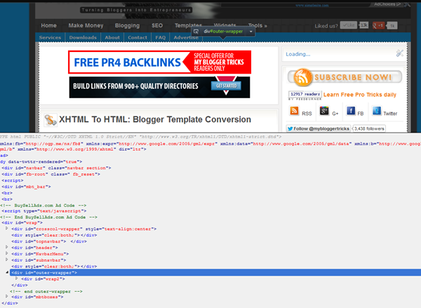
In the HTML section you will see important div sections. If you click any div tag, all html inside it will expand and when you click back it will contract. The important thing to note is what section is highlighted on your blog when you click a div. Note down that section for that particular div and save it in a notepad. Start from Divs at the top to divs at bottom. Go in sequential order.

For example if I click on the div tag for mbt highlighted below as <div id="wrap">  the entire container holding all the blog contents except the top-sticky-bar are highlighted. That's how I identified what this div does and what sections can be styled using it.

highlighted div section

Use the same method to identify the divs for Header, Navigation, Post container, Sidebar Container and finally the footer. The divs must go in order and keep track of which div is nested under another div. For example in my case the navigation, header, post body and sidebar all comes under the wrap div. So I will insert the remaining divs inside it.

This may sound a little techy for people not familay with HTML tag priorities but for developers who wish to understand how to create a clone design the method above can't be more clear than this.

Remove the Dynamic Tags

  1. Use Dreamweaver or Codelobster to open the xml file you downloaded
  2. Find each div tag and edit the code inside each one of them.
  3. For example for the outer-wrapper div tag I delete the div tags for post body and sidebar leaving the entire area vacant and then I add the contact form inside it. Visit our contact page to see the wide area with no sidebars and post-section.

identify the nested div containers

The dynamic code is easy to identify because all widgets have this basic structure:

<b:section ........................>
<b:widget ......................................../>

<b:widget ......................................../>


</b:section>


A widget container is initiated using the b:section tag and widget content is initiated using the b:widget tag. Find them all and replace the b:section tags with static div tags like the following:


<div ........................>


Delete all code inside B:widget tags found here


</div>


Once you are done with this, you will find your template looking neater and getting in shape if you are using code lobster or dreamweaver. It took me 4 hours to clean up MBT's code so it should not take you long. Its lengthy process but extremely interesting and worth trying. Once you have learnt how to do this, in our next part, I will teach you how to add a PHP contact form inside the Cloned Blogger template that looks exactly like the original blog, giving the user a great experience. 

I know you have tons of questions!

Of course this method is a little techy for newbies and would have given a headache to most of you but you may not panic and just post me a comment. I will be at your service. I reply late but I do reply! =)

I wish this tutorial may help you better understand the possibilities of customizing the Google hosted free blogs. There is no end to Blogger customization and you must try every possible tutorial that comes along your way because only Blogspot layouts can turn you into a brilliant web developer. Peace and blessings buddies. :)

Blogger Dynamic Templates Now Customizable


blogger dynamic template

Previously you guys read, "Should you enable Blogger Dynamic Views" here at MBT. The Dynamic templates are new templates designs, that were made available to apply to Blogger blogs, recently. As oppose to normal templates (the default ones), these dynamic templates are quite advance aesthetically, but lacked quite a few features, that we are used to.


Many users felt that the templates were not customizable at all. As the new dynamic templates were a new feature that was introduced, it had a long way to go to meet user expectations. Blogger blogs are quite famous for their ability to be customized, by the feature, Edit HTML.


blogger dynamic template


Many people believed that the new dynamic templates lacked that too. So recently, Blogger announced a couple of good news for Blogger fans. Though we still don't have the Edit HTML option available with us, for the Dynamic templates but still, we can at least say they are customizable to some extent, after the addition of few more fruits from Developers at Blogger.


Now you can change the colors and stuff for the templates. The background image can also be replaced. Blogger dev team says that they would soon introduce the widgets part to the dynamic templates, that we presently miss a lot. Also by navigating to the Template section (from Blogger in draft version), we get to see an disabled 'Edit HTML' option. We hope that gets live soon too.


Blogger team says :


Using the Template Designer, you can now modify your background, fonts, or colors, and add a custom header image like we did on Blogger Buzz
(just make sure it’s 65 pixels high). If you don’t fancy yourself a web
designer, simply choose from one of the “suggested themes” that we
provide.


blogger dynamic template customization


So in an all, folks at Blogger are working hard to provide all those benefits, that we enjoy with custom templates for Blogger.


Will you switch to the Dynamic suites if Blogger introduces Widgets and Edit HTML feature? Lets us know through the comment section below.


Guest Post by Hassam Ahmad Awan. MBT's Gold Star Guest Author.

Heading Tag With Drop Shadow and Mouse Hover Effect

HEADING TAGS

Blogger blogs has the free option of editing the style sheet. Fortunately you can play around the codes to give your blog any look you want. Last year I shared various ways of customizing the heading tags i.e. H3. We use H3 tags inside posts to write headlines and important sections of the posts. Today we would learn how to create a custom headline that will change colour on mouse hover. We will use CSS3 effects to produce a drop shadow effect along with mouse hover effect. This will give your headlines a neon look. So lets do it!


Create Post Heading Tags In Blogger

  1. Go To Blogger > Design > Edit HTML
  2. Backup your Template
  3. Search for this,

]]></b:skin>

    4.    Just above it paste the following code,

/*----MBT Heading Tag----*/


h3{
font-family:veranda !important;
font-style:italic !important;

}
.post h3 {
color:#666;
border-left:10px solid #666;
border-right:10px solid #666;
padding:3px 5px 3px  20px;
border-radius:15px;
-moz-border-radius:15px;
box-shadow:0px 0px 13px #666;
-webkit-box-shadow:0px 0px 13px #666;
-moz-box-shadow:0px 0px 13px #666;


}

.post h3:hover {
color:#FF133F;
border-left:10px solid #FF133F;
border-right:10px solid #FF133F;
box-shadow:0px 0px 13px #FF133F;
-webkit-box-shadow:0px 0px 13px #FF133F;
-moz-box-shadow:0px 0px 13px #FF133F;

}


Note:- Delete any code inside your template that may look like .post h3

Make these changes:

  • To Change font type edit verdana and replace it with any font family you like.
  • To change font style replace italic with either normal or bold
  • To change text color and left/right border colors in active mode then change #666 and replace it with a color of your choice
  • To replace text and border colors on mouse hover then change #FF133F
  • To change box shadow color in active mode change #666
  • To change box shadow color on mouse hover mode change #FF133F

     5.    Save your template and you are almost done!

How to use Heading Tags inside Posts?

  1. Create a new post as you normally do
  2. Now use the following code wherever you want to add a headline

<h3>Write Headline Text here</h3>

     3.  When you publish the post, you will find the magic working just perfectly. Enjoy!

I hope this little trick helps you in better writing quality posts. More variation will be introduced soon. Do let me know if you needed any help.

Please change your post title tags to h2 from h3 for better SEO and traffic value. Read this post:

Use Adobe PhotoShop Online!

online photoshop toolEver wanted an online Photo Editor with complete Image Editing options just like Adobe Photoshop CS5? Fortunately I just came across a great online image editing tool by the name Pixlr . It includes all options that photoshop has to offer. You have the option to browse an image from your computer and use effects like Gradient, brush, paint, filter, Engrave and emboss, red eye, blur, smudge etc. You can save the image in high quality formats like BMP, JPEG, PNG and two other new formats. The Image towards left is created using Pixlr.


Some Features

Tool Box

Contains a tool box with every basic photo editing equipment such as color picker, crop tool, selector, gradient, shape tool etc.

tool box


Complete Library Menu

photoshop menu

The Image, Layer, Adjustment and Filter options has sub categories that lets you add several effects to your image. All art and texture effects are included in it. The File option lets you create a custom image or save your end result.

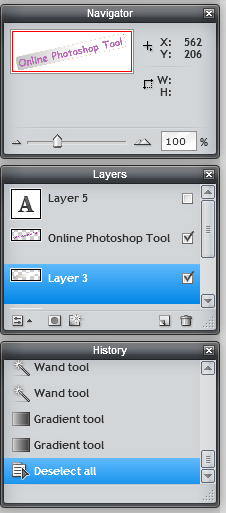
History, Navigator and Layers Windows

layers and navigator

These three windows with several other available under VIEW option lets you take the full benefit of the tool by zooming in and out and going forward and backward to edit and undo the changes.

What's new about it?

It include all features that you would need to create or edit an image or photo or any profile pic you may want. It is very useful when you are in hurry and don't have  Photoshop installed on your system. You can simply visit this website and start playing! I know this tool has many limitations when compared to CS5 and is just a small scale version of the mega Photoshop but its Online usability makes it stand out.

You can enjoy reading this post too:

Change Size, Font Family and Color Of Custom Search Engine

Custom Search EngineGoogle Custom Search Engine is another option that Adsense provides to increase your blog revenue. I shared detailed posts on how to create a custom search engine and integrate adsense in it. However the problem with the customization and editing options that Google provides lacks complete control over the margining and padding of the search box. Today we will learn on how to change the look of the search box using our own custom styles and change the size and alignment of the box elements. It is perfectly alright to edit the stylesheet (i.e. CSS Code) of the search engine because it is just a design change and therefore it does not violate any of Adsense terms of service. So lets get going!

DEMO: You will find the Minimalist Theme of the Search box on my sidebar.

Customize Google Search Box

I assume you have already tried our tutorial on Custom Search engines and have installed the search box on your blog sidebars. If not then you may first try them.

  1. Create a Custom Google Search Box
  2. Make Money With Google Custom Search Engine

The code that Google provides you will look slightly similar to this one,

Note: You are not going to use the code shared here. It only gives you idea on how to edit your own Google code for your search engine.

<div id="cse-search-form" style="width: 100%;">Loading</div>
<script src="http://www.google.com/jsapi" type="text/javascript"></script>
<script type="text/javascript">
  google.load('search', '1', {language : 'en', style : google.loader.themes.MINIMALIST});
  google.setOnLoadCallback(function() {
    customSearchControl.setResultSetSize(google.search.Search.FILTERED_CSE_RESULTSET);
    var options = new google.search.DrawOptions();
    options.setSearchFormRoot('cse-search-form');
    customSearchControl.draw('cse', options);
  }, true);
</script>

<style type="text/css">
  .gsc-control-cse {
    font-family: Arial, sans-serif;
    border-color: #ffffff;
    background-color: #ffffff;
  }


input.gsc-input {
    border:1px solid #c7c7c7; padding:5px 0px 4px 0px; color:#666;
  }


  input.gsc-search-button {
    border-color: #333333;
    background-color: #333333; margin-left:1px;
  }


  .gsc-tabHeader.gsc-tabhInactive {
    border-color: #0080ff;
    background-color: #289728;
  }
  .gsc-tabHeader.gsc-tabhActive {
    border-color: #0080ff;
    background-color: #0080ff;
  }
  .gsc-tabsArea {
    border-color: #0080ff;
  }
  .gsc-webResult.gsc-result,
  .gsc-results .gsc-imageResult {
    border-color: #FFFFFF;
    background-color: #FFFFFF;
  }
  .gsc-webResult.gsc-result:hover,
  .gsc-imageResult:hover {
    border-color: #0080ff;
    background-color: #E0F0FF;
  }
  .gs-webResult.gs-result a.gs-title:link,
  .gs-webResult.gs-result a.gs-title:link b,
  .gs-imageResult a.gs-title:link,
  .gs-imageResult a.gs-title:link b {
    color: #0080ff;
  }
  .gs-webResult.gs-result a.gs-title:visited,
  .gs-webResult.gs-result a.gs-title:visited b,
  .gs-imageResult a.gs-title:visited,
  .gs-imageResult a.gs-title:visited b {
    color: #666666;
  }
  .gs-webResult.gs-result a.gs-title:hover,
  .gs-webResult.gs-result a.gs-title:hover b,
  .gs-imageResult a.gs-title:hover,
  .gs-imageResult a.gs-title:hover b {
    color: #444444;
  }
  .gs-webResult.gs-result a.gs-title:active,
  .gs-webResult.gs-result a.gs-title:active b,
  .gs-imageResult a.gs-title:active,
  .gs-imageResult a.gs-title:active b {
    color: #777777;
  }
  .gsc-cursor-page {
    color: #0080ff;
  }
  a.gsc-trailing-more-results:link {
    color: #0080ff;
  }
  .gs-webResult .gs-snippet,
  .gs-imageResult .gs-snippet {
    color: #333333;
  }
  .gs-webResult div.gs-visibleUrl,
  .gs-imageResult div.gs-visibleUrl {
    color: #333333;
  }
  .gs-webResult div.gs-visibleUrl-short {
    color: #333333;
  }
  .gs-webResult div.gs-visibleUrl-short {
    display: none;
  }
  .gs-webResult div.gs-visibleUrl-long {
    display: block;
  }
  .gsc-cursor-box {
    border-color: #FFFFFF;
  }
  .gsc-results .gsc-cursor-box .gsc-cursor-page {
    border-color: #0080ff;
    background-color: #FFFFFF;
    color: #0080ff;
  }
  .gsc-results .gsc-cursor-box .gsc-cursor-current-page {
    border-color: #0080ff;
    background-color: #0080ff;
    color: #666666;
  }
  .gs-promotion {
    border-color: #0080ff;
    background-color: #ffffff;
  }
  .gs-promotion a.gs-title:link,
  .gs-promotion a.gs-title:link *,
  .gs-promotion .gs-snippet a:link {
    color: #0080ff !important;
  }
  .gs-promotion a.gs-title:visited,
  .gs-promotion a.gs-title:visited *,
  .gs-promotion .gs-snippet a:visited {
    color: #666666;
  }
  .gs-promotion a.gs-title:hover,
  .gs-promotion a.gs-title:hover *,
  .gs-promotion .gs-snippet a:hover {
    color: #666666;
  }
  .gs-promotion a.gs-title:active,
  .gs-promotion a.gs-title:active *,
  .gs-promotion .gs-snippet a:active {
    color: #0080ff;
  }
  .gs-promotion .gs-snippet,
  .gs-promotion .gs-title .gs-promotion-title-right,
  .gs-promotion .gs-title .gs-promotion-title-right *  {
    color: #0080ff;
  }
  .gs-promotion .gs-visibleUrl,
  .gs-promotion .gs-visibleUrl-short {
    color: #289728;
  }
</style>


The CSS code is the one enclosed between the two yellow highlighted lines. This code is responsible for the over all look of your box. To keep things simple we will be focusing only on the three coloured sections of the code and I will refer them as Purple, Orange and Green section.


If you want your search box to look exactly like mine then create a search box as instructed in our previous tutorial and choose the style as "Minimalist" Then replace the first three sections of your CSS code with the ones I shared above as purple, orange and green. That's it.

However if you wish to edit the style of your current search box then you only need to change the CSS properties which are enclosed between the curly brackets i.e. {}

Lets first understand the three sections.

  • The Purple section is responsible for the look of the box that contains the Input rectangle and search button.
  • The Orange section is responsible for look of the input box where users write query.
  • The Green section is then responsible for the look of the Search/Submit button

The purple CSS code is as follows:

.gsc-control-cse {
    font-family: Arial, sans-serif;
    border-color: #ffffff;
    background-color: #ffffff;
  }

In my case I have kept border color as white and background color as white. To Change the border and background colors simply change the hexadecimal code by using our color generator Tool. If you wish to use a background image instead and you wish to change the box height and width then you may alter the same purple code as follows.

.gsc-control-cse {
    font-family: Arial, sans-serif;
    border-color: #ffffff
;


    background: url(ADD IMAGE LINK HERE) no-repeat;

    height:25px;

    width:300px;


  }


Replace ADD IMAGE LINK HERE with image direct link and change the width and height size to suit your alignment.

The Orange CSS Code is as follows:

input.gsc-input {
    border:1px solid #c7c7c7; padding:5px 0px 4px 0px; color:#666;
  }

This will style the rectangular input box where you write query text. Now here we can introduce and change several new styles like font size, font type, text area size, text color etc. You can also set a gap between the text area and the search button using padding. You can make these alterations if you wish else you can use the code in its default form and replace your input section with this orange one. Altered code is:

input.gsc-input {
    border:1px solid #c7c7c7; padding:5px 0px 4px 0px; color:#666;

font-size:12px;

font-family:arial;

font-weight:normal;
  }


I am sure the code is easy enough to be edited. You can choose the following font families as standards: Arial, Verdana or sans-serif. Font weight turns the text thickness. You can choose normal or bold. To change to text color simply change color:#666

The padding is actually the distance between the outline of the input box (Text Area box) and the text. Keep it as default. If you wish to change it then it follows this order:

padding:Top Right Bottom Left; In my case I have set them as padding:5px 0px 4px 0px;

The Green CSS Code is as follows:

input.gsc-search-button {
    border-color: #333333;
    background-color: #333333; margin-left:1px;
  }


This code changes the look and appearance of the Search/Submit button. You can edit it as there is nothing new except the margin property.

A margin is the gap distance between the search button and Text Input Box. You can set other margins too. Altered code is here:

input.gsc-search-button {
    border-color: #333333;
    background-color: #333333; margin-left:1px;

margin-right:0px;

margin-top:0px;

margin-bottom:0px;

font-size:12px;

font-family:Arial;

font-weight:bold;


  }

Start playing with these and keep saving your widget to see the preview.

Need Help?

Try customizing your search box using the simple method shared above. If you needed any help then feel free to let me know. Do share the CSS code of your search box while asking a question. I hope this helps most of you. Peace brothers.

Glossy Red-Grey Tabs Menu

This new menu has two different variations. The color combination can either be red in active mode and grey on mouse hover or vice versa. It is a shiny navigation menu that is mainly created for including blogger pages such as Home, Contact, About. That's why I ignored adding a drop down column to it. Very soon we will also learn how to create mega menus with multi columns in drop down view. But first lets see a demo first,

Grey-Red Theme

blogger menu

Red-Grey Theme

glossy tabs menu


Live Demo

Add This Menu To Blogger

  1. Go to Blogger > Design
  2. Choose HTML/JavaScript widget
  3. Paste the following code inside it,

<style>
.mbt-red-grey-menu{
border:5px solid #cd0000;
padding:0;
clear:both;
}

.mbt-red-grey-menu{
margin:0px;
padding: 0;
float: left;
font: bold 13px Arial;
width: 100%;
overflow: hidden;
margin-bottom: 1em;
border: 1px solid #625e00;
border-width: 1px 0;
background: black url(https://blogger.googleusercontent.com/img/b/R29vZ2xl/AVvXsEiOpcjvBrsBjNCmI2e74p3UnsXI-sXGpKstVy292tae1jOumDOYdQim1JKi8RsnD7w-_1kWpQgyeuUdld_EFsZfRLl5QORgIXMbxwvHpwCPtEyTTXwRCbyhh9FOj7QlTuZJn5VmPSnW9Mg/s400/blockdefault.gif) center center repeat-x;
}

.mbt-red-grey-menu li{
display: inline;
}

.mbt-red-grey-menu li a{
float: left;
color: #fff;
padding: 9px 11px;
text-decoration: none;
border-right: 1px solid white;
}

.mbt-red-grey-menu li a:visited{
color: #fff;
}

.mbt-red-grey-menu li a:hover, .mbt-red-grey-menu li a.selected{
color: #fff;
background: transparent url(https://blogger.googleusercontent.com/img/b/R29vZ2xl/AVvXsEjIJH4BfX4TEtCJNKujmdS8HQ8b-T1-zelzcuT5lOSS8aiDLptKLzPnZzR60nLhFEd-fWV6n-maIr3r9W3EekUftCrzCkXuEszm8nAVe8z1iu_Q3WwXJTIM_gqvqOdd2TK21S7F915FtOU/s400/blockactive.gif) center center repeat-x;
}

</style>


<ul  class="mbt-red-grey-menu">
<li><a href="#">Home</a></li>
<li><a href="#" >About Us </a></li>
<li><a href="#">Contact Us</a></li>
<li><a href="#">Sitemap</a></li>
</ul>


      Make these changes:

Replace the # sign in each case with related Page URL.

The above code is for Red-Grey theme if you wish to use the other theme instead then simply swap the position of the two image links in the above code (shown in purple).

To add a new link then paste the following code each time you want just before </ul>

<li><a href="#">page-name</a></li>

     4.   Save your widget and drag it just below your blog header. (Blog header is the widget where you add blog title and description)

     5.   Hit the Save button at the top-right corner of Page Elements page

     6.   You are all done!

Visit your blogs to see it working just perfectly. If you would like to select a different menu out of 30-40 menus created by MBT then you can search our blog to find something more exciting. Feel free to let me know if you needed any help. I am sure this menu will let you better organize your blog. Peace brothers. :>