How to Add Neat CSS3 Dropdown Menu in Blogger

Here's another simple yet amazing dropdown menu with pure CSS3 made by Andrew from script-tutorials.com with some slight modifications so that it can be easily adapted to our Blogger template.

In the upper right side of this menu, we have the contact links and social media icons for Facebook, Twitter, Google Plus and RSS feed. Below these links, there is the drop-down navigation menu and on the left side, the search form.

To achieve a better user interface and interaction, the CSS dropdown menu features sub categories that appear with a nice touch of CSS3 box-shadow, text-shadow and a cool transition once the parent link is activated by a hover selector.

dropdown menu


Adding the CSS dropdown navigation menu in Blogger

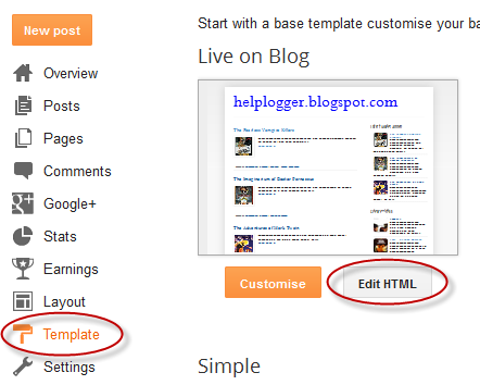
Step 1. Access your Blogger Dashboard and go to "Template", then click on the "Edit HTML" button


Step 2. Next, click anywhere inside the code area and press the CTRL + F keys to open the search box. Type the tag below inside the search box and hit Enter to find it.
</header>
Step 3. Just below </header> add the HTML structure of the dropdown menu:
<div id='contact-links'>
    <div id='my-links'>
        <a href='#'>About</a>
        <a href='#'>Contact</a>
                <a href='#'><img height='18px' src='https://blogger.googleusercontent.com/img/b/R29vZ2xl/AVvXsEhaTVOVDg4064dWDrf5Uaz22OoZtKFNB-pXryyiCEc2wa692A5xapNhZiaCDZVbtVpZ-mr7R7SDAwhUwiUkbsEzXt6JRh9qgc_fBrSG4VDl7lVONlrnh7uJlTSu7MV9rQGHLHtO_D_WNdZn/s1600/facebook-icon.png' title='Facebook' width='18px'/></a>
<a href='#'><img height='18px' src='https://blogger.googleusercontent.com/img/b/R29vZ2xl/AVvXsEgwMjd2p9a16mdQ6OHMeSHDMBGuzpOzX1an8aj0okMCmUCj57ncdCNXxAeSes-wp5NuG1opCtjgvqEi1d1rvzn0SaLfuvBRu8r3U2yH68b0gIPjVlNJnxAG8ri0fKr5a8yz_LGDQxzaZkpx/s1600/twitter.png' title='Twitter' width='18px' /></a>
        <a href='#'><img height='18px' src='https://blogger.googleusercontent.com/img/b/R29vZ2xl/AVvXsEinR8iOpDdUl1MbFODaRqwnbX6-CHtz8ZEHI8o_fzGErLM1sVQZMH87lXrtLK8OJabKadAD4wJ9TXgG8-27RpgcrYTBeDSSEx3rhX8JHWssLtrUxDYIBQ07y6KCCnB0fXe_9DNFE2_eiKP7/s1600/google-plus-icon.png' title='Google' width='18px'/></a>
        <a href='#'><img height='18px' src='https://blogger.googleusercontent.com/img/b/R29vZ2xl/AVvXsEjRH2GRnZefEeHSIPv0GayzphY_gqNJY85zSCMJXhx94zFmI-TQOKIB_pMR_2w6hlzkAPqrLdkVVZ_OZwPyHDFebIq7_Jzr82fNScXkDX2iA48Jk6mMiVmXa0kjmrsM7BXIvL3KyhXD_5dd/s1600/rss-icon.png' title='RSS Feed' width='18px'/></a>
    </div>

    <div id='menu-container'>
        <nav id='neat-menu'>
            <ul>
              <li class='active'><a href='/'>Home</a></li>
                <li><a href='#'>Dropdown</a>
                    <ul>
                        <li><a href='#'>Menu element 1</a></li>
                        <li><a href='#'>Menu element 2</a></li>
                        <li><a href='#'>Menu element 3</a></li>
                        <li><a href='#'>Menu element 4</a></li>
                        <li><a href='#'>Menu element 5</a></li>
                    </ul>
                </li>
                <li><a href='#'>Dropdown</a>
                    <ul>
                        <li><a href='#'>Menu element 1</a></li>
                        <li><a href='#'>Menu element 2</a></li>
                        <li><a href='#'>Menu element 3</a></li>
                        <li><a href='#'>Menu element 4</a></li>
                        <li><a href='#'>Menu element 5</a></li>
                    </ul>
                </li>
                <li><a href='#'>Dropdown</a>
                    <ul>
                        <li><a href='#'>Menu element 1</a></li>
                        <li><a href='#'>Menu element 2</a></li>
                        <li><a href='#'>Menu element 3</a></li>
                        <li><a href='#'>Menu element 4</a></li>
                        <li><a href='#'>Menu element 5</a></li>
                    </ul>
                </li>
                <li><a href='#'>Single Menu</a></li>
                <li><a href='#'>Single Menu</a></li>
                <li><a href='#'>Dropdown</a>
                    <ul>
                        <li><a href='#'>Menu element 1</a></li>
                        <li><a href='#'>Menu element 2</a></li>
                        <li><a href='#'>Menu element 3</a></li>
                        <li><a href='#'>Menu element 4</a></li>
                        <li><a href='#'>Menu element 5</a></li>
                    </ul>
                </li>
            </ul>
        </nav>

        <!-- menu-search form -->
        <div id='menu-search'>
          <form method='get' action='/search'>
                <input autocomplete='off' name='q' placeholder='search...' type='text' value=''/>
            </form>
        </div>
    </div>
</div>

How to Set up the Dropdown Menu

  • Replace the # symbols with the URLs of your links and replace the texts in blue with the titles that you want to appear in the menu.
  • To change the social media icons, add the links of your icons instead of the ones in blue. For more help, please see this tutorial on how to upload and get the URL of an image.
  • If you want to remove the sub categories, remove the code within the tags highlighted in yellow, including the ul tags. To remove only a menu element, remove the part that starts with <li> and ends with </li>
Step 4. Now, let's add the CSS styling for the menu. Search for the following tag:
]]></b:skin>
Step 5. Just above the ]]></b:skin> tag, add this CSS code:
#contact-links{text-shadow:0 -1px 0 rgba(0,0,0,0.3);margin:auto;position:relative;width:100%}#contact-links a{color:#4C9FEB}#contact-links a:hover{color:#3D85C6}#my-links{float:right;font-size:12px;margin:4px 10px;overflow:hidden;text-shadow:0 1px 0 #FFF}#my-links a{margin-left:7px;padding-left:8px;text-decoration:none}#my-links a:first-child{border-width:0}#menu-container{background:-webkit-linear-gradient(#f6f6f6,#e9eaea) repeat scroll 0 0 transparent;background:-moz-linear-gradient(#f6f6f6,#e9eaea) repeat scroll 0 0 transparent;background:linear-gradient(#f6f6f6,#e9eaea) repeat scroll 0 0 transparent;filter:progid:DXImageTransform.Microsoft.gradient(startColorstr='#f6f6f6',endColorstr='#e9eaea',GradientType=0);border-radius:0 0 4px 4px;border:1px solid rgba(0,0,0,0.1);box-shadow:-1px 1px 0 rgba(255,255,255,0.8) inset;clear:both;height:46px;padding-top:1px}#neat-menu{float:left}#neat-menu a{text-decoration:none}#neat-menu ul{list-style:none;margin:0;padding:0}#neat-menu > ul > li{float:left;padding-bottom:12px}#neat-menu ul li a{box-shadow:-1px 0 0 rgba(255,255,255,0.8) inset,1px 0 0 rgba(255,255,255,0.8) inset;border-color:#D1D1D1;border-image:none;border-style:solid;border-width:0 1px 0 0;color:#333;display:block;font-size:14px;height:25px;line-height:25px;padding:11px 15px 10px;text-shadow:0 1px 0 #FFF}#neat-menu ul li a:hover{background:-webkit-linear-gradient(#efefef,#e9eaea) repeat scroll 0 0 transparent;background:-moz-linear-gradient(#efefef,#e9eaea) repeat scroll 0 0 transparent;background:linear-gradient(#efefef,#e9eaea) repeat scroll 0 0 transparent;filter:progid:DXImageTransform.Microsoft.gradient(startColorstr='#efefef',endColorstr='#e9eaea',GradientType=0)}#neat-menu > ul > li.active > a{background:-webkit-linear-gradient(#55A6F1,#3F96E5) repeat scroll 0 0 transparent;background:-moz-linear-gradient(#55A6F1,#3F96E5) repeat scroll 0 0 transparent;background:linear-gradient(#55A6F1,#3F96E5) repeat scroll 0 0 transparent;filter:progid:DXImageTransform.Microsoft.gradient(startColorstr='#55A6F1',endColorstr='#3F96E5',GradientType=0);border-bottom:1px solid #2D81CC;border-top:1px solid #4791D6;box-shadow:-1px 0 0 #55A6F1 inset,1px 0 0 #55A6F1 inset;color:#FFF;margin:-1px 0 -1px -1px;text-shadow:0 -1px 0 rgba(0,0,0,0.3)}#neat-menu > ul > li.active > a:hover{background:-webkit-linear-gradient(#499FEE,#3F96E5) repeat scroll 0 0 transparent;background:-moz-linear-gradient(#499FEE,#3F96E5) repeat scroll 0 0 transparent;background:linear-gradient(#499FEE,#3F96E5) repeat scroll 0 0 transparent;filter:progid:DXImageTransform.Microsoft.gradient(startColorstr='#499FEE',endColorstr='#3F96E5',GradientType=0)}#neat-menu > ul > li:first-child > a{border-radius:0 0 0 5px}#neat-menu ul ul{background:-webkit-linear-gradient(#F7F7F7,#F4F4F4) repeat scroll 0 0 padding-box transparent;background:-moz-linear-gradient(#F7F7F7,#F4F4F4) repeat scroll 0 0 padding-box transparent;background:linear-gradient(#F7F7F7,#F4F4F4) repeat scroll 0 0 padding-box transparent;filter:progid:DXImageTransform.Microsoft.gradient(startColorstr='#F7F7F7',endColorstr='#F4F4F4',GradientType=0);border-radius:5px 5px 5px 5px;border:1px solid rgba(0,0,0,0.1);box-shadow:0 1px 0 #FFF inset;height:0;margin-top:1px;opacity:0;overflow:hidden;width:240px;padding:0;position:absolute;visibility:hidden;z-index:1;-webkit-transition:all .5s;-moz-transition:all .5s;-ms-transition:all .5s;-o-transition:all .5s;transition:all .5s}#neat-menu ul li:hover ul{margin-top:0\2;height:auto;opacity:1;visibility:visible}#neat-menu ul ul a{border-right-width:0;border-top:1px solid #D1D1D1;box-shadow:0 1px 0 #FFF inset;color:#444;height:24px;line-height:24px;padding:7px 12px;text-shadow:0 1px 0 #FFF}#neat-menu ul ul a:hover{background:-webkit-linear-gradient(#55A6F1,#3F96E5) repeat scroll 0 0 transparent;background:-moz-linear-gradient(#55A6F1,#3F96E5) repeat scroll 0 0 transparent;background:linear-gradient(#55A6F1,#3F96E5) repeat scroll 0 0 transparent;filter:progid:DXImageTransform.Microsoft.gradient(startColorstr='#55A6F1',endColorstr='#3F96E5',GradientType=0);border-top:1px solid #4791D6;box-shadow:-1px 0 0 #55A6F1 inset,1px 0 0 #55A6F1 inset;color:#FFF;text-shadow:0 -1px 0 rgba(0,0,0,0.3)}#neat-menu ul ul li:first-child a{border-top-width:0}#menu-search{margin:8px 10px 0 0;float:right}#menu-search form{background:url(https://blogger.googleusercontent.com/img/b/R29vZ2xl/AVvXsEjUWUUMxbOf6zr-cLwapQz9ofheK7Ki0ZbVJoy62ehGnGZLlO3XueVWKAjFYfVL0CYl-4WCgRehLKNUqbZHn3BKnpcb-Ei5H1zsDqYEDcAc1D1w3aLc5x2sdKn4ukf7IYU86G7d2ztzU2x_/s1600/menu-search.gif) no-repeat scroll 5% 50% transparent;border:1px solid #CCC;border-radius:3px 3px 3px 3px;box-shadow:0 1px 0 rgba(0,0,0,0.05) inset,0 1px 0 #FFF;height:26px;padding:0 25px;position:relative;width:130px}#menu-search form:hover{background-color:#F9F9F9}#menu-search form input{color:#999;font-size:13px;height:26px;text-shadow:0 1px 0 #FFF;background:none repeat scroll 0 0 transparent;border:medium none;float:left;outline:medium none;padding:0;width:100%}#menu-search form input.placeholder,#menu-search form input:-moz-placeholder{color:#C4C4C4}
Step 6. Click on the "Save template" button to save the changes and you're done!

Hope you like this CSS3 dropdown menu for Blogger and if you enjoyed the tutorial, please share and subscribe.

Share Blog Posts in Social Media using AddThis

AddThis is the most complete social sharing service allowing you to share your posts in more than 270 different social networks. If you want to use the AddThis widget and get the AddThis sharing buttons, this tutorial will show you how to register and add this feature on your blog. Plus, you will get to know some of the customization options of these buttons. So let's get started!

Getting the AddThis share buttons code

Step 1. Visit the https://www.addthis.com/get/sharing page.

Step 2. To get the sharing buttons and to access the AddThis sharing stats to find out how many people shared your post by using the AddThis feature, click on the "Create account" button.

create addthis account

The site will ask you to make a small registration. Fill out the information to register. It's quick, simple and it's free. To finish the registration, click on the Register button.

register addthis

Step 3. After you've been logged in, right below the "Get sharing buttons for", choose the "A website" option.

addthis share buttons

Step 4. In the "Select style" section, choose the buttons style that you think would look the best on your site/blog. Please note that on the right side you can see a preview of these buttons.

addthis sharing buttons

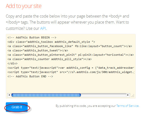
Step 5. After you have chosen the style, the site will provide a code - click on the "Grab it" button to copy it.

addthis code

The code provided will look like this:
<!-- AddThis Button BEGIN -->
<div class="addthis_toolbox addthis_default_style ">
<a class="addthis_button_facebook_like" fb:like:layout="button_count"></a>
<a class="addthis_button_tweet"></a>
<a class="addthis_button_pinterest_pinit" pi:pinit:layout="horizontal"></a>
<a class="addthis_counter addthis_pill_style"></a>
</div>
<script type="text/javascript">var addthis_config = {"data_track_addressbar":true};</script>
<script type="text/javascript" src="//s7.addthis.com/js/300/addthis_widget.js#pubid=ra-XXXXXXXXXXX"></script>
<!-- AddThis Button END -->
Now that you have selected and set up your AddThis sharing buttons, let's add them in the footer of the posts.

Adding the AddThis sharing buttons on Blogger

Step 1. Access your Blogger Dashboard and go to "Template", then click on the "Edit HTML" button on the right side:

blogger template

Step 2. Click anywhere inside the code area and press the CTRL + F keys to open the search box.

Step 3. Type the following line inside the search box and try to find the second occurrence of it - hit Enter:
<div class='post-footer'>
Step 4. Just above this line, add the code for the AddThis social sharing buttons.

Note: If you want to add at the beginning of your posts, add the code below the second:
<div class='post-header'>

How to add more AddThis buttons

To add more buttons, simply choose the button for that social network and add the code just before the </div> tag (refer to the step 5 from above).

Some examples:
<a class="addthis_button_linkedin"></a> /* linkedin button */
<a class="addthis_button_google_plusone" g:plusone:size="medium"></a> /*gplus button */
<a class="addthis_button_digg"></a> /* digg button */
<a class="addthis_button_stumbleupon"></a> /* stumbleupon button */
<a class="addthis_button_print"></a> /* print button */

CSS3 AddThis Share Buttons

You can add just a single button, so that when the reader hovers over it, a menu will open with the options of social networks to share the post.

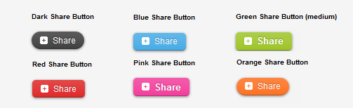
css3 share buttons, addthis

Visit this page for a demo.

Step 1. Go to "Template" > click on the "Edit HTML" button > press the CTRL + F keys and search:
<div class='post-footer'>
Just above this line, paste the following code:
<style type='text/css'>
.addthis_share_btn a, .addthis_share_btn a:visited {
background: #FF5C00; /* background color of the button */
display: inline-block;
padding: 6px 12px;
font-family: arial,helvetica,lucida,verdana,sans-serif;
font-size: 12px;
line-height: 1em;
color: #fff;
text-decoration: none;
-moz-border-radius: 5px;
-webkit-border-radius: 5px;
-moz-box-shadow: 0 1px 3px rgba(0,0,0,0.5);
-webkit-box-shadow: 0 1px 3px rgba(0,0,0,0.5);
border-radius: 5px;
box-shadow: 0 1px 3px rgba(0,0,0,0.5);
text-shadow: 0 -1px 1px rgba(0,0,0,0.25);
border-bottom: 1px solid rgba(0,0,0,0.25);
position: relative;
cursor: pointer;
}
.addthis_share_btn a:hover {
background: #D45500; /* background color on mouse hover */
color: #fff;
}
.addthis_share_btn a:active { top: 1px; }

.addthis_share_btn a span, .addthis_share_btn:visited a span {
background: url(http://www.addthis.com/cms-content/images/gallery/icon-addthis.gif) no-repeat left;
padding: 1px 0 1px 18px;
}
</style>
<!-- AddThis Share Button -->
<div class='addthis_toolbox addthis_share_btn'>
<a class='addthis_button_compact' href='http://addthis.com/bookmark.php'>
<span>Share</span></a>
</div>
<script src='http://s7.addthis.com/js/250/addthis_widget.js' type='text/javascript'/>
<!-- End AddThis Share Button -->

Customization

  • To change the color of the button according to the colors of your template, modify the color value in red.
  • If you want to change the "Share" text, replace the text in blue.
Step 2. Save the changes by clicking on the "Save template" button and you're done!

CSS3 Transition Property Basics

While browsing some sites, we can see an interesting effect on some links. Most of the time, when you hover over a link, something changes in its style: it will either change its color or background, or will become underlined.

What about this cool effect that consists in gradual transition from one style to another that you can see in the example below:
Hover Over Me!

This transition is achieved by using the CSS3 transition property - property which is supported in all major browsers such as Chrome, Firefox, Opera, Safari (for Safari we will need the -webkit- prefix to get this effect).

The CSS3 Transition Syntax

The syntax of the transition supports four values:
  • the property affected by the transition, such as color, border, background, width, etc.
  • the duration of this transition in seconds, i.e. how long will it take to change your style completely
  • the delay time for the transition to be executed, also in seconds, i.e. how long it takes for the transition to start when the mouse hovers over that element;
Check out the code below:
.example {
 transition-property: width; /* property that undergoes a transition */
 transition-duration: 2s; /* duration of the transition */
 transition-timing-function: linear; /* timing-function */
 transition-delay: 0; /* length of time to delay the start of a transition */
/* now we will repeat the entire declaration with the -webkit- prefix for the effect to work in Chrome and Safari */
 -webkit-transition-property: width;
 -webkit-transition-duration: 2s;
 -webkit-transition-timing-function: linear;
 -webkit-transition-delay: 0;
}
In the example above, the elements with the .example class will become wide within two seconds as the mouse passes over them.

When we define the style of a link, usually we need to use the a:link selector, and when defining the style when the mouse is over the link, we need to use the :hover selector. However, the transition can be used in any HTML element, not just links.

To make the transition effect to work properly, we should define two blocks of style for that element, i.e. the normal style for a tag/id/class and the style on mouse :hover for a specific tag/id/class.

For example:
tag, #id, .class {
/* insert here the styles that you want for the selector */
/* insert below the transition effects */

}
tag:hover, #id:hover, class:hover {
/* Insert here the styles for when the mouse is over the element */
/* here it is not necessary to repeat the declaration of the transition */

}
You can add the same style on multiple selectors separated by commas as you can see above, although it is not necessary.

Below are some transition examples with their respective CSS codes. I will not use the transition-timing-function in these examples because it makes no difference, as the first value is the duration in seconds and the second is the delay.

Example 1:

Transition example

/* with a single property */
#example1 {
 background-color: #FFFF00;
-moz-transition-property: background-color;
-moz-transition-duration: 2s;
-webkit-transition-property: background-color;
-webkit-transition-duration: 2s;
-o-transition-property: background-color;
-o-transition-duration: 2s;
}
#example1:hover {
background-color: #B5E2FF;
}

Example 2:

Transition example

/* with four properties and delay */
#example2 {
background-color: #9c3;
border: 8px solid #690;
padding: 20px;
color: #fff;
-moz-transition-property: background-color,border;
-moz-transition-duration: 1s;
-webkit-transition-property: background-color,border;
-webkit-transition-duration: 1s;
-o-transition-property: background-color,border;
-o-transition-duration: 1s;
}
#example2:hover {
background-color: #690;
border: 8px dashed #fff;
color: #FFFF00;
-moz-transition-property: background-color,border;
-moz-transition-duration: 2s;
-webkit-transition-property: background-color,border;
-webkit-transition-duration: 2s;
-o-transition-property: background-color,border;
-o-transition-duration: 2s;
}
Example 3:

Transition example

/* with seven properties and delay */
#example3 {
padding: 15px;
background-color: #FF7CA6;
font-size: 16px;
width: 30%;
font-weight: bold;
color: #fff;
height: 20px;
-moz-transition-property: background-color,width,height,padding,font-size,color;
-moz-transition-duration: 1s;
-webkit-transition-property: background-color,width,height,padding,font-size,color;
-webkit-transition-duration: 1s;
-o-transition-property: background-color,width,height,padding,font-size,color;
-o-transition-duration: 1s;
}
#example3:hover {
background-color:#9c3;
width: 60%;
height: 60px;
padding: 50px;
font-size: 30px;
color: #FFFF00;
-moz-transition-property: background-color,width,height,padding,font-size,color;
-moz-transition-duration: 2s;
-webkit-transition-property: background-color,width,height,padding,font-size,color;
-webkit-transition-duration: 2s;
-o-transition-property: background-color,width,height,padding,font-size,color;
-o-transition-duration: 2s;
}
Example 4:

Transition example

/* with all the properties simultaneously */
#example4 {
padding: 15px;
background-color: #9c3;
color: #fff;
font-size: 16px;
width: 30%;
font-weight: bold;
transition: all 2s;
-webkit-transition: all 2s;
}
#example4:hover {
background-color: #FF7CA6;
color: #242424;
width: 60%;
}

Final words:

  • the transition declarations need to appear in the CSS. In Blogger, the CSS is located before ]]</b:skin>
  • as you can see in the examples above, you can assign different rules for the transitions of different elements in a single rule - just separate them with commas.
  • it is not mandatory to use the four properties in the transition declaration, but their order must always look like this: property/duration/timing-function/delay.
  • the duration and delay values ​​must be expressed in seconds, but sometimes a second is a long time for a transition. In this case, you can use values with milliseconds, for example, .5s means half a second.
  • In small time intervals, the timing of the transition-function property does not give a remarkable effect being most useful only in more advanced animations. The possible values are either ease (the default, which makes the transition with a slow beginning, then gets faster and ends slowly), linear (the same transition speed from beginning to end), ease-in (transition begins slowly and then the speed increases), ease-out (transition starts fast and slows down at the end) and ease-in-out

Add Author's Profile Picture and Name in Multi Author Blog

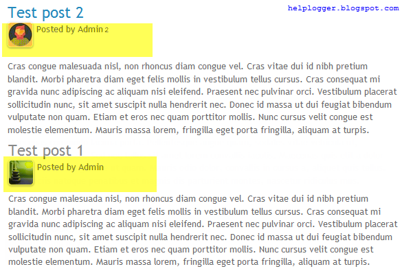
In this tutorial, we will see how to add the author's profile picture and name on a Blogger blog just below the post title. Not only that this can give your blog that personal touch but attaching an image to your blog posts in Blogger can help visitors identify, and perhaps have a level of trust with you. Also, this could be a great addition to blogs with multiple authors, since the info for each publisher will be shown below the titles of their respective posts and this way, they will get the proper credit for their work.
multi-author blog, blogger tricks

Related: How to Add or Invite Multiple Authors in Blogger

Adding the Author's Profile Picture / Avatar and Name in Blogger

Step 1. From the Blogger Dashboard, go to "Template" and click the "Edit HTML" button.


Step 2. Click anywhere inside the code area and press the CTRL + F keys to open the search box. Paste the following code inside the search box, then hit Enter to find it:
<span class='post-author vcard'>
Just below this line is the rest of code, which should look something like this:
              <span class='post-author vcard'>
                <b:if cond='data:top.showAuthor'>
                  <b:if cond='data:post.authorProfileUrl'>
                    <span class='fn' itemprop='author' itemscope='itemscope' itemtype='http://schema.org/Person'>
                      <meta expr:content='data:post.authorProfileUrl' itemprop='url'/>
                      <a expr:href='data:post.authorProfileUrl' rel='author' title='author profile'>
                        <span itemprop='name'><data:post.author/></span>
                      </a>
                    </span>
                  <b:else/>
                    <span class='fn' itemprop='author' itemscope='itemscope' itemtype='http://schema.org/Person'>
                      <span itemprop='name'><data:post.author/></span>
                    </span>
                  </b:if>
                </b:if> 
</span>
Note: If you are using a custom template, it could look something like this:
<span class='post-author vcard'>
<b:if cond='data:top.showAuthor'>
<data:top.authorLabel/>
<span class='fn'><data:post.author/>
</span>
</b:if>
</span>
Step 3. Now that you found the code, delete it. Please note that it should start and end with the tags marked in yellow. This code is repeated two times in the template's code and you will need to remove both occurrences.

Step 4. Next, search for this line (you'll find it twice but stop on the second one):
<div class='post-header-line-1'/>
Step 5. Just below the line, paste the following code:
<span class='post-author vcard'>
<b:if cond='data:post.author == &quot;AuthorName&quot;'>
<span class='author'><a href='Author-Profile-URL'><img src='Author-Image-URL'/></a></span>
</b:if>
        <b:if cond='data:top.showAuthor'>
          <data:top.authorLabel/>
            <b:if cond='data:post.authorProfileUrl'>
              <span class='fn'>
                <a expr:href='data:post.authorProfileUrl' itemprop='author' rel='author' title='author profile'>
                  <data:post.author/>
                </a>
              </span>
            <b:else/>
              <span class='fn'><data:post.author/></span>
            </b:if>
        </b:if>
      </span>
Replace the AuthorName text with the EXACT name that appears on the Blogger profile, i.e. the one that appears in the posts or comments. If it is added in a different way, Blogger will not recognize the username, nor the image and the code will not work.

To display the author's pic, add the URL of the author's Blogger profile and the image URL by replacing the text in blue. It is recommended to use an image with a maximum height of 40px and 40px wide. Once done, the photo of the author will appear next to the "posted by" text just below the post title.

Now for those who maintain a blog with more than one author, you will need to add the following code just above <b:if cond='data:top.showAuthor'>
<b:if cond='data:post.author == &quot;AuthorName2&quot;'>
<span class='author'><a href='Author2-Profile-URL'><img src='Author2-Image-URL'/></a></span>
</b:if>
If you have more than two authors, repeat this block of code for each author that you want to add.

Now, let's go one step further and add the CSS styles.

Step 6. Search using CTRL + F for this tag:
]]></b:skin>
Just above the ]]></b:skin> tag, paste the following CSS code:
.post-header {
width: 100%;
padding: 2px 5px;
margin: 5px;
clear: both;
float: left;
}
.author img{
float: left;
margin: 0px 5px 10px 0px;
max-width:100%;
height:45px;
border-radius: 10px;
}
.post-author{
color:#777;
font-size: 13px;
font-style: italic;
}
.post-author a {
color:#777; }
Note: to change the size of avatar, modify the 45px> value.

Step 7. Click on the "Save template" button and that's it. You should see now the profile picture and name of the Blogger author below the title of each post.

PageRank Checker - Check Your Google Page Rank

PageRank is an algorithm used by Google Search to rank websites in their search engine results. Page Rank was named after Larry Page, one of the founders of Google as a way of measuring the importance of website pages.

What is Google PageRank and Why Is It Important

According to Google:
"PageRank works by counting the number and quality of links to a page to determine a rough estimate of how important the website is. The underlying assumption is that more important websites are likely to receive more links from other websites."

Briefly, the Page Rank is an assessment of the importance of a web page. This relevance is calculated and published on a scale from 0 to 10. Google basically takes into account the number of backlinks that each page receives, however, the number doesn't matter that much if we don't build high quality backlinks from sites which are related to our links, preferably internal links.

A greater importance has the quantity of internal links linked by other websites, which happens when you create a post and someone publishes the link that redirects to this post that you created. So, the more backlinks your blog or site has, the higher is the chance of having a good PageRank.
pagerank, check page rank

Now that we have a basic understanding of what Page Rank is, how about checking yours?

Check Google Page Rank using the PageRank Checker

You can easily calculate your page rank and check the importance of your page. Just enter the address of your website / blog below and check it out:

Check Page Rank of your Web site pages instantly:

This page rank checking tool is powered by Page Rank Checker service

Do you want to share your page rank with your visitors? You can add a button to your blog by visiting the PageRank Buttons page.

The difference between white hat SEO and black hat SEO

The search engine optimization (SEO) is a good way to promote your blog on Google search results and other search engines. For those who don't understand how SEO works, here you can find several SEO articles that might help you, but we need to be also aware of the good and bad SEO techniques that could have a direct impact on our ranking.

This article will shed some light on the terms known as black hat and white hat SEO and we will get to know what's good and what is not when we optimize our website and its content.

black hat and white hat seo

What is Black Hat SEO?

From the 'SEO dictionary', the term black hat SEO has to do with the abusive techniques that will force the search engines to look at a specific site and rank it. This might work at first, but the algorithms can already see some of these techniques that have become common for a fast result.

Such practices to trick the search engines are, for example, the excessive use of keywords, especially in headings and subheadings; transparent keywords to the user or the so-called hidden text, automatically generated content, pages redirecting automatically to other content and more.

What is White Hat SEO?

The white hat SEO has to do with the good techniques in the 'eyes' of the search engines. These are considered ethical techniques for the ranking, helping thus, the positioning of a website or blog. However, working on the white hat is a process that requires dedication and results may take longer to appear (this is why so many people opt for black hat in order to 'try' something more 'effective') but the results could be much more safe and satisfactory on a long term.

Keep in mind that Google has plenty of tricks up its sleeve to penalize anyone who doesn't act in accordance with the policies and rules of their website - this includes removing your page from any of the positions. Fair enough, after all, why Google would 'reward' somebody with the top spot if the site doesn't provide good content for its users and at the same time, doesn't meet the requirements of the algorithm?

For those who are interested and want to get to the top of Google search results, visit the webmaster guidelines page. There, you can find more information about how to create good content, how the design of your blog/site should be and how to work with your links. Also, you can find mentions about black hat SEO techniques.

Add floating social media sharing buttons below Blogger post titles

It is becoming increasingly important to make our posts appreciated and shared on social networks and one of the best ways to get traffic to our blog or site and boost sharing stats is to add social sharing buttons.

In this tutorial we will see how to add a floating social media sharing bar below the title of Blogger posts, so when a reader scrolls down the page, he will still be able to see the sharing buttons without having to scroll back to the top.

Adding the below jQuery script will make the buttons float in a fixed position as soon as they reach "the top" of the page. By scrolling back, the buttons will return to their initial position.

The social sharing bar includes buttons for Facebook, Twitter, Google+, and Pinterest.

Social Media Sharing Buttons below Blogger Post Title

Step 1. From the Blogger Dashboard, go to "Template" and click on the "Edit HTML" button:


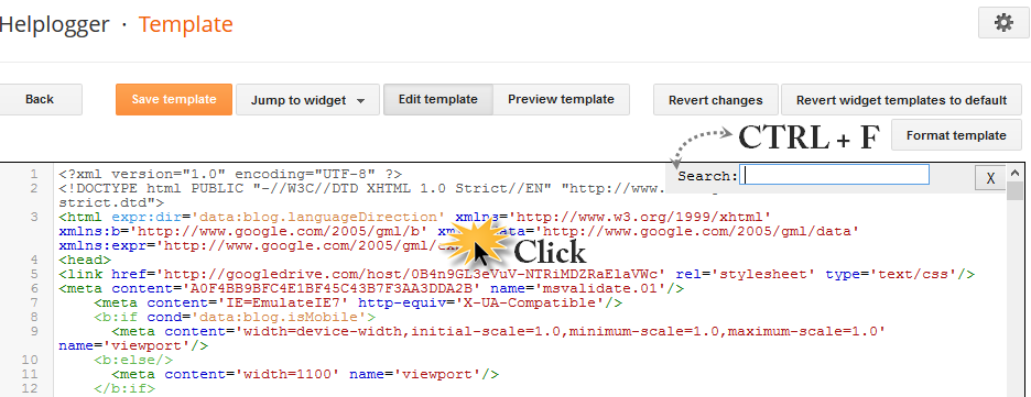
Step 2. Click anywhere inside the code area and press the CTRL + F keys to open the search box. Once you see the search box, type the </head> tag inside the search box and hit Enter to find it.

blogger search box, ctrl + f

Step 3. Just above </head> add this script:
<script src='http://ajax.googleapis.com/ajax/libs/jquery/1.7.1/jquery.min.js' type='text/javascript'/>

<script type='text/javascript'>
//<![CDATA[
$(function() {
var $movesbuttons = $("#floating-social-buttons"),
$window = $(window),
offset = $movesbuttons.offset();
$window.scroll(function() {
if ($window.scrollTop() > offset.top) {
$movesbuttons.css({'position' : 'fixed', 'width' : '550px', 'top' : '0px'});
} else {
$movesbuttons.css({'position' : 'absolute', 'top' : 'auto'});
}
});
});
//]]>
</script>
Step 4. Now before the ]]></b:skin> tag (press CTRL + F to find it) add the following CSS styles:
#floating-social-buttons {
padding: 6px 0px 12px;
position: absolute;
background: #F6F6F6;
border-bottom: 1px solid #DEDEDE;
width: 550px;
height: 18px;
z-index: 99;
}
.floating-social-buttons {
margin-left: 5px !important;
}
.floating-social-buttons li {
float: left;
margin-left: 5px;
list-style:none;
}
To change the width of the bar, modify the 550px values in red. Note that this value also appears in the script which also needs to be modified.

Step 5. Finally, just below the second <div class='post-header'> (press CTRL + F and hit Enter twice to find the second one) add the following code:
<b:if cond='data:blog.pageType == &quot;item&quot;'>
<div style='padding:5px 0 35px 0;clear:both;'>
<div id='floating-social-buttons'>
<ul class='floating-social-buttons'>

<li><iframe allowTransparency='true' expr:src='&quot;http://www.facebook.com/plugins/like.php?href=&quot; + data:post.url+ &quot;&amp;layout=button_count&amp;show_faces=false&amp;width=100&amp;height=25&amp;action=like&amp;font=tahoma&amp;colorscheme=light&quot;' frameborder='0' scrolling='no' style='border:none; overflow:hidden; width:100px; height:25px;'/></li>

<li><a class='twitter-share-button' data-lang='en' href='https://twitter.com/share'>Tweet</a><script src='//platform.twitter.com/widgets.js' type='text/javascript'/></li>

<li><script src='http://apis.google.com/js/plusone.js' type='text/javascript'/><g:plusone expr:href='data:post.url' size='medium'/></li>

<li><a class='pin-it-button' count-layout='horizontal' expr:href='&quot;http://pinterest.com/pin/create/button/?url=&quot; + data:post.url + &quot;&amp;media=&quot; + data:post.thumbnailUrl + &quot;&amp;description=&quot; + data:post.snippet' style='margin:0 10px 5px 0;'>Pin It</a> <script src='http://assets.pinterest.com/js/pinit.js' type='text/javascript'/></li>

</ul>
</div>
</div>
</b:if>

Customizing the Floating Social Media Sharing buttons

If you want the buttons to appear at the end of the post, paste this code before or after <div class='post-footer'>
If the bar overlaps with the post content, then change 35px to a higher value.

Step 6. Click on the "Save template" button and you're done!

So these were the steps for adding the horizontal social buttons bar on Blogger. Using this bar it is also useful as it could help you to get more social traffic for your blog.