
This is a quick post about featured post swiper for blogger mobile site. So in this post I am going to share different types of mobile swipers and there features. I hope you will like them. Other bloggers and webmasters are requested to not copy and share this code without 101helper tag below each code, if found to be copied it will be against 101Helper's copyright violation and action will be taken!
Featured Posts Mobile Swiper Features:
1. It is free of cost.2. 4 different designs.
3. Fully customizable.
4. Doesn't affect blog speed.
5. 100% optimized for all mobile screens.
6. Unlimited featured posts can be added.
7. Thumbnails ready.
8. Touch enabled for mobiles.
How To Add Featured Posts Swiper In Blogger Mobile Site?
Follow below steps to add featured posts swiper in blogger mobile site.Step 1: Go to blogger dashboard and navigate to Template.
Step 2: Click on Edit Html.

Step 3: Search for <head> and just below it paste the following code.
<link href='https://rawgit.com/101Helper/mobile/master/swiper.css' rel='stylesheet'/>
<script src='https://rawgit.com/101Helper/mobile/master/swiper.js'/>
<script src='https://rawgit.com/101Helper/mobile/master/swiper.js'/>

Step 4: Click on Save template.
Step 5: Go to Layout, click on add a gadget and open Html/Javascript.
Step 6: Copy code of desired swiper from below and paste it into Html/Javascript.
Mega Swiper Compatible With Desktop Site:

<style>
.swiper-slide a {width: 100%;}
.swiper-container.swiper-container-horizontal {background: #eee;padding: 10px 0px;}
.swiper-container{width:100%;height:280px;margin:20px auto;}.swiper-slide{height: 270px;padding: 5px;text-align:center;font-size:18px;background:#fff;display:-webkit-box;display:-ms-flexbox;display:-webkit-flex;display:flex;}
.swiper-container.swiper-container-horizontal img {width: 100%;height:176px;margin: 0;right: 0.5px;position: relative;}
.swiper-container.swiper-container-horizontal h3 { position: absolute; left: 2px; top: 190px; font-size: 17px; width: 95%; padding: 5px; font-weight: normal; text-align: left; }
</style>
<div class="swiper-container swiper-container-horizontal" style="cursor: -webkit-grab;">
<div class="swiper-wrapper" style="transform: translate3d(-562px, 0px, 0px); transition-duration: 0ms;">
<div class="swiper-slide" style="margin-right: 30px;"><a href="YOUR POST LINK HERE"><img src="YOUR IMAGE LINK HERE"/><h3>YOUR POST TITLE</h3></a></div>
<div class="swiper-slide" style="margin-right: 30px;"><a href="YOUR POST LINK HERE"><img src="YOUR IMAGE LINK HERE"/><h3>YOUR POST TITLE</h3></a></div>
<div class="swiper-slide" style="margin-right: 30px;"><a href="YOUR POST LINK HERE"><img src="YOUR IMAGE LINK HERE"/><h3>YOUR POST TITLE</h3></a></div>
<div class="swiper-slide swiper-slide-prev" style="margin-right: 30px;"><a href="YOUR POST LINK HERE"><img src="YOUR IMAGE LINK HERE"/><h3>YOUR POST TITLE</h3></a></div>
<div class="swiper-slide swiper-slide-active" style="margin-right: 30px;"><a href="YOUR POST LINK HERE"><img src="YOUR IMAGE LINK HERE"/><h3>YOUR POST TITLE</h3></a></div>
<div class="swiper-slide swiper-slide-next" style="margin-right: 30px;"><a href="YOUR POST LINK HERE"><img src="YOUR IMAGE LINK HERE"/><h3>YOUR POST TITLE</h3></a></div>
<div class="swiper-slide" style="margin-right: 30px;"><a href="YOUR POST LINK HERE"><img src="YOUR IMAGE LINK HERE"/><h3>YOUR POST TITLE</h3></a></div>
<div class="swiper-slide" style="margin-right: 30px;"><a href="YOUR POST LINK HERE"><img src="YOUR IMAGE LINK HERE"/><h3>YOUR POST TITLE</h3></a></div>
</div>
</div>
<!-- Initialize Swiper -->
<!-- Swiper JS -->
<script src="../dist/js/swiper.min.js"></script>
<script>
var swiper = new Swiper('.swiper-container', {
pagination: '.swiper-pagination',
slidesPerView: 1.5,
centeredSlides: true,
paginationClickable: true,
spaceBetween: 30,
grabCursor: true
});
</script>
Mega Swiper Non-Compatible With Desktop Site:

Note: This swiper will show only in mobile not in desktop site.
<style>
@media only screen and (min-width: 800px) {
.swiper-container.swiper-container-horizontal{display:none;}}
.swiper-slide a {width: 100%;}
.swiper-container.swiper-container-horizontal {
background: #eee;
padding: 10px 0px;
}.swiper-container{width:100%;height:280px;margin:20px auto;}.swiper-slide{height: 270px;padding: 5px;text-align:center;font-size:18px;background:#fff;width:250px;display:-webkit-box;display:-ms-flexbox;display:-webkit-flex;display:flex;}
.swiper-container.swiper-container-horizontal img {width: 100%;height:160px;margin: 0;right: 0.5px;position: relative;}
.swiper-container.swiper-container-horizontal h3 { position: absolute; left: 2px; top: 190px; font-size: 17px; width: 95%; padding: 5px; font-weight: normal; text-align: left; }
</style>
<div class="swiper-container swiper-container-horizontal" style="cursor: -webkit-grab;">
<div class="swiper-wrapper" style="transform: translate3d(-562px, 0px, 0px); transition-duration: 0ms;">
<div class="swiper-slide" style="margin-right: 30px;"><a href="YOUR POST LINK HERE"><img src="YOUR IMAGE LINK HERE"/><h3>YOUR POST TITLE</h3></a></div>
<div class="swiper-slide" style="margin-right: 30px;"><a href="YOUR POST LINK HERE"><img src="YOUR IMAGE LINK HERE"/><h3>YOUR POST TITLE</h3></a></div>
<div class="swiper-slide" style="margin-right: 30px;"><a href="YOUR POST LINK HERE"><img src="YOUR IMAGE LINK HERE"/><h3>YOUR POST TITLE</h3></a></div>
<div class="swiper-slide swiper-slide-prev" style="margin-right: 30px;"><a href="YOUR POST LINK HERE"><img src="YOUR IMAGE LINK HERE"/><h3>YOUR POST TITLE</h3></a></div>
<div class="swiper-slide swiper-slide-active" style="margin-right: 30px;"><a href="YOUR POST LINK HERE"><img src="YOUR IMAGE LINK HERE"/><h3>YOUR POST TITLE</h3></a></div>
<div class="swiper-slide swiper-slide-next" style="margin-right: 30px;"><a href="YOUR POST LINK HERE"><img src="YOUR IMAGE LINK HERE"/><h3>YOUR POST TITLE</h3></a></div>
<div class="swiper-slide" style="margin-right: 30px;"><a href="YOUR POST LINK HERE"><img src="YOUR IMAGE LINK HERE"/><h3>YOUR POST TITLE</h3></a></div>
<div class="swiper-slide" style="margin-right: 30px;"><a href="YOUR POST LINK HERE"><img src="YOUR IMAGE LINK HERE"/><h3>YOUR POST TITLE</h3></a></div>
</div>
</div>
<!-- Initialize Swiper -->
<!-- Swiper JS -->
<script src="../dist/js/swiper.min.js"></script>
<script>
var swiper = new Swiper('.swiper-container', {
pagination: '.swiper-pagination',
slidesPerView: 2,
centeredSlides: true,
paginationClickable: true,
spaceBetween: 30,
grabCursor: true
});
</script>
Mini Swiper Non-Compatible With Desktop Site - Dark Theme:

Note: This swiper will show only in mobile not in desktop site.
<style>
@media only screen and (min-width: 800px) {
.swiper-container.swiper-container-horizontal{display:none;}}
.swiper-slide a {width: 100%;}
.swiper-slide a,.swiper-container.swiper-container-horizontal h3 {color: #fff;}
.swiper-container.swiper-container-horizontal {background: #222;padding: 10px 0px;}
.swiper-container{width:100%;height:200px;margin:20px auto;}.swiper-slide{height: 190px;padding: 5px;text-align:center;font-size:18px;width:250px;display:-webkit-box;display:-ms-flexbox;display:-webkit-flex;display:flex;}
.swiper-container.swiper-container-horizontal img { width: 100%; height: 130px; margin: 0; right: 0.5px; position: relative; }
.swiper-container.swiper-container-horizontal h3 { position: relative; font-size: 17px; width: 95%; padding: 5px; font-weight: normal; text-align: left; }
</style>
<div class="swiper-container swiper-container-horizontal" style="cursor: -webkit-grab;">
<div class="swiper-wrapper" style="transform: translate3d(-562px, 0px, 0px); transition-duration: 0ms;">
<div class="swiper-slide" style="margin-right: 30px;"><a href="YOUR POST LINK HERE"><img src="YOUR IMAGE LINK HERE"/><h3>YOUR POST TITLE</h3></a></div>
<div class="swiper-slide" style="margin-right: 30px;"><a href="YOUR POST LINK HERE"><img src="YOUR IMAGE LINK HERE"/><h3>YOUR POST TITLE</h3></a></div>
<div class="swiper-slide" style="margin-right: 30px;"><a href="YOUR POST LINK HERE"><img src="YOUR IMAGE LINK HERE"/><h3>YOUR POST TITLE</h3></a></div>
<div class="swiper-slide swiper-slide-prev" style="margin-right: 30px;"><a href="YOUR POST LINK HERE"><img src="YOUR IMAGE LINK HERE"/><h3>YOUR POST TITLE</h3></a></div>
<div class="swiper-slide swiper-slide-active" style="margin-right: 30px;"><a href="YOUR POST LINK HERE"><img src="YOUR IMAGE LINK HERE"/><h3>YOUR POST TITLE</h3></a></div>
<div class="swiper-slide swiper-slide-next" style="margin-right: 30px;"><a href="YOUR POST LINK HERE"><img src="YOUR IMAGE LINK HERE"/><h3>YOUR POST TITLE</h3></a></div>
<div class="swiper-slide" style="margin-right: 30px;"><a href="YOUR POST LINK HERE"><img src="YOUR IMAGE LINK HERE"/><h3>YOUR POST TITLE</h3></a></div>
<div class="swiper-slide" style="margin-right: 30px;"><a href="YOUR POST LINK HERE"><img src="YOUR IMAGE LINK HERE"/><h3>YOUR POST TITLE</h3></a></div>
</div>
</div>
<!-- Initialize Swiper -->
<!-- Swiper JS -->
<script src="../dist/js/swiper.min.js"></script>
<script>
var swiper = new Swiper('.swiper-container', {
pagination: '.swiper-pagination',
slidesPerView: 2,
centeredSlides: true,
paginationClickable: true,
spaceBetween: 30,
grabCursor: true
});
</script>
Freestyle Only Text/Links Without Thumbnails Swiper:

<style>
.swiper-container.swiper-container-horizontal {background: #eee;padding: 10px 0px;}
.swiper-container{width:100%;height:200px;margin:20px auto;}
.swiper-container.swiper-container-horizontal img { width: 100%; height: 130px; margin: 0; right: 0.5px; position: relative; }
.swiper-slide {
height: 190px;
padding: 5px;
text-align: center;
font-size: 18px;
display: -webkit-box;
display: -ms-flexbox;
display: -webkit-flex;
display: flex;
background: url(https://blogger.googleusercontent.com/img/b/R29vZ2xl/AVvXsEgBIRV_V3Jz3buUr83DCKWMj_BKtDkvuiZ-0fMZDK4vcCb6bQ_QYANwMNkgRYr0b2pERaPuz1fq8QhJApwZqjB0aVgfK-J_kE8H3iZS5NNTtV_pQiRQji6m9gjC6W8efHQnWtWE9tiObcI/s1600/more.png) no-repeat #fff;
background-position: 93% 94%;
}
.swiper-container.swiper-container-horizontal h3 {
font-size: 15px;
line-height: 1.2;
text-align: left;
position: relative;
color: #2288bb;
float: left;
}
.swiper-container.swiper-container-horizontal p {
color: #666;
font-size: 14px;
padding: 0;
text-align: left;
margin: 0;
float: left;
padding-top: 5px;
height: 93px;
overflow: hidden;
}
@media only screen and (min-width: 800px) {
.swiper-container.swiper-container-horizontal{
display:none;
}
}
</style>
<div class="swiper-container swiper-container-horizontal" style="cursor: -webkit-grab;">
<div class="swiper-wrapper" style="transform: translate3d(-562px, 0px, 0px); transition-duration: 0ms;">
<div class="swiper-slide" style="margin-right: 30px;"><a href="YOUR POST LINK"><h3>YOUR POST TITLE</h3></a><p>YOUR POST TEXT(SMALL INTRO)</p></div>
<div class="swiper-slide" style="margin-right: 30px;"><a href="YOUR POST LINK"><h3>YOUR POST TITLE</h3></a><p>YOUR POST TEXT(SMALL INTRO)</p></div>
<div class="swiper-slide" style="margin-right: 30px;"><a href="YOUR POST LINK"><h3>YOUR POST TITLE</h3></a><p>YOUR POST TEXT(SMALL INTRO)</p></div>
<div class="swiper-slide swiper-slide-prev" style="margin-right: 30px;"><a href="YOUR POST LINK"><h3>YOUR POST TITLE</h3></a><p>YOUR POST TEXT(SMALL INTRO)</p></div>
<div class="swiper-slide swiper-slide-active" style="margin-right: 30px;"><a href="YOUR POST LINK"><h3>YOUR POST TITLE</h3></a><p>YOUR POST TEXT(SMALL INTRO)</p></div>
<div class="swiper-slide swiper-slide-next" style="margin-right: 30px;"><a href="YOUR POST LINK"><h3>YOUR POST TITLE</h3></a><p>YOUR POST TEXT(SMALL INTRO)</p></div>
<div class="swiper-slide" style="margin-right: 30px;"><a href="YOUR POST LINK"><h3>YOUR POST TITLE</h3></a><p>YOUR POST TEXT(SMALL INTRO)</p></div>
<div class="swiper-slide" style="margin-right: 30px;"><a href="YOUR POST LINK"><h3>YOUR POST TITLE</h3></a><p>YOUR POST TEXT(SMALL INTRO)</p></div>
</div>
</div>
<script>
var swiper = new Swiper('.swiper-container', {
scrollbarHide: true,
slidesPerView: '2',
autoplay: true,
speed: 2000,
centeredSlides: true,
spaceBetween: 30,
grabCursor: true
});
</script>
Step 7: Click on save and note the ID of your gadget or give it a title so that you could find it easily for next steps.
Step 8: Go to template and find the swiper gadget which you just added by its ID or by its Title.
Step 9: After finding the swiper gadget in your template, you will see a line of code like this:
<b:widget id='HTML1' locked='false' title='Swiper' type='HTML' visible='true'>
You need to add mobile='yes' after locked='false' like this:
<b:widget id='HTML1' locked='false' mobile='yes' title='Swiper' type='HTML' visible='true'>

Step 10: Click on save and you are done, now you just need to enable mobile custom template for your blog and swiper will start showing up in your phone.
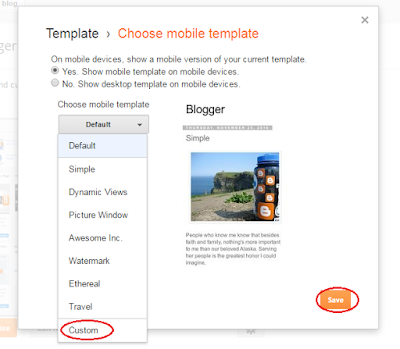
Step 11: Go to template and click on settings icon below mobile template.

Step 12: Choose Custom template for your mobile template and click on save button.
That's it! you are done.
I hope you like this post, if yes then share it with others. Thanks for visiting 101Helper.
NOTE: Never remove the Light blue highlighted area of the code!
How To Customize Mobile Swiper?
Handle the codes carefully incase of any removal of a single code can result in stopping of the swiper!
1. Replace YOUR IMAGE LINK HERE with your image links
2. Replace YOUR POST LINK HERE with your post links
3. Replace YOUR TITLE HERE with your post title.
4. Replace YOUR POST TEXT HERE with your post text.
5. To add more slides add below piece of code above the highlighted area(yellow).
For Only Text Swiper.
<div class="swiper-slide" style="margin-right: 30px;"><a href="YOUR POST LINK"><h3>YOUR POST TITLE</h3></a><p>YOUR POST TEXT(SMALL INTRO)</p></div>
For Image Swiper.
<div class="swiper-slide" style="margin-right: 30px;"><a href="YOUR POST LINK HERE"><img src="YOUR IMAGE LINK HERE"/><h3>YOUR POST TITLE</h3></a></div>
Step 9: After finding the swiper gadget in your template, you will see a line of code like this:
<b:widget id='HTML1' locked='false' title='Swiper' type='HTML' visible='true'>
You need to add mobile='yes' after locked='false' like this:
<b:widget id='HTML1' locked='false' mobile='yes' title='Swiper' type='HTML' visible='true'>

Step 10: Click on save and you are done, now you just need to enable mobile custom template for your blog and swiper will start showing up in your phone.
Step 11: Go to template and click on settings icon below mobile template.

Step 12: Choose Custom template for your mobile template and click on save button.

That's it! you are done.
I hope you like this post, if yes then share it with others. Thanks for visiting 101Helper.
NOTE: Never remove the Light blue highlighted area of the code!
How To Customize Mobile Swiper?
Handle the codes carefully incase of any removal of a single code can result in stopping of the swiper!
1. Replace YOUR IMAGE LINK HERE with your image links
2. Replace YOUR POST LINK HERE with your post links
3. Replace YOUR TITLE HERE with your post title.
4. Replace YOUR POST TEXT HERE with your post text.
5. To add more slides add below piece of code above the highlighted area(yellow).
For Only Text Swiper.
<div class="swiper-slide" style="margin-right: 30px;"><a href="YOUR POST LINK"><h3>YOUR POST TITLE</h3></a><p>YOUR POST TEXT(SMALL INTRO)</p></div>
For Image Swiper.
<div class="swiper-slide" style="margin-right: 30px;"><a href="YOUR POST LINK HERE"><img src="YOUR IMAGE LINK HERE"/><h3>YOUR POST TITLE</h3></a></div>


