Business Card Design Changes
Company designs should be kept identical at all times without any major changes because after all keeping your identity same at all times is the whole concept behind a business logo. We have made slight changes to the web domain and email domain address. We simply replaced the blog domain address with company website URL inside the new design. We also changed NETWORK to lowercase and made the blue color a little brighter rest all things are kept the same.
The cards are printed at both sides, matt laminated and match the size of a credit card 310g2. Went through 3 + 2 color printing with dye cutting. Its designed by keeping MBT's parent design in mind, utilizing the same blue and black color combination. The front of the card contains details about the network administration, logo and some contact details whilst the back contains my favorite quote i.e. "I blog for living"
We printed a total of 1000 copies this time:
Our previous design:
Letterhead Design Specifications
As a business, every single time you reach out a customer, whether through an invoice, contract or offer – you’re saying something about who you are. Letterheads leave your trademark on all documentations and business correspondence that takes place. Thus a unique form of marketing that further boosts your authenticity and credibility in the eyes of customers.
Letterheads can be used for both offline and online correspondences. You can print anything inside them using a inkjet or laser printers just like you do on any A4 size paper.
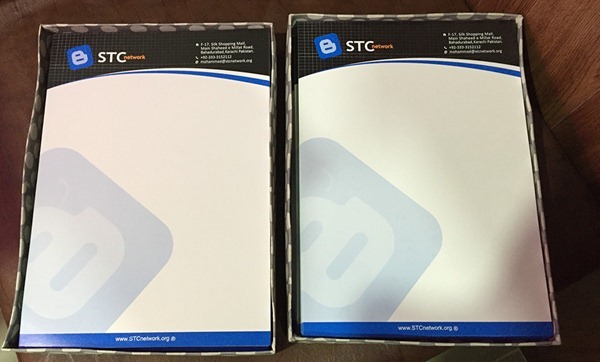
We have kept the design both comprehensive and yet simple in concept. The header consists of the company logo and office address while the footer contains the company web address. We have also inserted a large faded logo inside the center-left of the paper to make things more eye catching.
These letterheads will also be used as certificates in our coming workshops and conferences. The paper consists of a thick layer of 150 g2 matt paper with tri color printing
Your views?
How important do you think are letterheads for a business and have you planned designing VC and letterheads for your blog? If yes then do share the design with us by using the following shortcode inside comments:
[img src="Insert your Image Link here" width="50%" /]
Our Cards and Letterheads are designed and printed by Waqas Haider from Al - Rehman Enterprises. Waqas is a great friend and an excellent designer without doubts. I would recommend his services to anyone home or abroad.
Do give us your feedback on this latest development and let us know what could be done to make the cards even more better. Peace and blessings buddies! =>


